Becky Blomberg is an author, illustrator, and graphic designer based in Milwaukee.
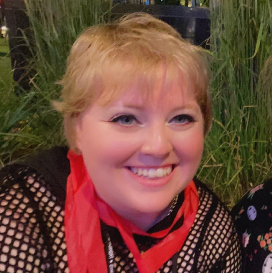
Hello, world! Becky, here!
You may also know me online as Kensa! I'm an artist working full-time in Milwaukee. I spend most of my free time writing or working with textiles, but my real passion comes through with graphic design.
Portfolio
See below for examples of my illustration and design work.
“What an unequaled gift for disaster you have.” —Naomi Novik
A Brief Overview
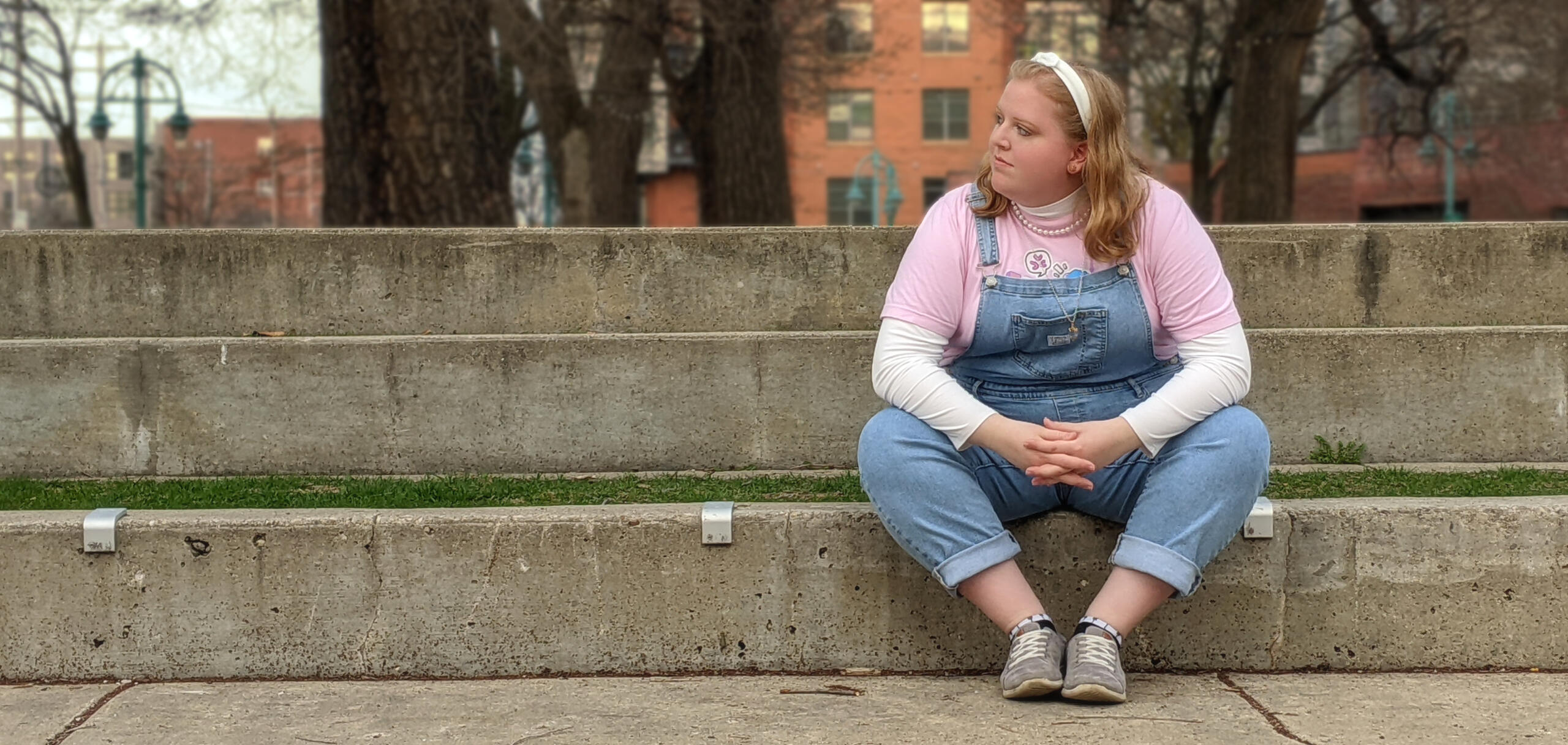
I grew up in a suburb-of-a-suburb of Chicago and have remained in the Midwest ever since. Outside of illustration and design, I immerse myself in textiles, enjoying sewing plushies, crocheting amigurumis, and customizing fashion dolls. I have an unabashed love for the Legend of Zelda and Fire Emblem, but the "real me" comes out while playing online in Splatoon. I enjoy collecting a variety of knickknacks, such as Barbies, blind box figurines, Amiibos, and enamel pins. Don't try to hook me on a new trend—it'll hurt my wallet in some way or another.
Artistic History & Career
After a sit-down with my high school art teacher, I was convinced that my destiny lay within the world of art instead of majoring in English. I've been drawing for as long as I can remember, so it's only natural that I would pursue it as a career. With support from my family and friends, I have been able to flourish in the realm of art and design.I graduated in May 2023 with BFAs in Illustration and Communication Design at the Milwaukee Institute of Art & Design. I had initially only planned to major in Illustration, but after taking a beginning course on design, I fell in love with the practice and just had to major in both. I also received a minor in writing at MIAD, and a minor in copywriting at Marquette University through its partnership program with MIAD.I currently work at MIAD as one of its Housing and Student Engagement Coordinators. Although this role doesn't have me creating full-time, it allows me to interact with artists and assist in any ways I can with their work—scratching that itch telling me that I need to be a teacher—and provide essential support to my students as they navigate being an adult for the first time. Outside of work, I often participate in online fanzines and work freelance when the opportunity arises.
Zine Experience
See below for a list of my zine experience as both a moderator and contributor.
Moderator Experience
| Zine | Year | Role | Status |
|---|---|---|---|
| The Twilight Princess Anniversary Zine | 2026 | Host | Interest Check |
| Atonement: A Michael Afton Zine | 2026 | Formatting Mod | Planning Period |
| Splatoween Zine | 2026 | Host | Planning Period |
| Tidal Rush: A Squid Sisters Zine | 2025 | Formatting Mod | Production Period |
| Four Seasons: An Animal Crossing Zine | 2025 | Host & Formatting Mod | Creation Period |
| Tides: A Katara Zine | 2025 | Graphics & Formatting Mod | Creation Period |
| The Wind Waker Trilogy Zine | 2025 | Host, Graphics, & Formatting Mod | Creation Period |
| Space Invaded: A Momokarun Zine | 2025 | Graphics & Formatting Mod | Production Period |
| Splatoon Raiders: Concept Zine | 2025 | Graphics & Formatting Mod | Hiatus |
| Now or Never Seven: World Tour | 2025 | Formatting Mod | Complete |
| Eggstra Credit: An Overfishing Zine | 2025 | Graphics & Formatting Mod | Complete |
| Sea Major: A Splatband Zine | 2024 | Graphics & Formatting Mod | Leftovers (soon) |
| Silent Princess: A Zelda Zine | 2024 | Formatting Mod | Complete |
| Monochrome Walker: A Side Order Fanzine | 2024 | Graphics & Formatting Mod | Complete |
| Encore, Pwease! A Side Order Fanzine | 2024 | Graphics & Formatting Mod | Leftovers (soon) |
| Will of the Universe: A Splatoon Tarot Project | 2023 | Graphics & Formatting Mod | Fulfillment Period |
"Year" refers to the year I joined the project.
Contributor Experience
"Year" refers to the year I joined the project.
Are you interested in working with me to bring your next creative endeavor to life? Shoot me an email at blombergart@gmail.com.
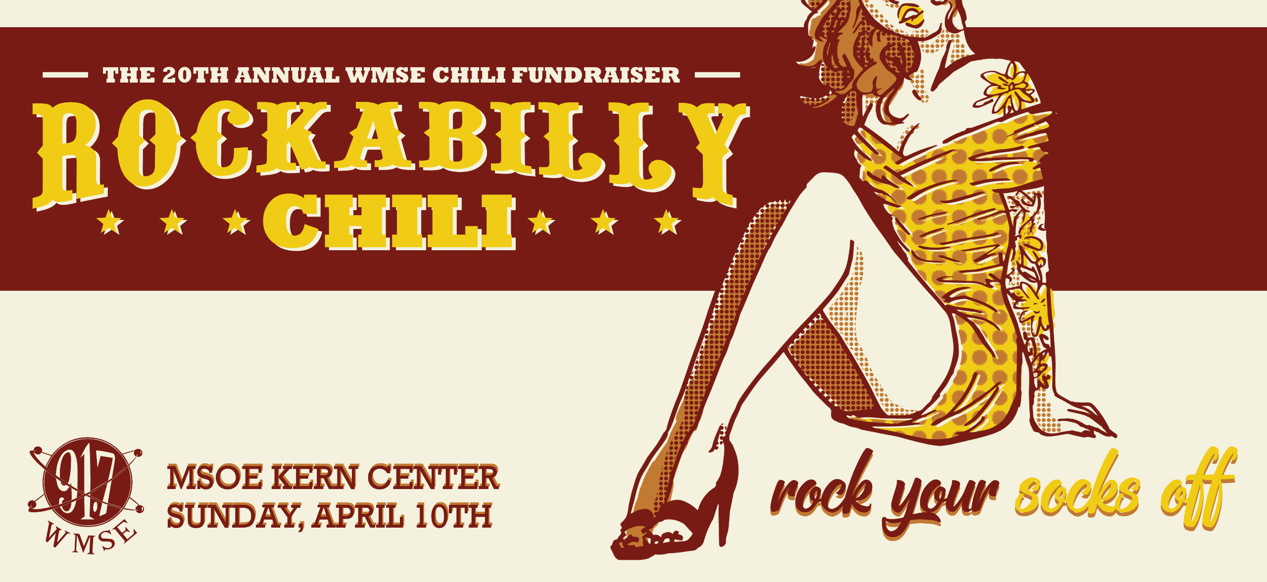
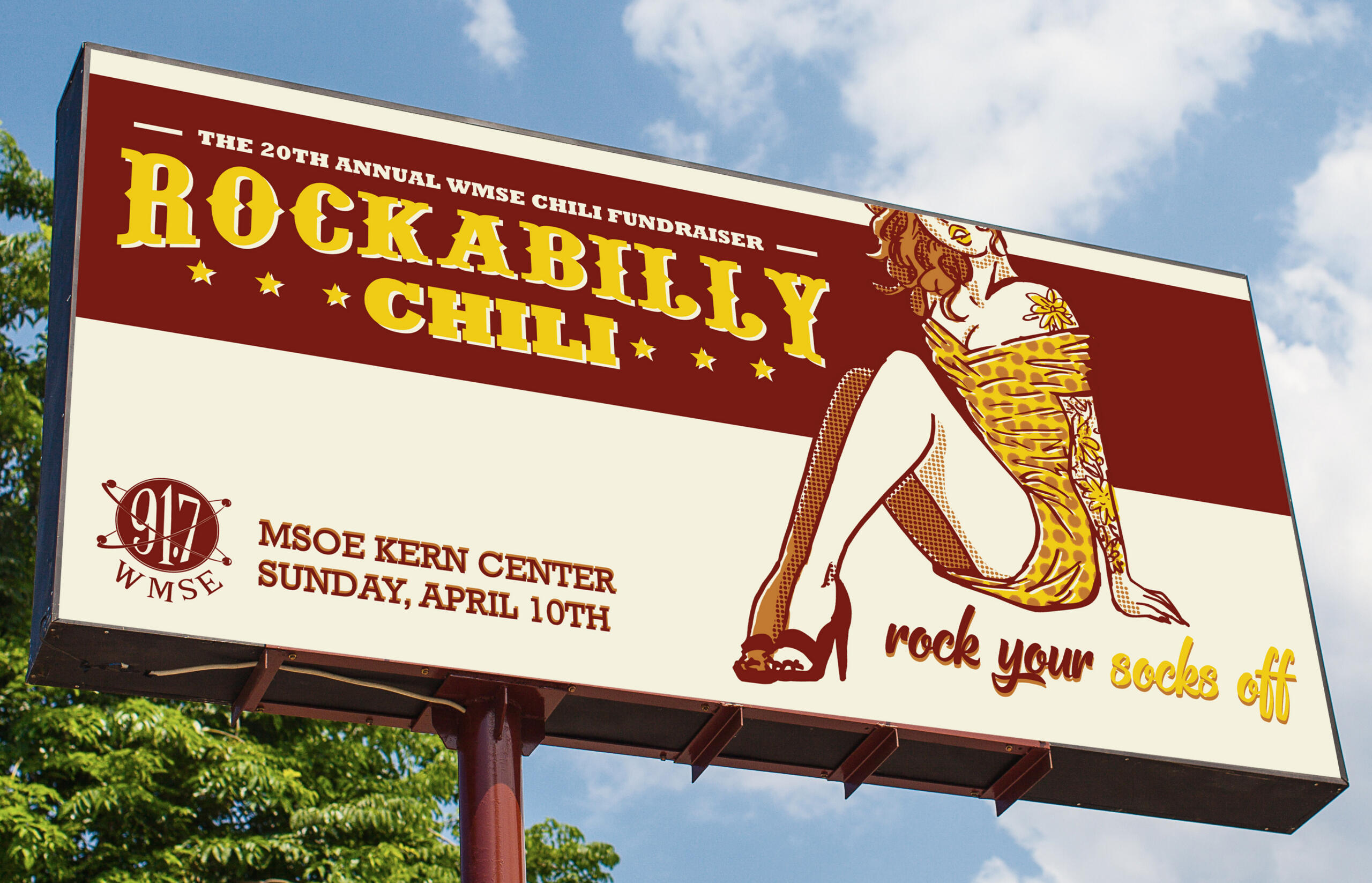
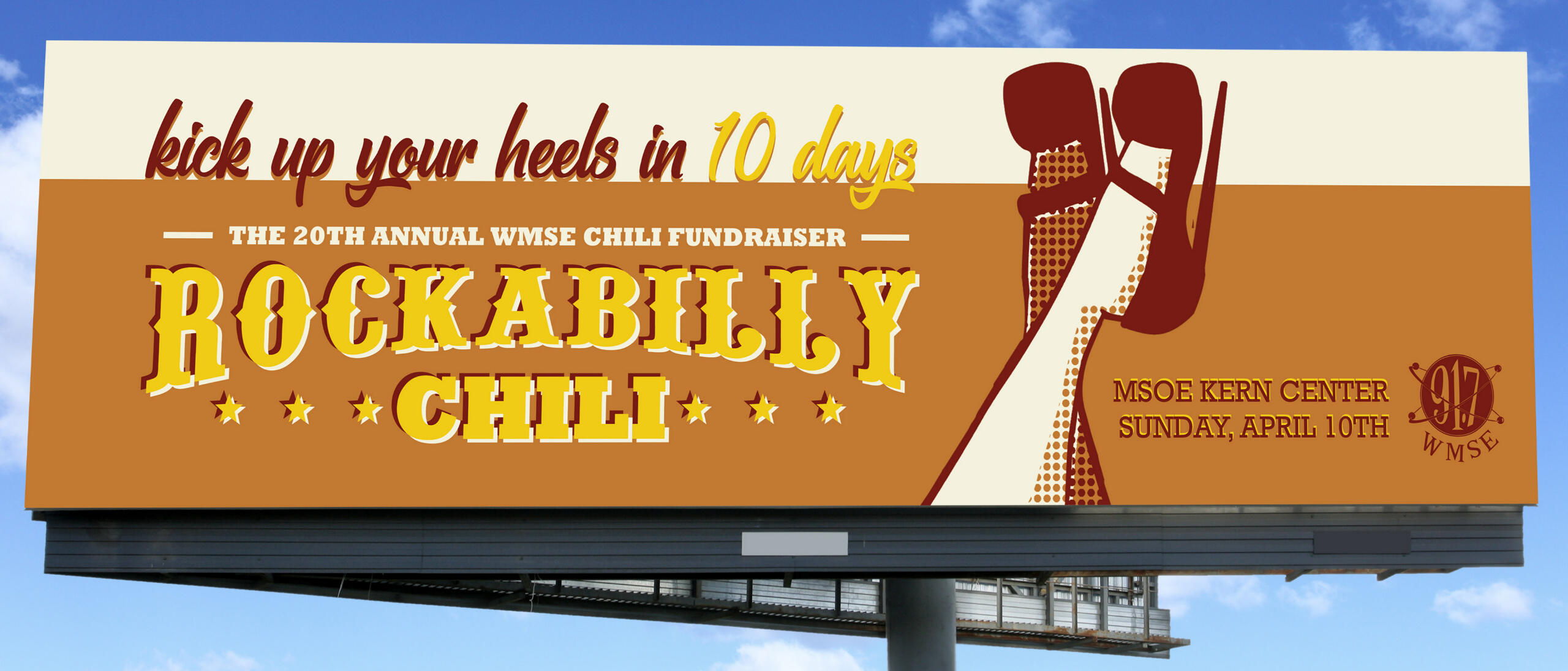
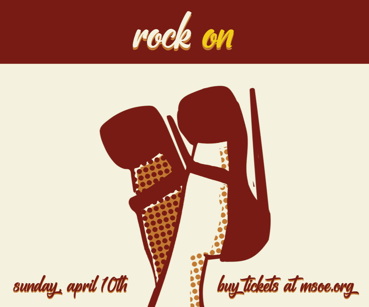
Rockabilly Chili: An MKE Fundraiser Campaign
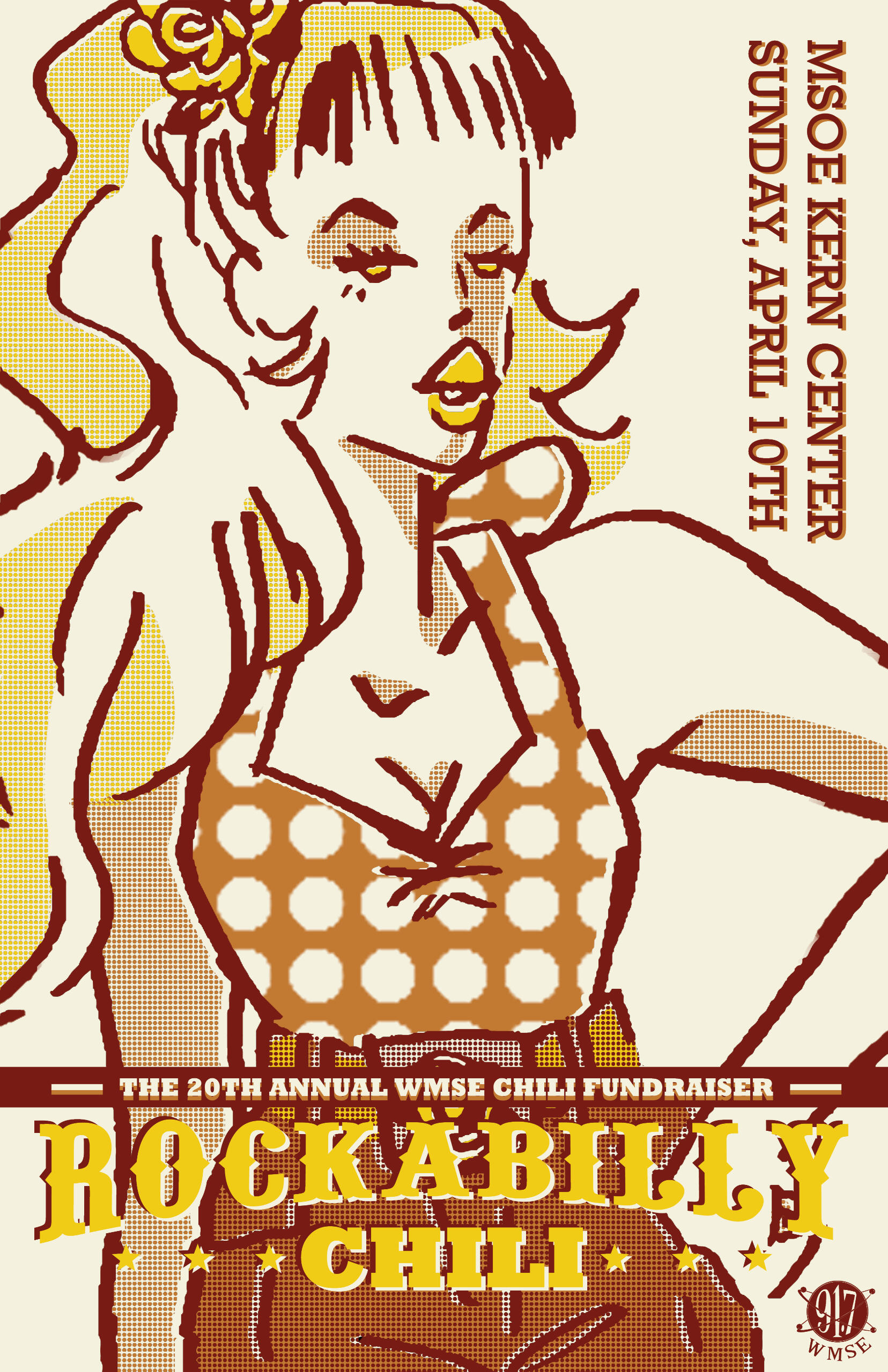
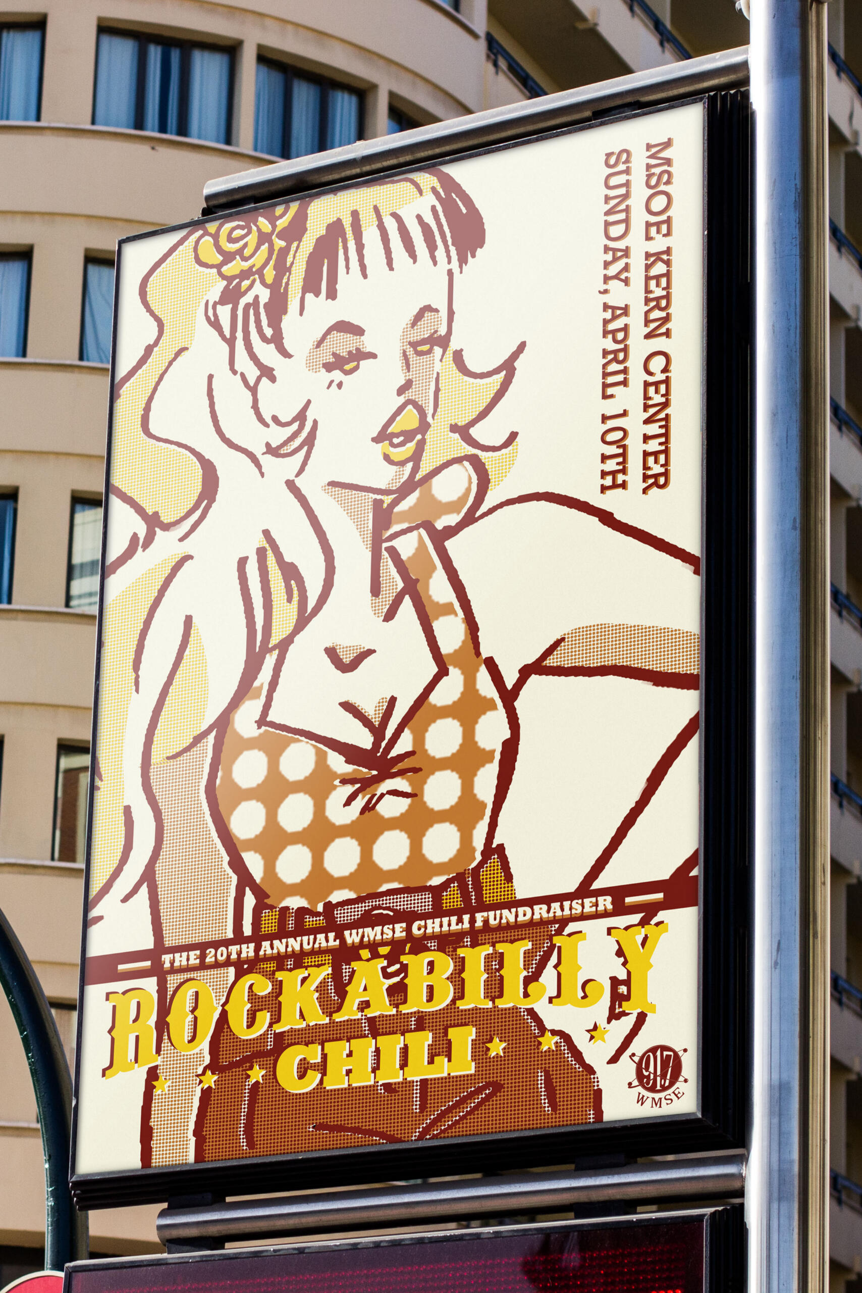
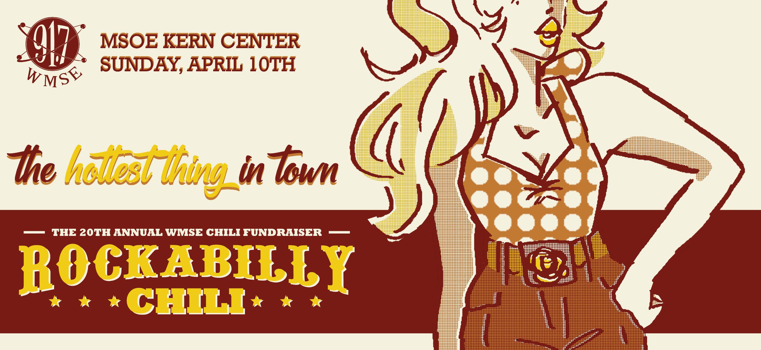
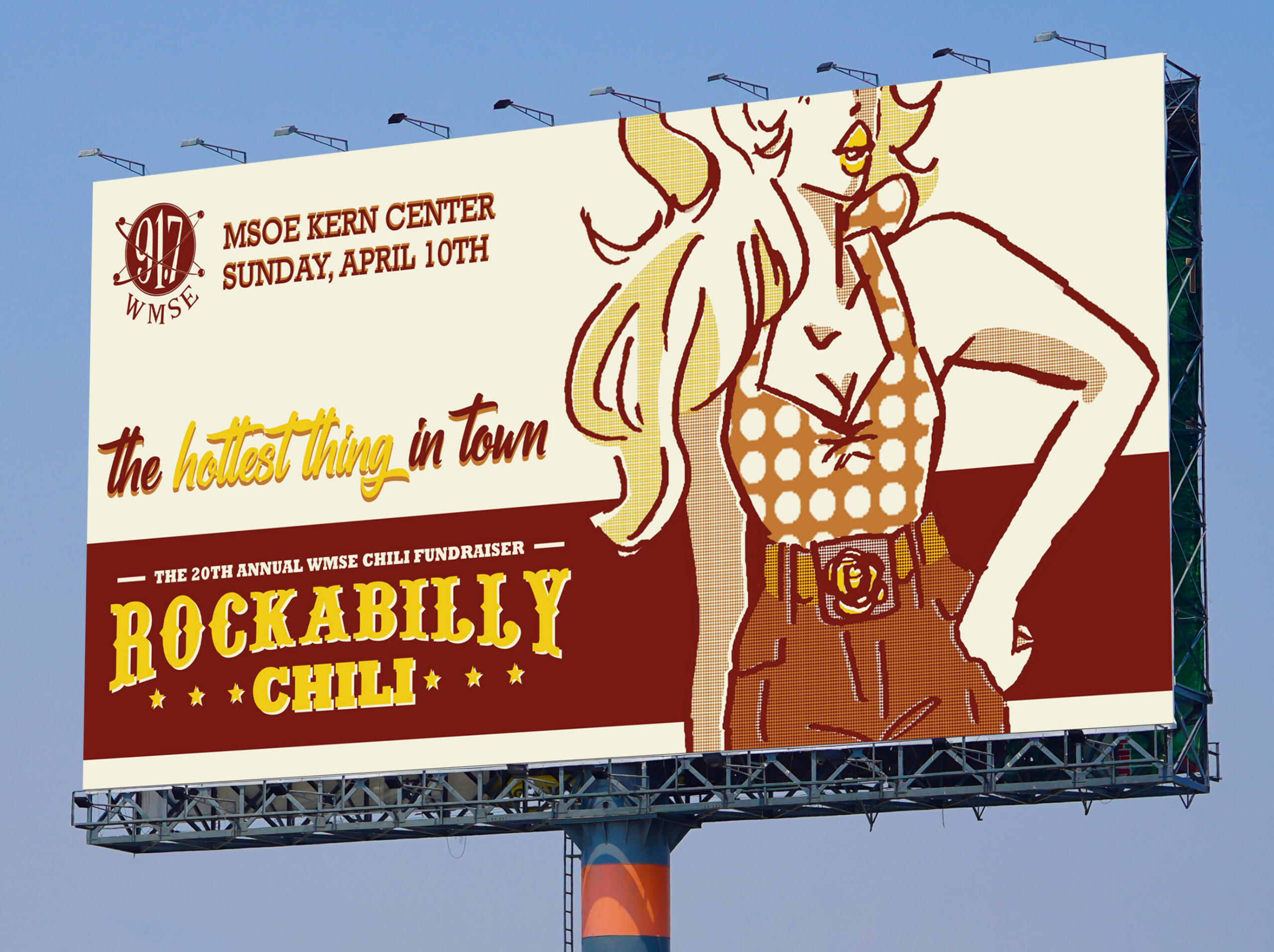
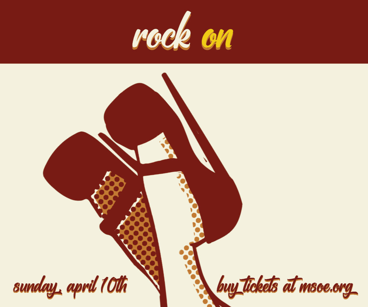
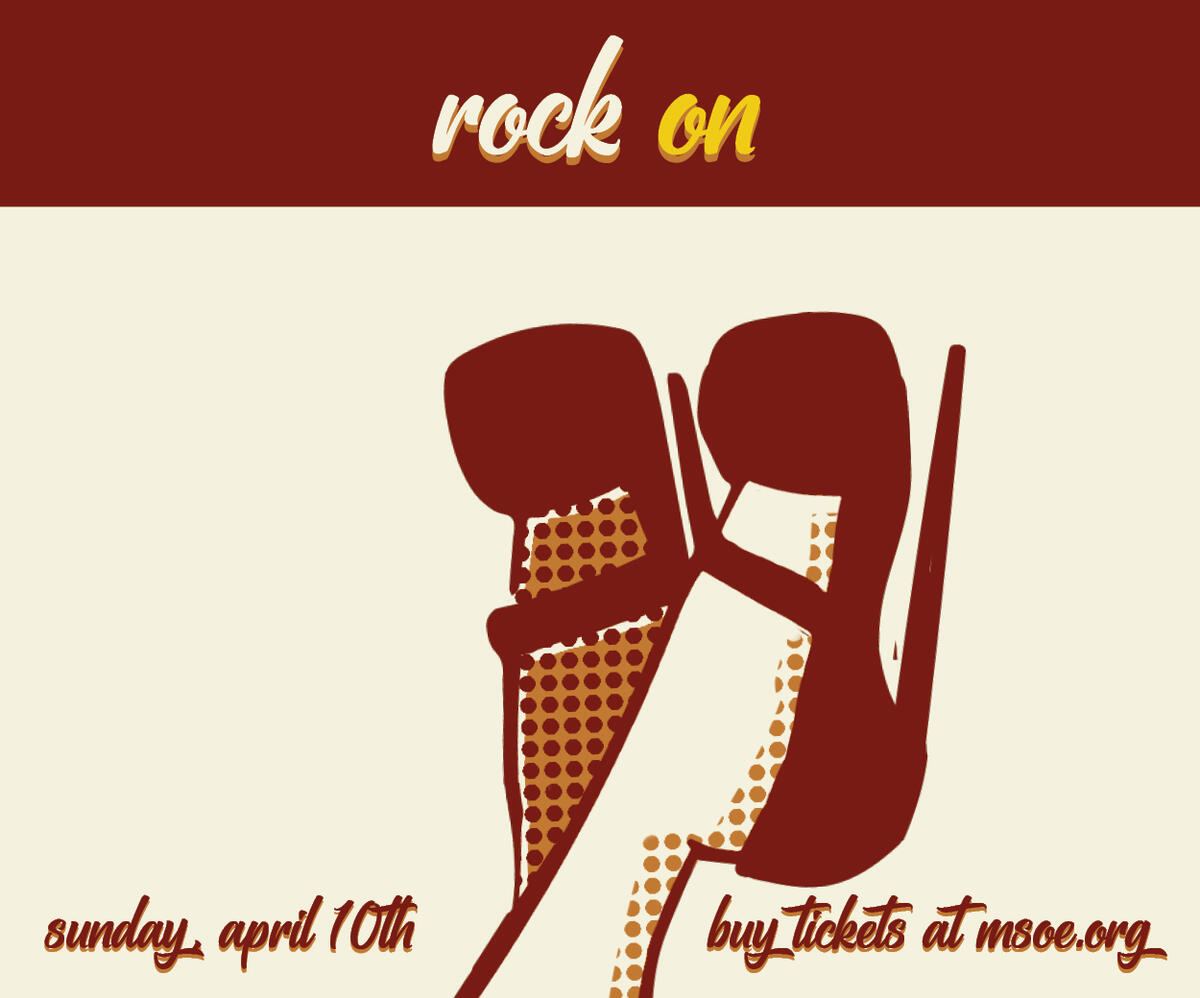
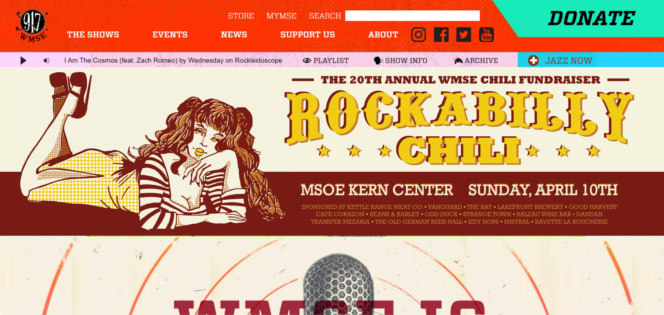
Overview: Rockabilly Chili is an annual Milwaukee-based chili fundraiser hosted by WMSE. Students were tasked with creating an advertising campaign for the event consisting of one poster, three billboard ads, three online banner ads, and one landing page design.Brief: Milwaukee residents need to be informed of the event and rock fans need to gain interest in either participating in or supporting the fundraiser.Solution: By banking on the pinup style of rockabilly fashion, advertisements will attract an audience with their fun & flirty tone and familiar sense of style.






Annual Croquet Ball: A Penfield Fundraiser Poster
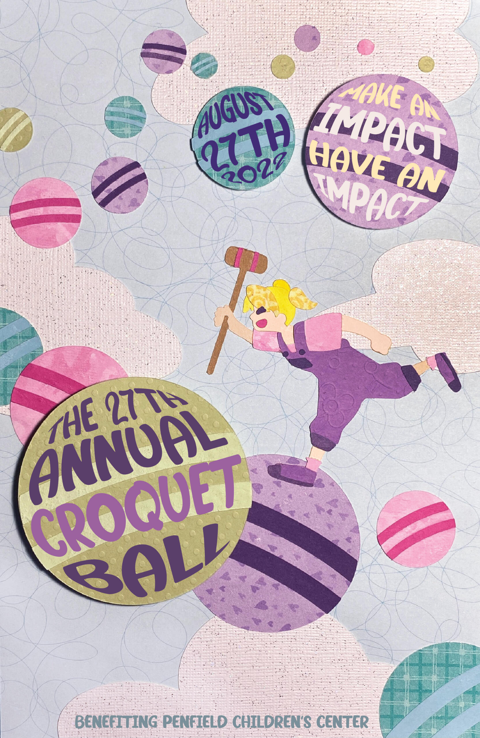
Overview: The Annual Croquet Ball is a fundraiser run by Penfield's Children Center to raise money for the benefit and care of children with developmental delays and disabilities.Brief: The Annual Croquet Ball poster is intended to be auctioned off as a display piece, the proceeds of which will benefit Penfield's Children Center. The main message of the poster have a more aesthetically pleasing execution than an informational one.Solution: The utilization of a cut-paper style with bright, fun patterns, and a whimsical composition shows that a game of croquet can become a path for a child into a wide-open, brighter future.
The HOP Streetcar: A Public Transport Advertising Campaign
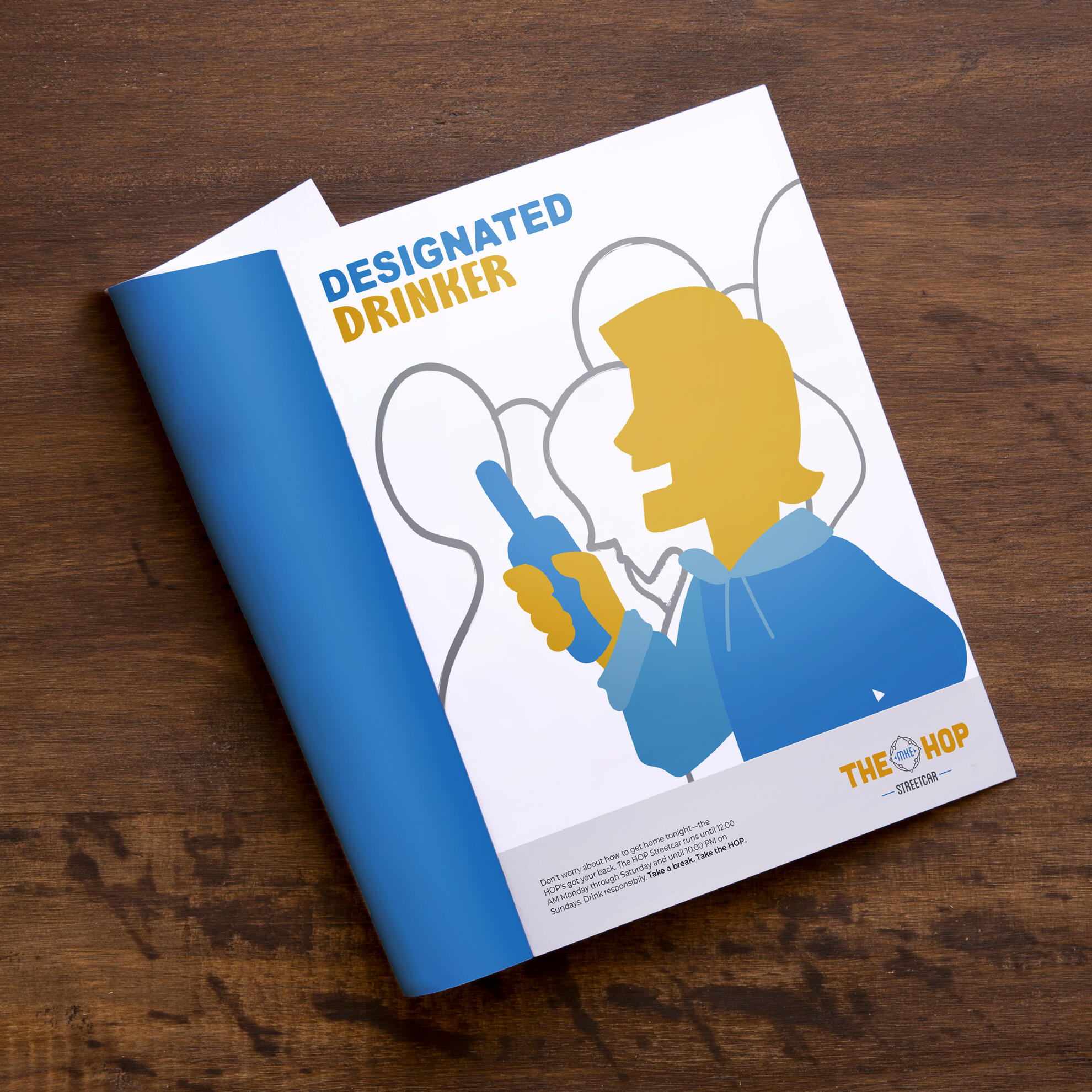
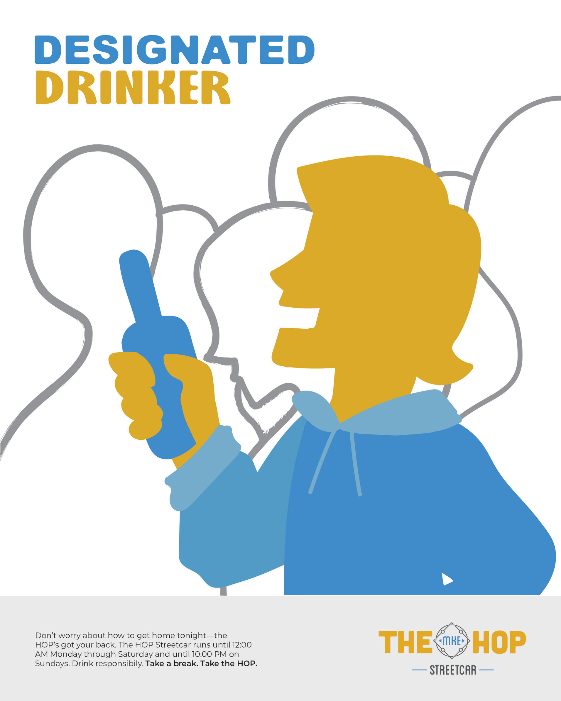
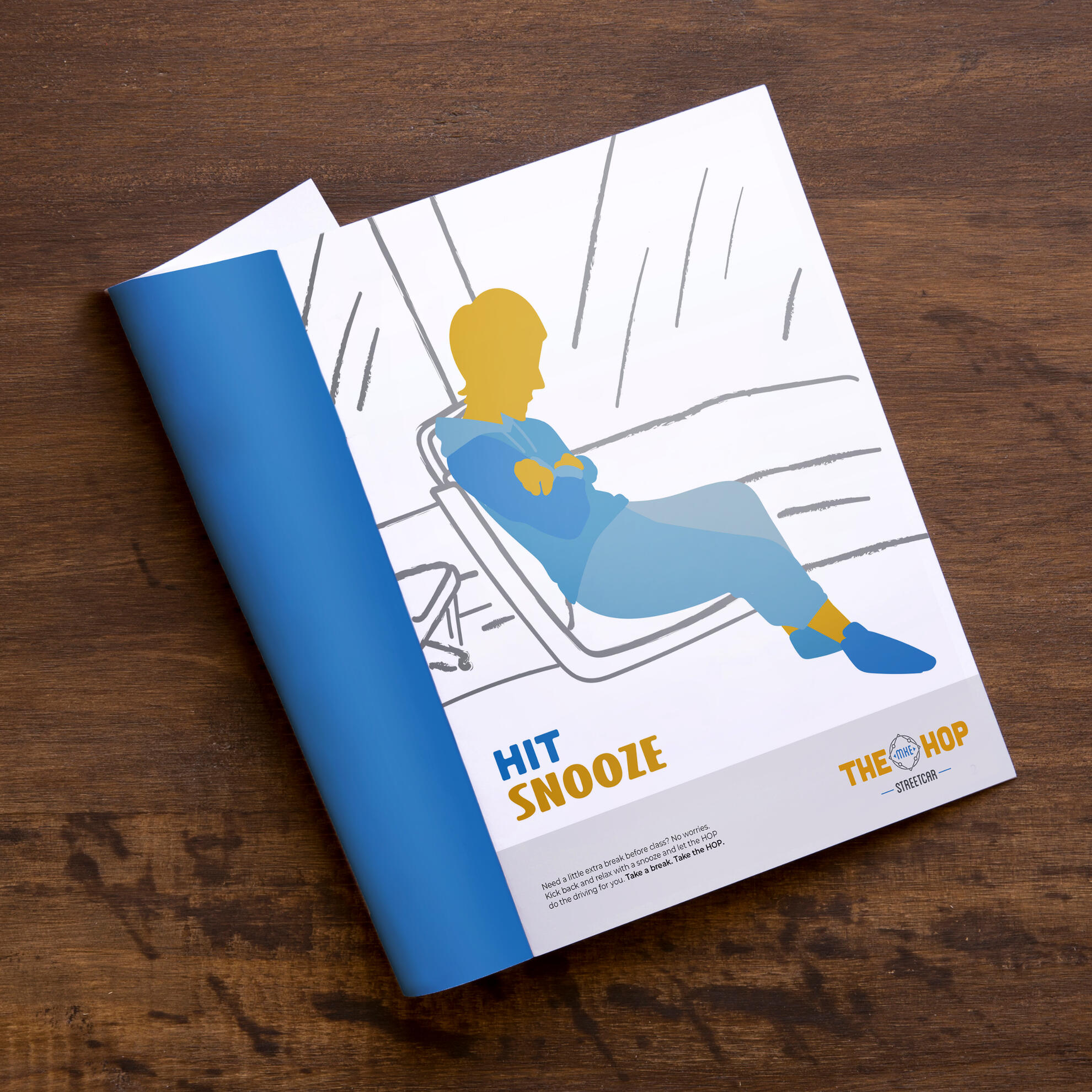
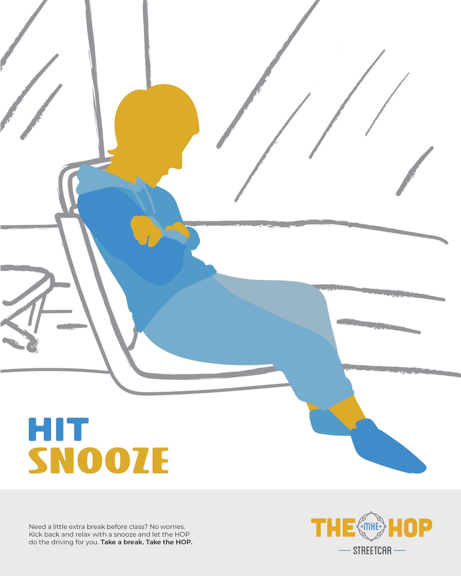
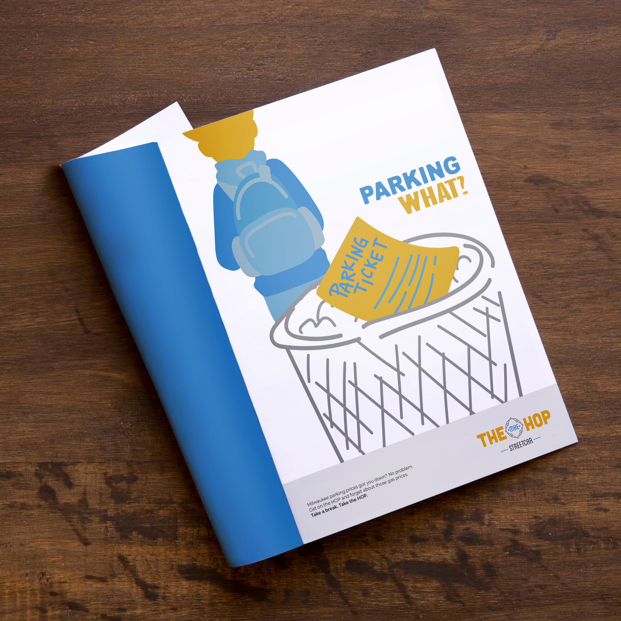
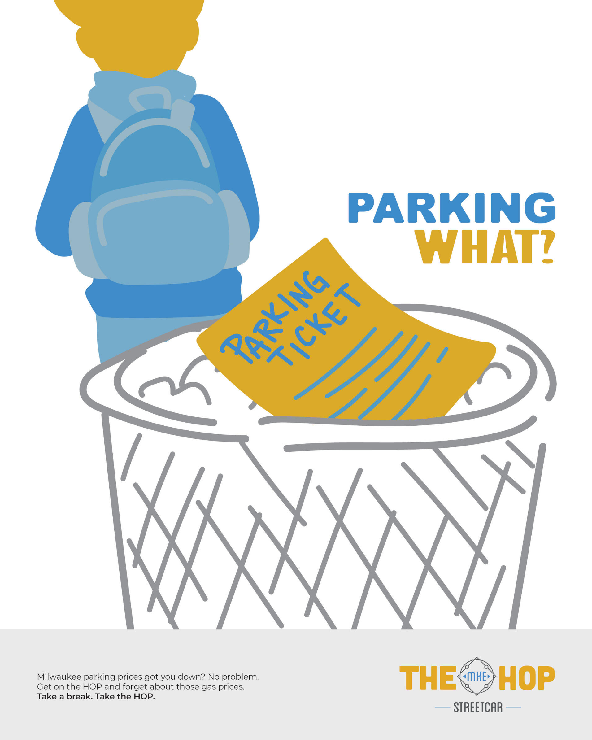
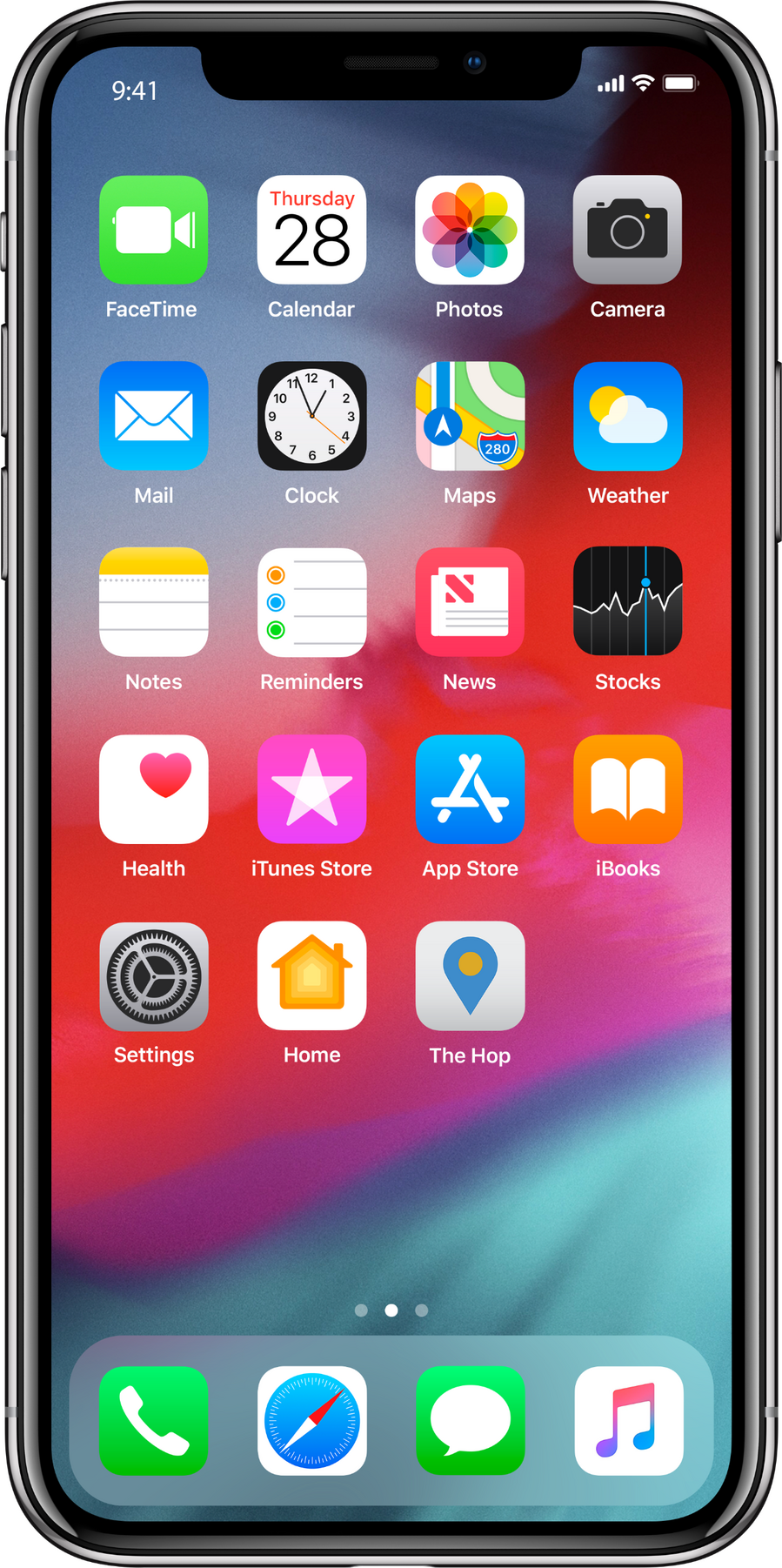
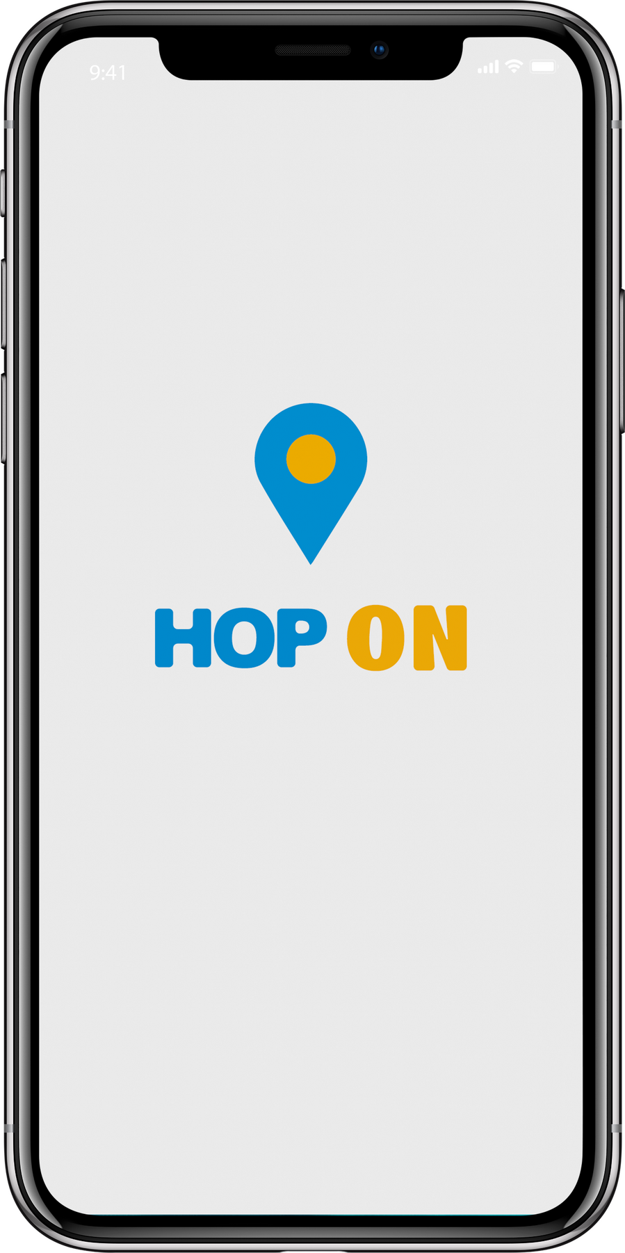
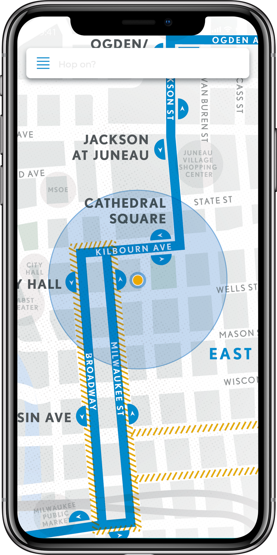
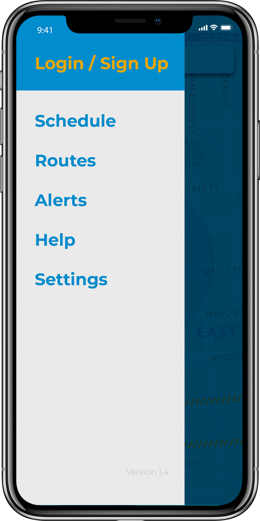
Overview: The HOP is a public streetcar that connects the Lower East Side of Milwaukee to the Historic Third Ward. It travels from the Intermodal Station to Burns Commons, making eight stops in-between, and has plans to open a new line, the “Lakefront Branch,” in late 2022. The HOP is free to ride thanks to its Potawatomi Hotel & Casino sponsorship.Brief: Students were tasked with creating a campaign that would increase ridership among a specified group of Milwaukee residents that includes three 8x10 print ads, an app icon and three mocked-up screenshots, and one execution of either guerilla or ambient advertising tactics.Solution: Through the use of a limited color palette, strong, graphic shapes, and a style hinting at street graffiti, the campaign draws the attention of a younger demographic that more often walks the streets than drives through them. By painting the street that the HOP tracks run through, it ensures that the audience knows of the HOP’s existence and remembers it next time they’re thinking about how to get home.

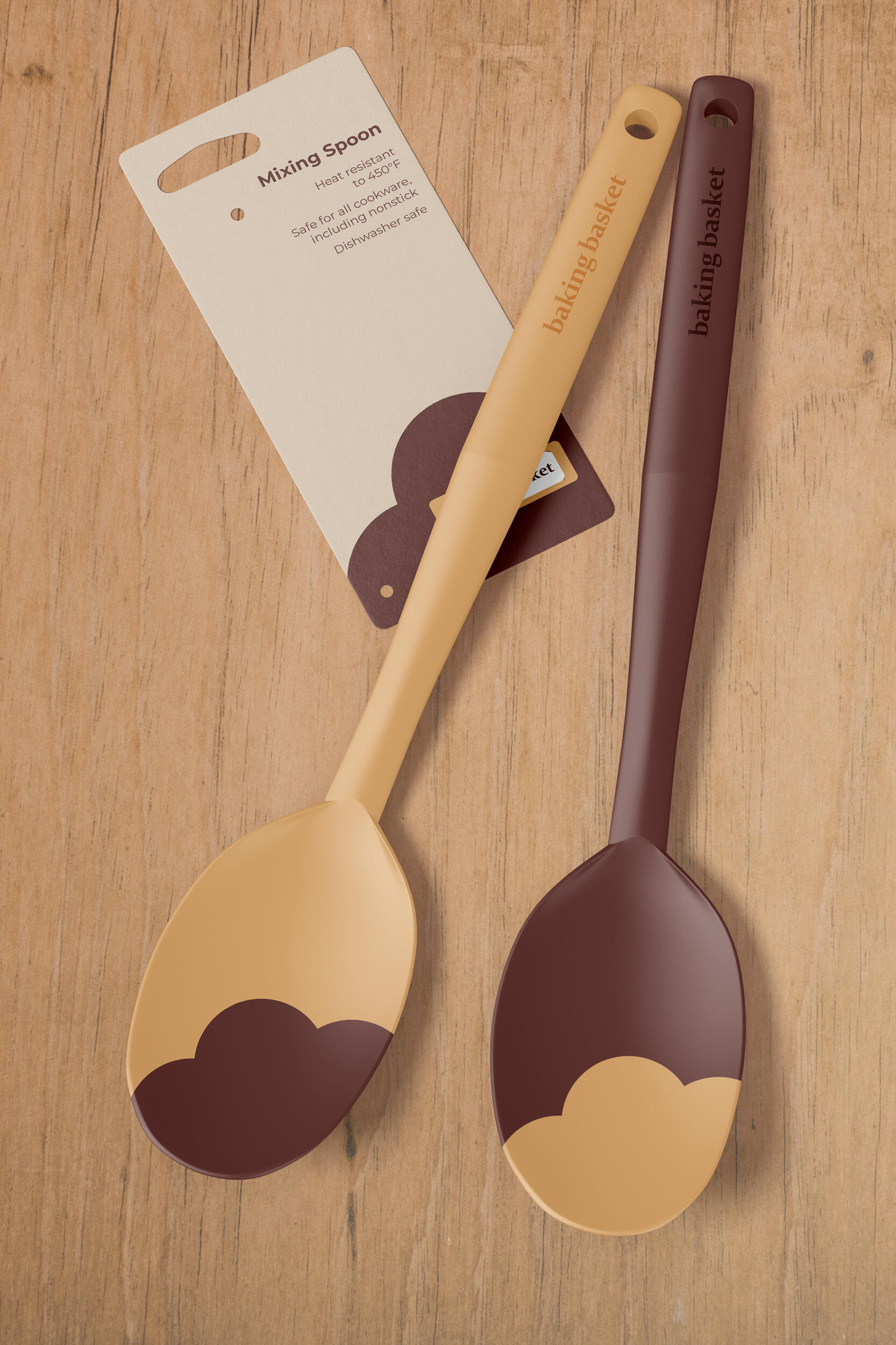
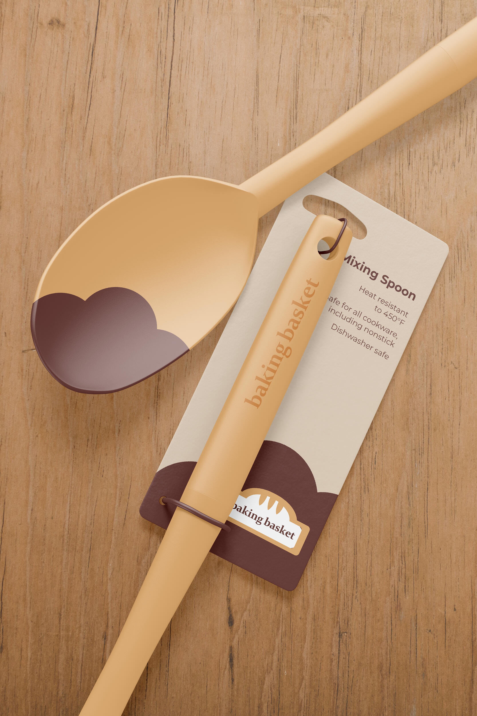
Baking Basket: Branding a Meal Subscription Service
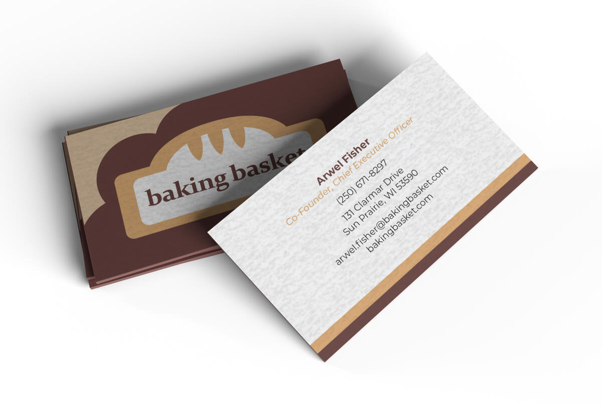
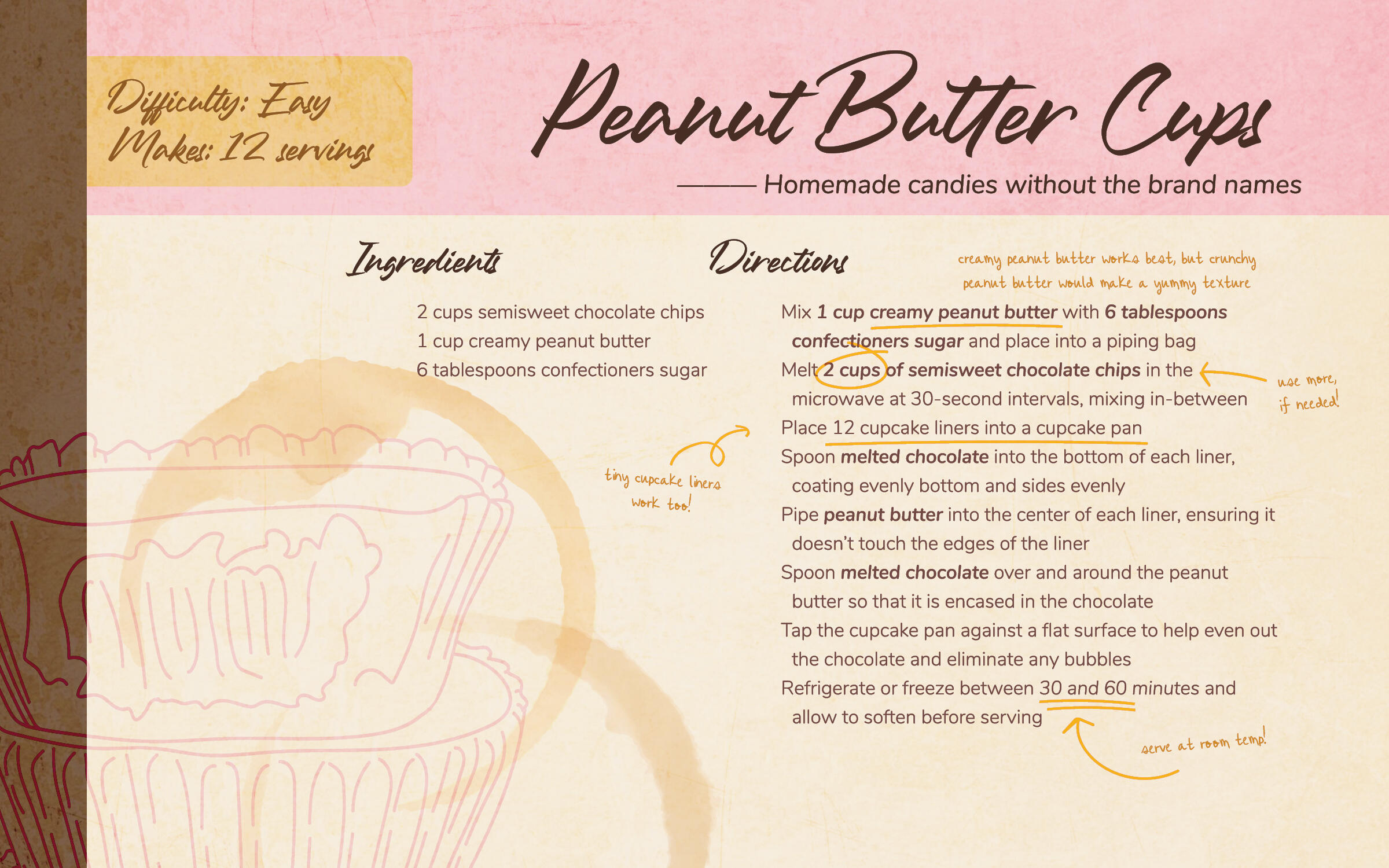
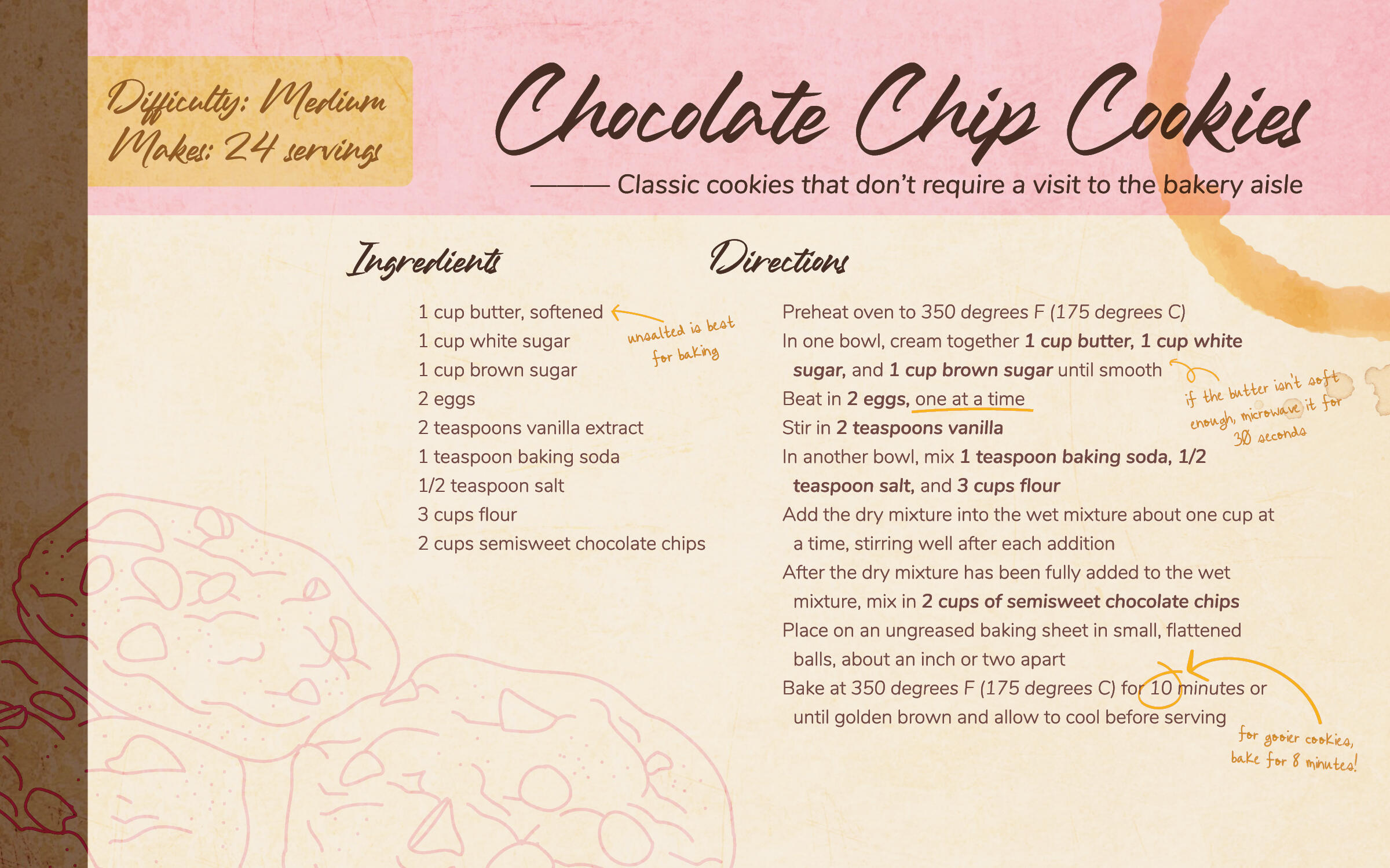
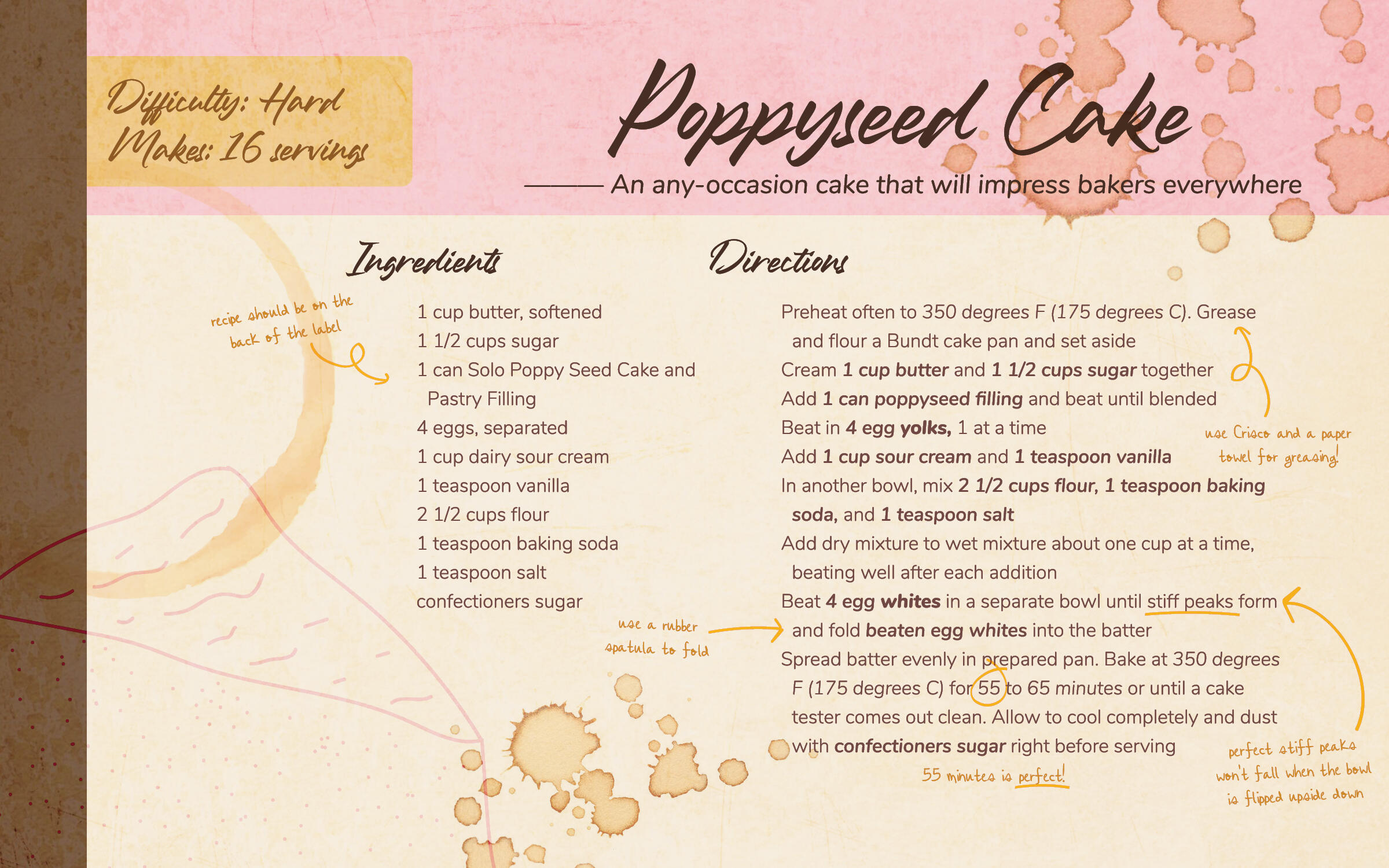
Overview: Baking Basket is a fictional meal subscription service created to practice branding and other design elements. Subscribers would receive weekly or monthly boxes containing ingredients for different baked recipes, such as cookies or cakes. It plays into that "family recipe" stereotype, or "just like momma used to make," giving each recipe a traditional feel with a modern twist. Each recipe includes "handwritten" notes, tips, and tricks, as though being taught by an older family member how to perfect the recipe.Brief: Create and execute Baking Basket's brand standards, including designing logos, letterhead, envelopes, business cards, social media avatars, branded objects, and identifying color palettes, type choices, brand voice, copy direction, and a brand standards manual.Solution: After determining the company's brand standards, utilization of its color palette and "antiquated" roots gave its solutions an old-but-modern feeling that anyone could find charming.
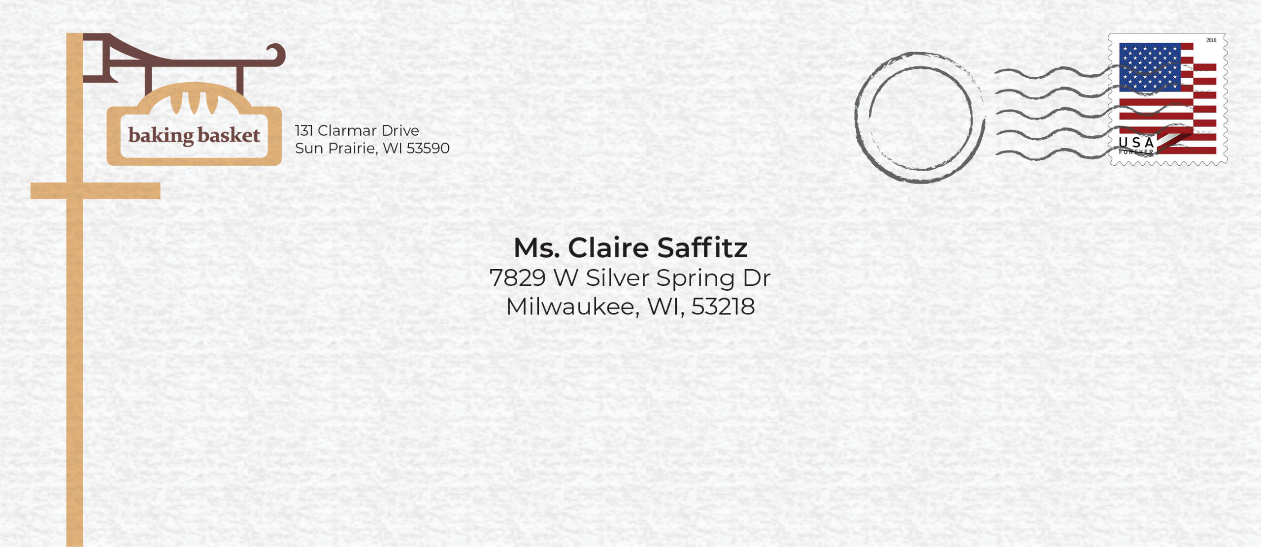
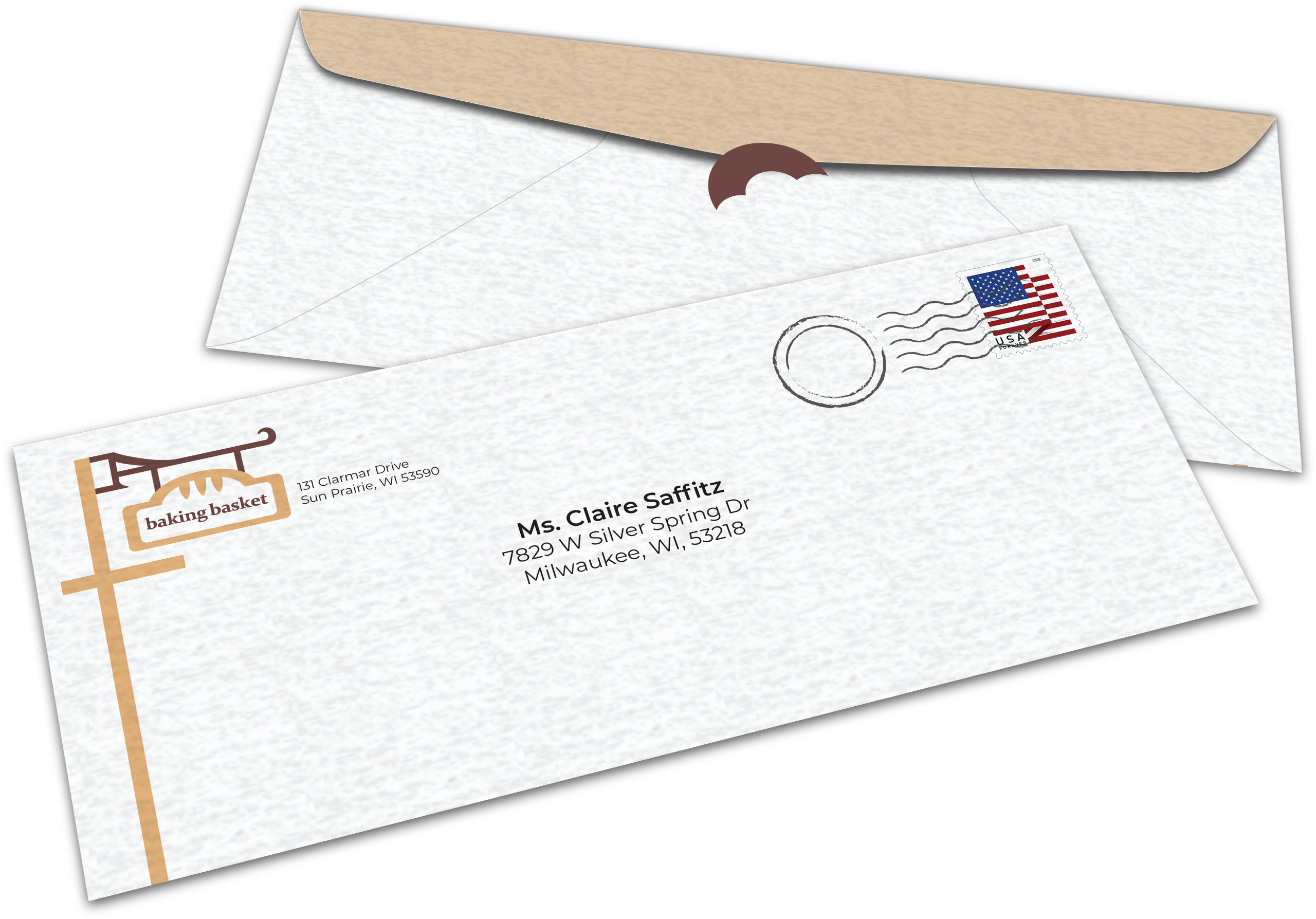
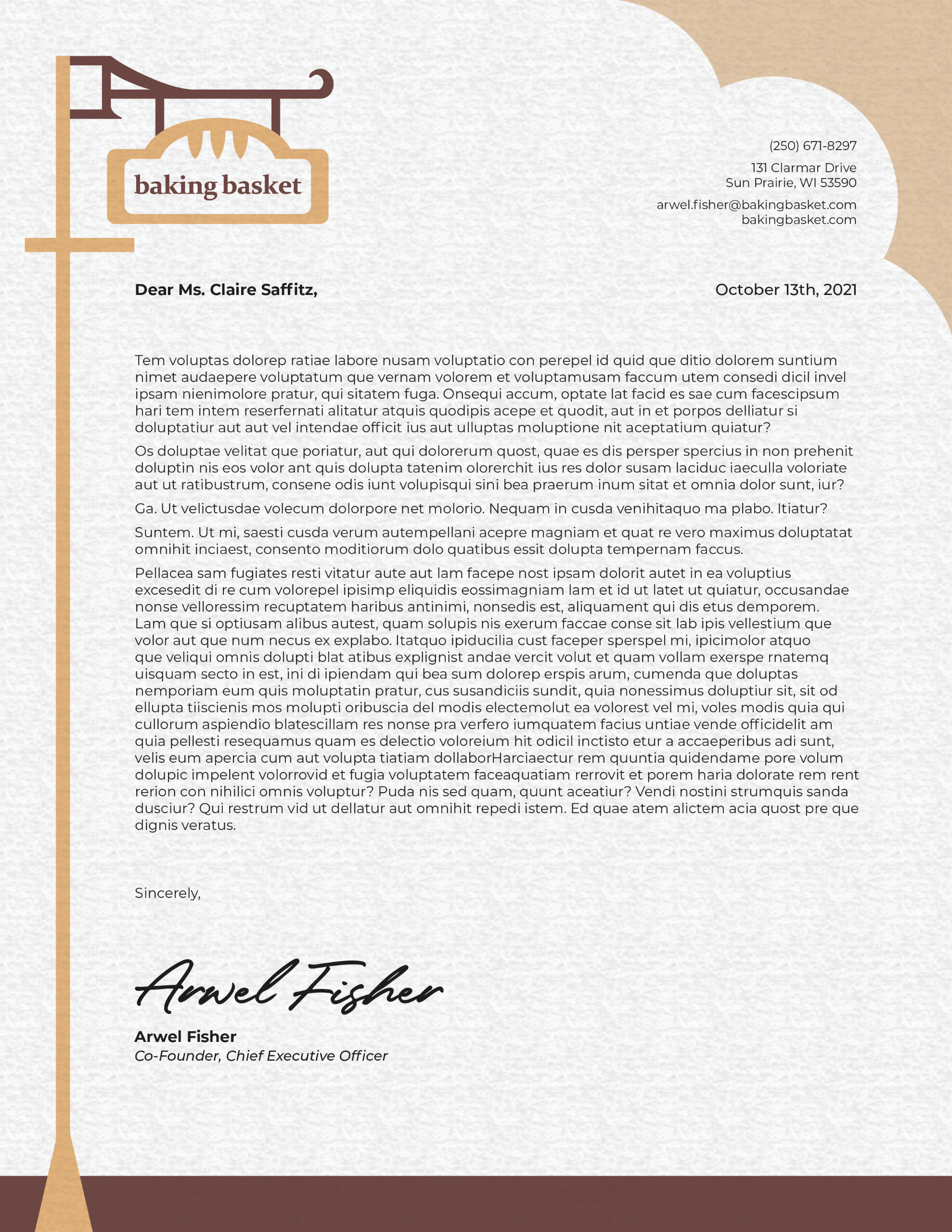
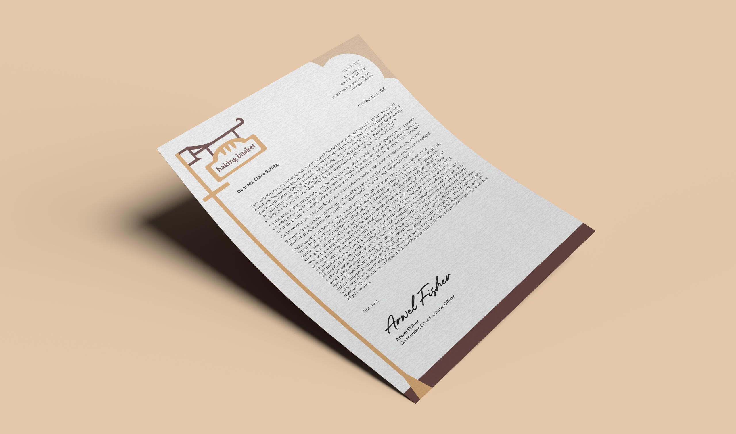
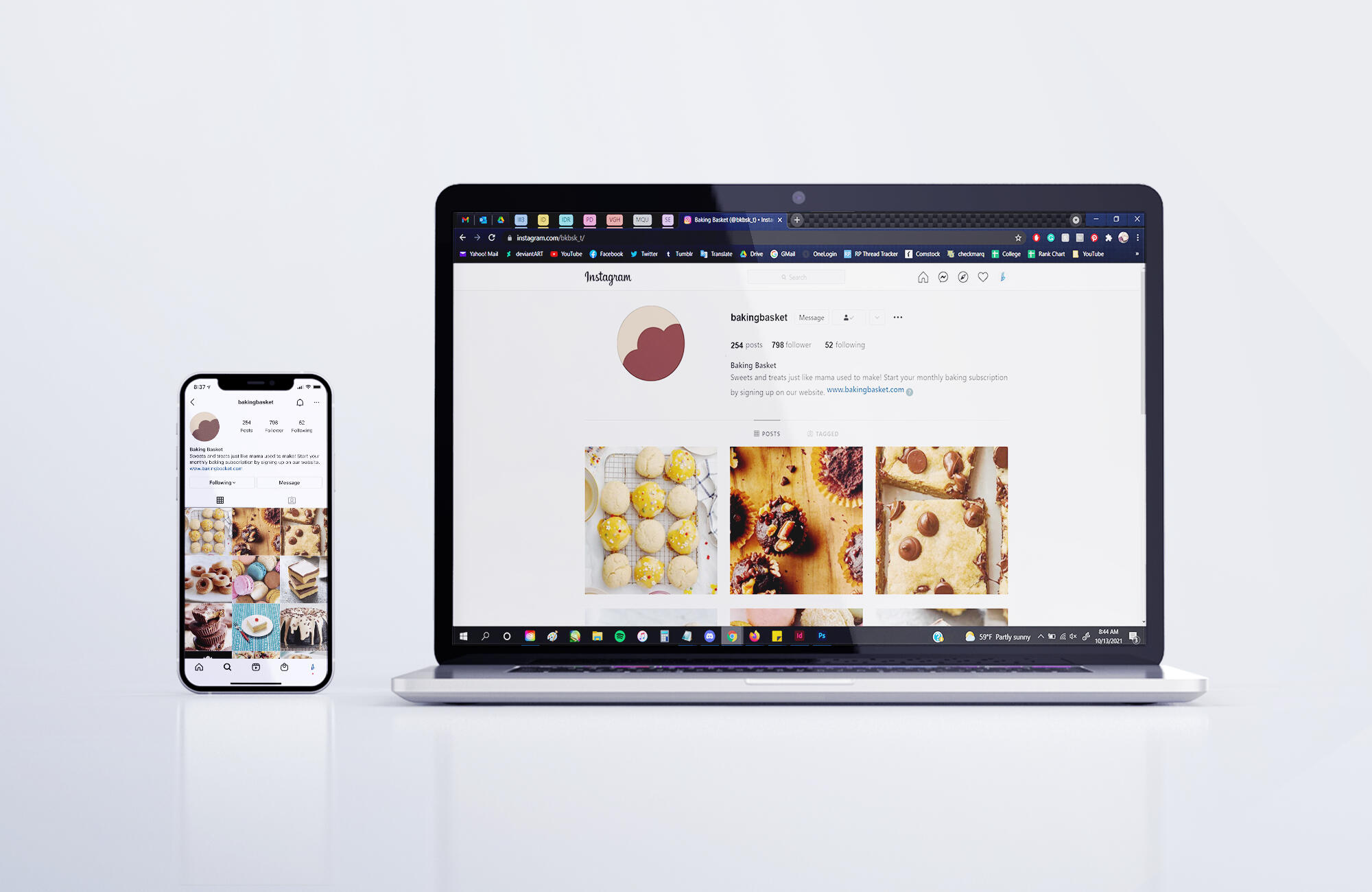
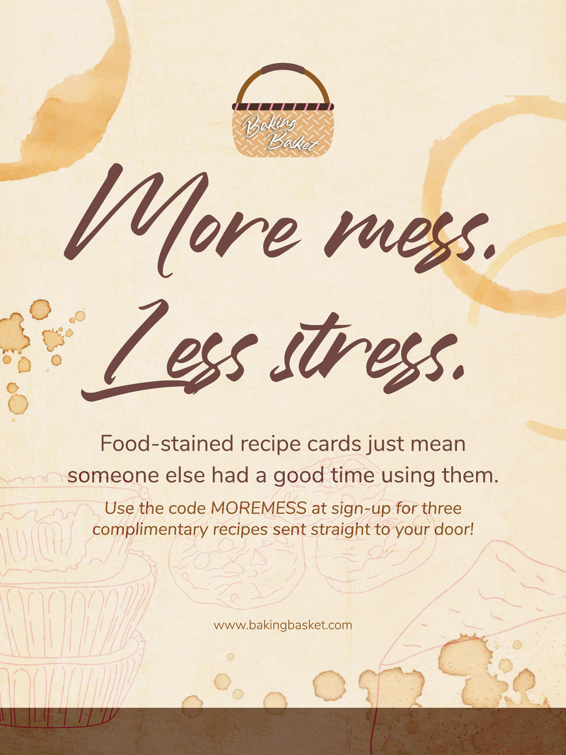
Note that the following executions were designed before the brand standards manual was implemented but inspired the standards' creation.
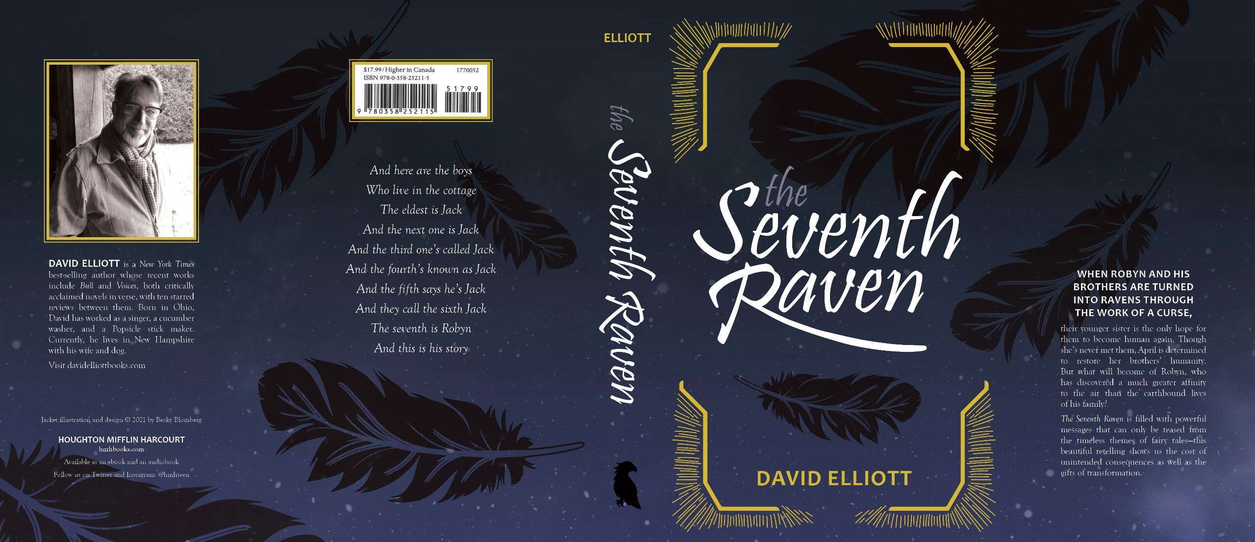
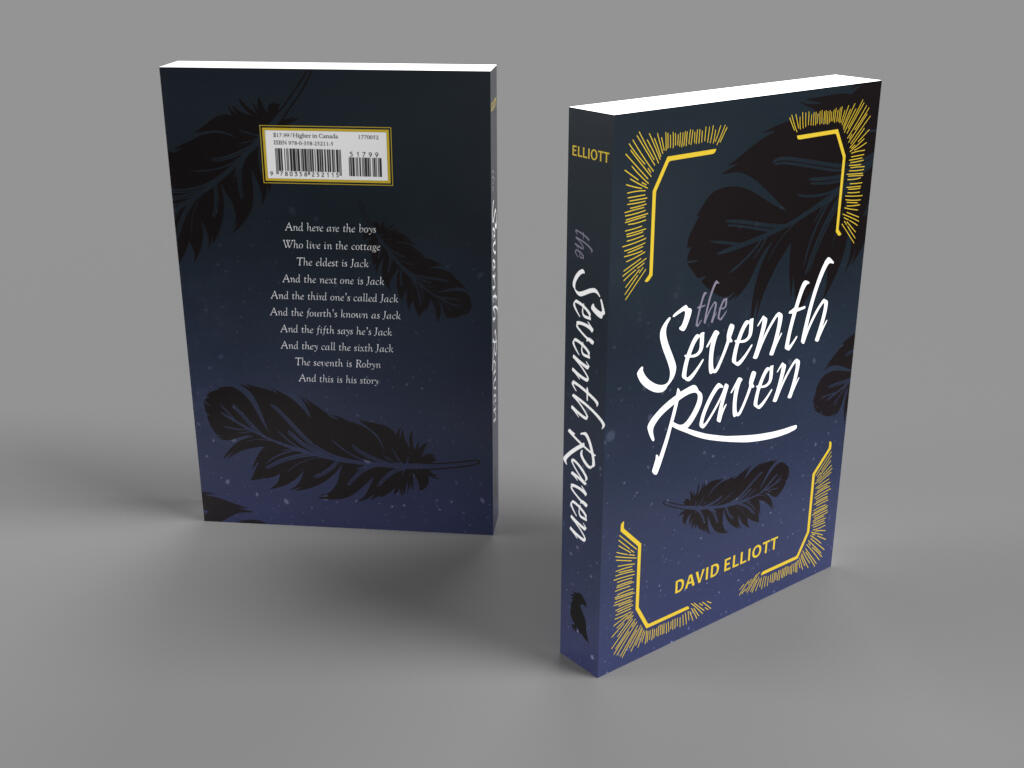
The Seventh Raven: Redesigning a Book Cover
Overview: Students were tasked with redesigning the dust jacket of a book that was not a part of a larger series or franchise, but could instead stand on its own.Brief: Redesign an already-existing book cover in a manner that does not copy the original design, but still gives insight into the book's themes and story.Solution: Dark, cool colors give way to the edgier theme of the book, with pops of gold hinting towards its fantasy element. Flowing script-like typography has a poetic feel, telling the reader that the story is in verse before they open the book. The seven feathers scattered across the jacket represent the seven characters the story centers around.
Matchbox Set: A One-Day Project
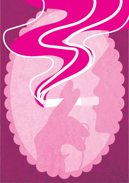
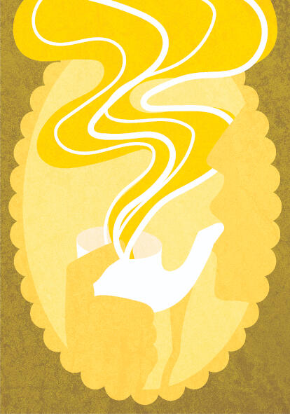
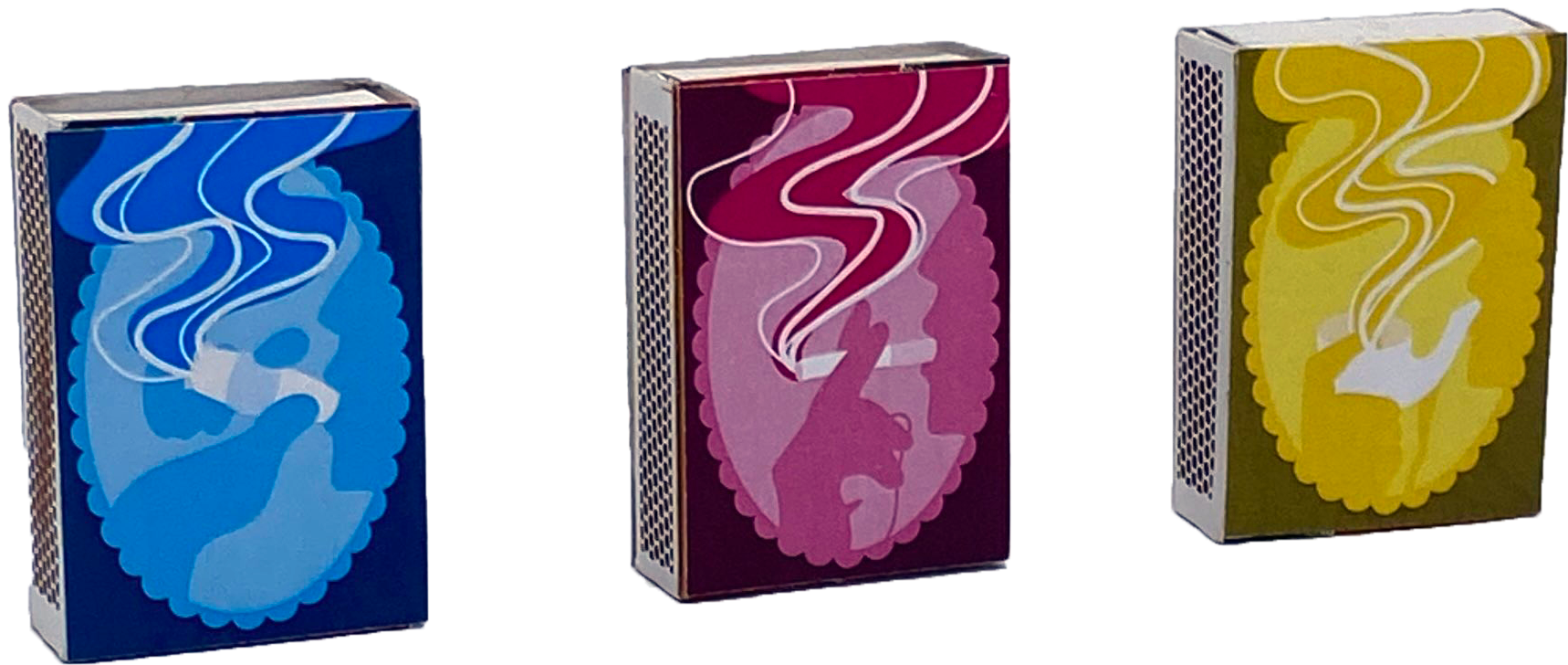
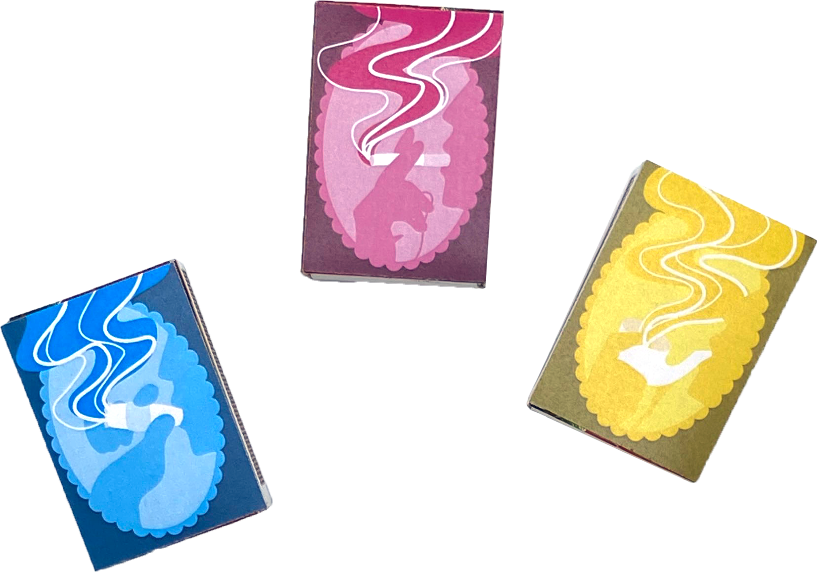
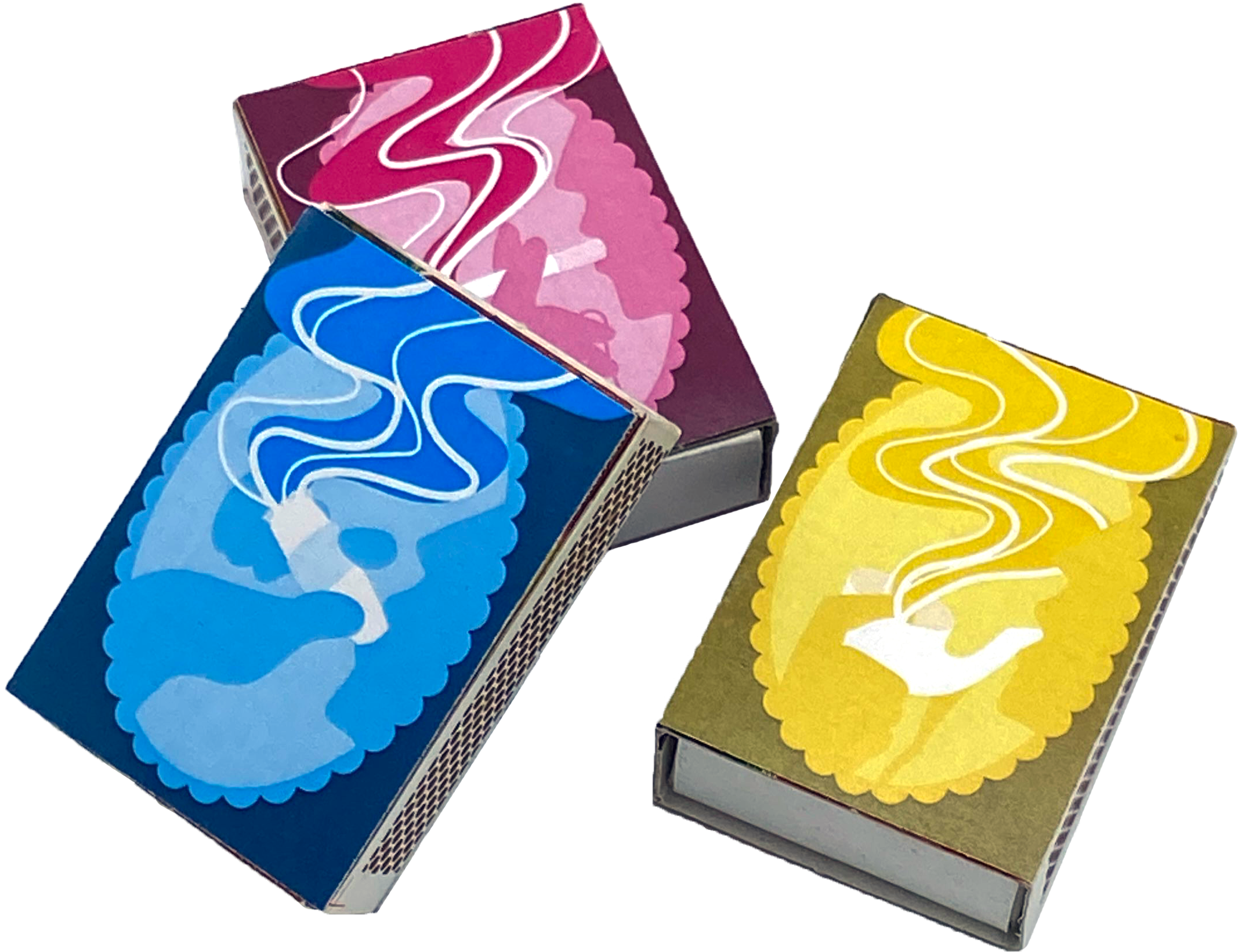
Overview: Modern matchboxes are boring and uninspired, but they used to be decorated with beautiful illustrations and typography. They were meant to be kept as display pieces and often came in sets, all similar but unique on their own.Brief: Using inspiration from old matchbox sets, create a set of three matchbox designs that can stand alone but work together in a series, all having something to do with fire.Solution: In order to put a contemporary twist on an otherwise old-timey concept, bright colors—cyan, magenta, and yellow, as in CMYK—make up profile views of three different types of smokers: cigars, cigarettes, and pipes.

Barrack Report: A Self-Driven Magazine
Overview: Fire Emblem is a popular videogame series by Nintendo and Intelligent Systems, with enough games, merchandise, and community members to span more than just one publication.Brief: Students were given the entirety of one semester to plan a magazine of at least 24 pages, containing 3 featured articles (focusing on illustration, typography, and photography, respectively), 3 departments, a full masthead, a table of contents, and contain at least one sidebar and infographic.Solution: By designing spreads that feature game lore and secrets, artists and groups, and cosplayers and their work, Barrack Report acts as the one-stop shop for Fire Emblem fans that want to keep up with the series and its community.
Monopoly: Olympic Design
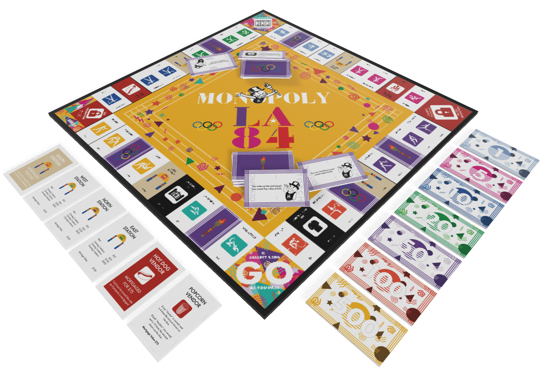
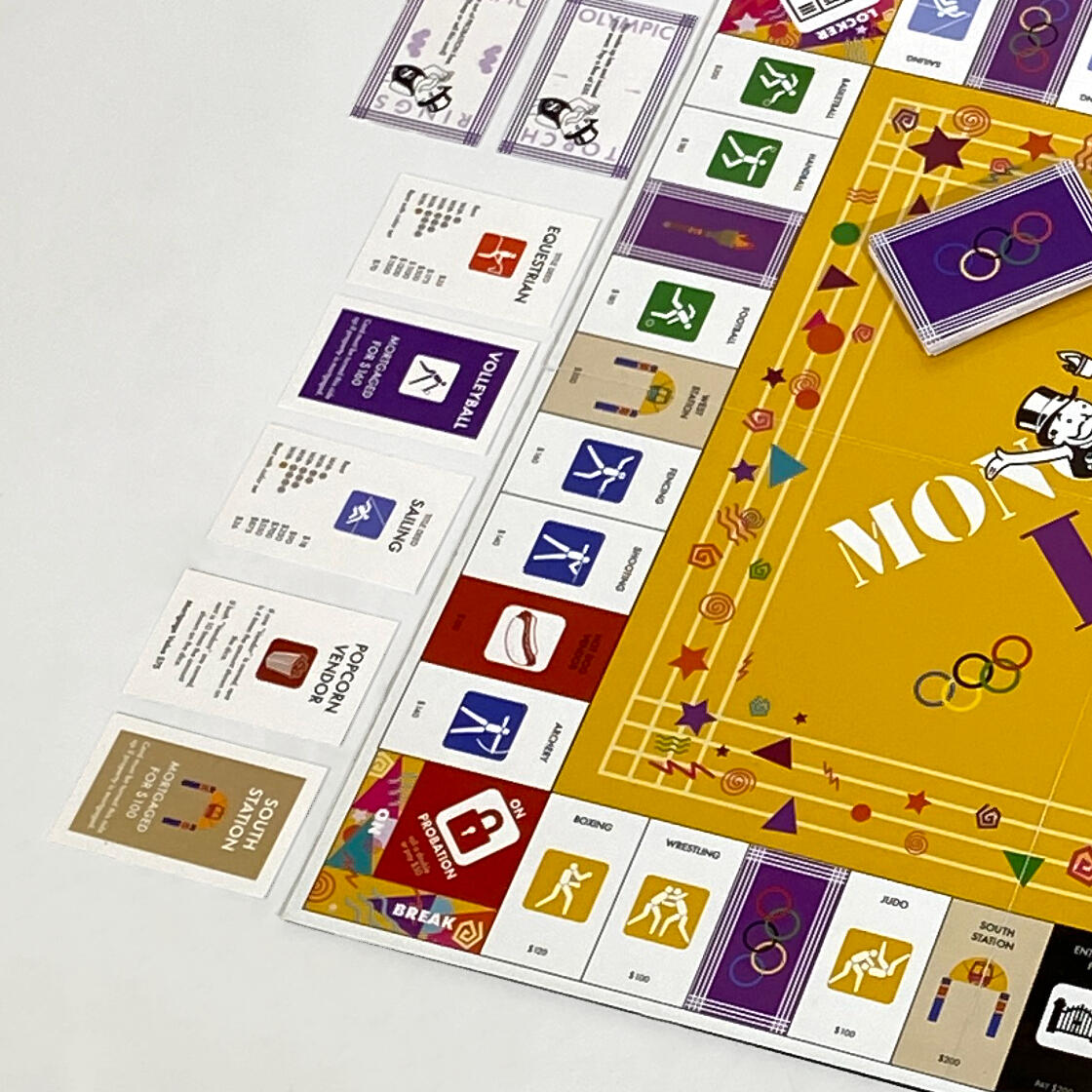
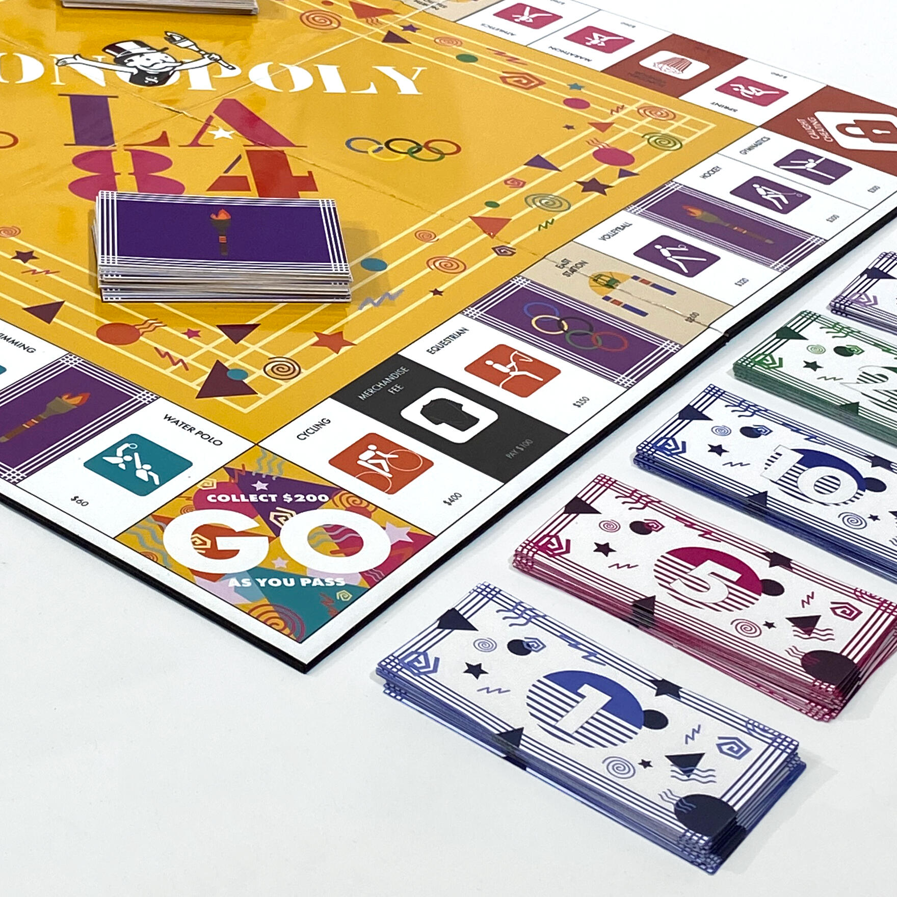
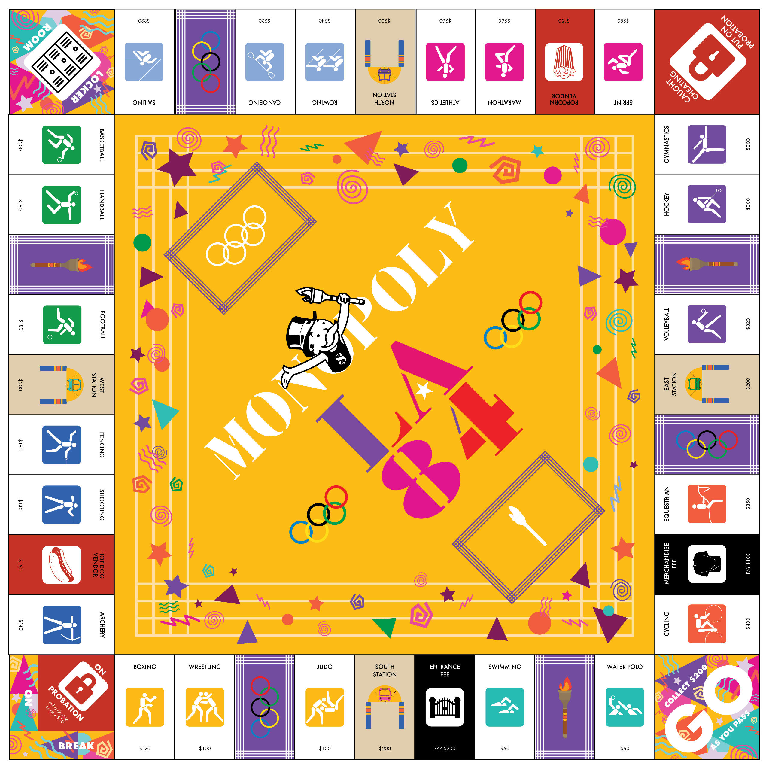
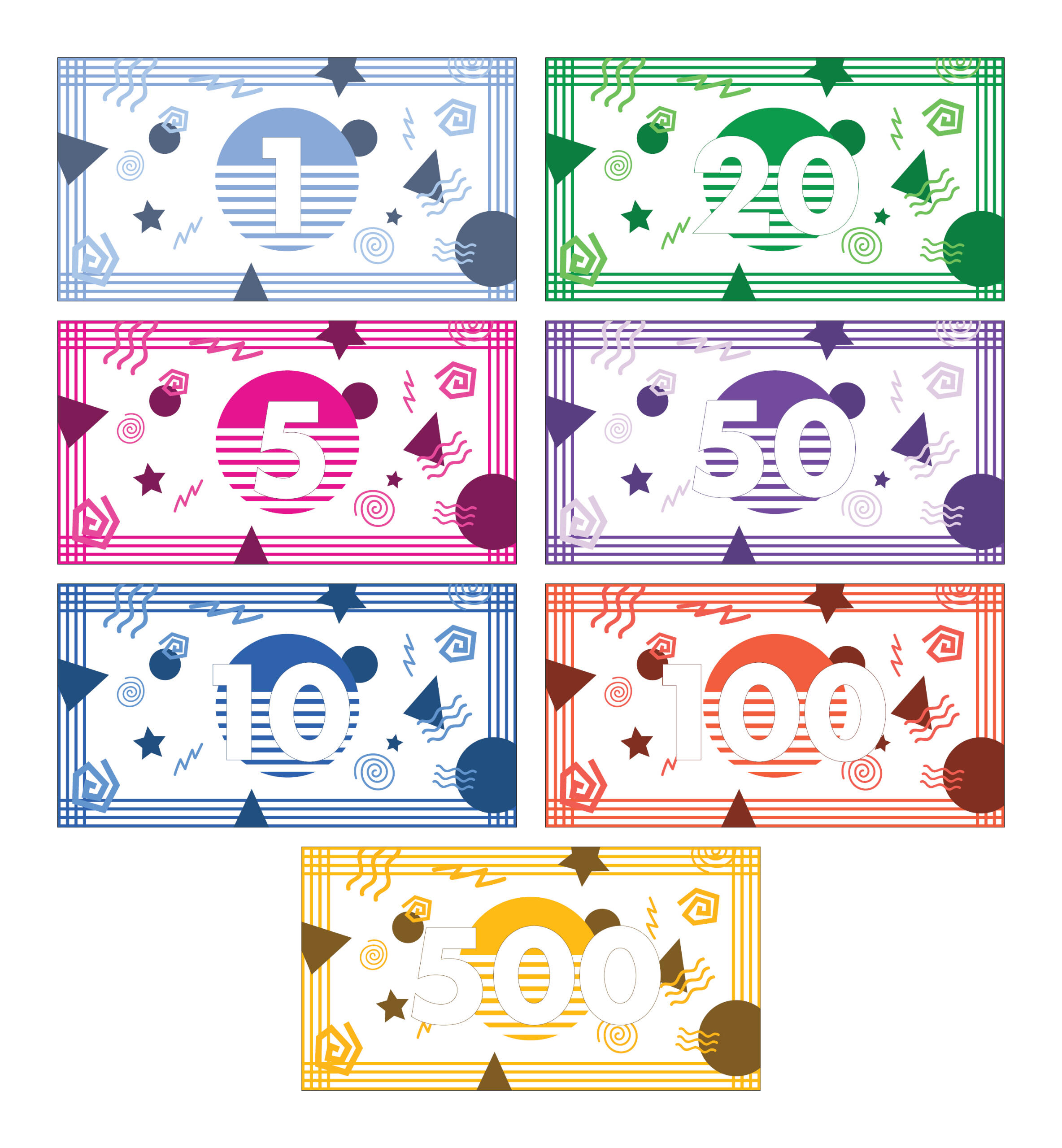
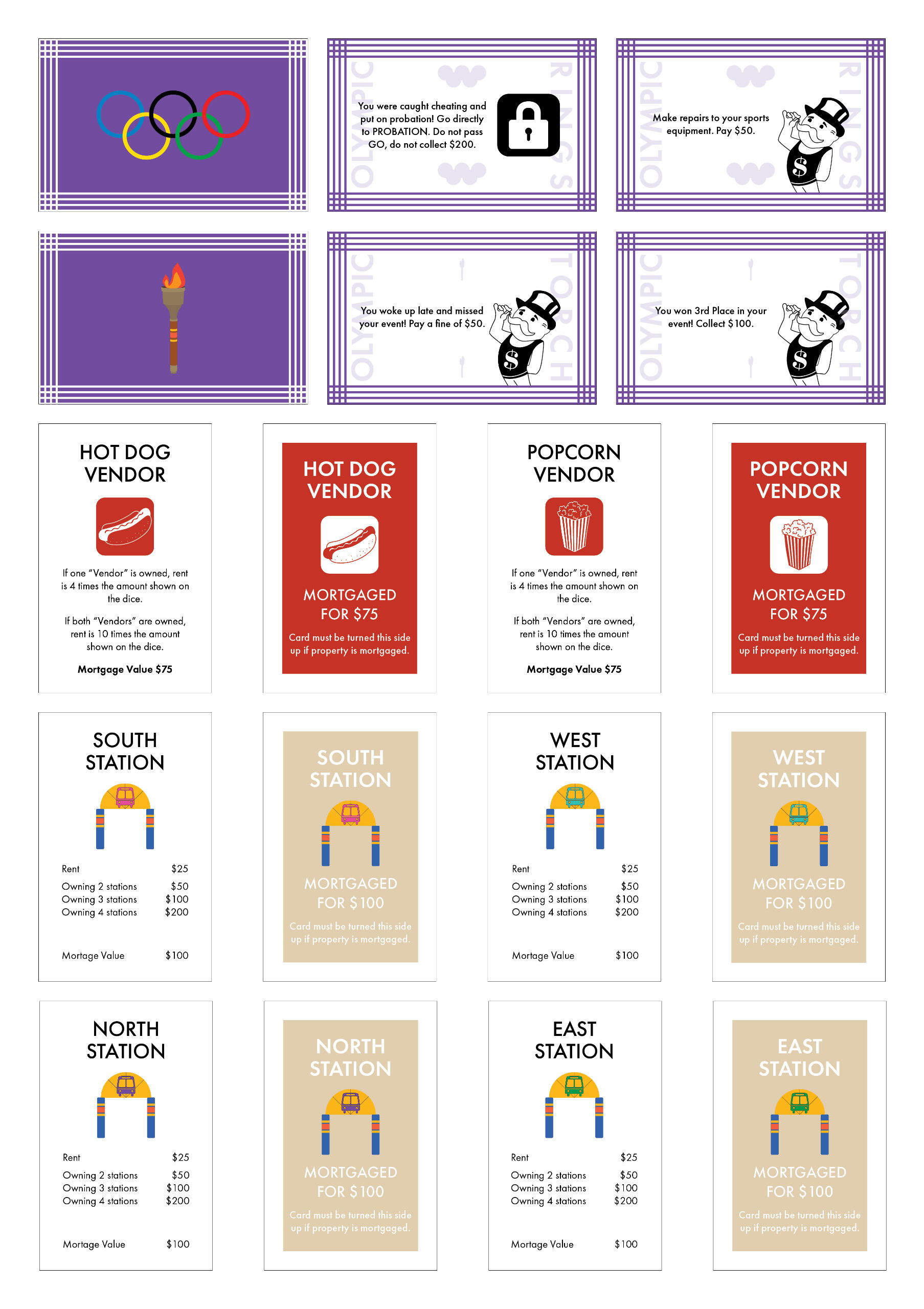
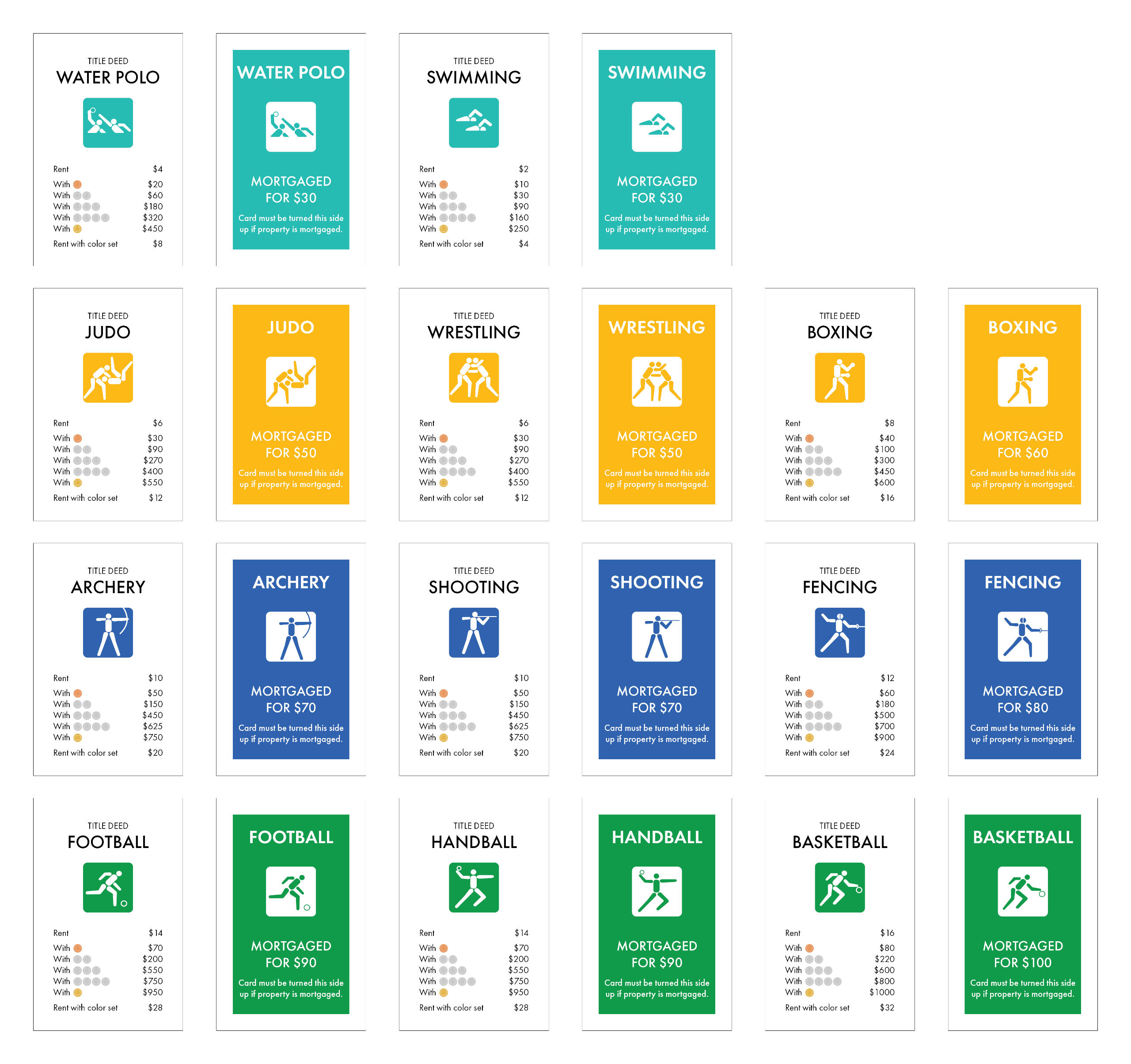
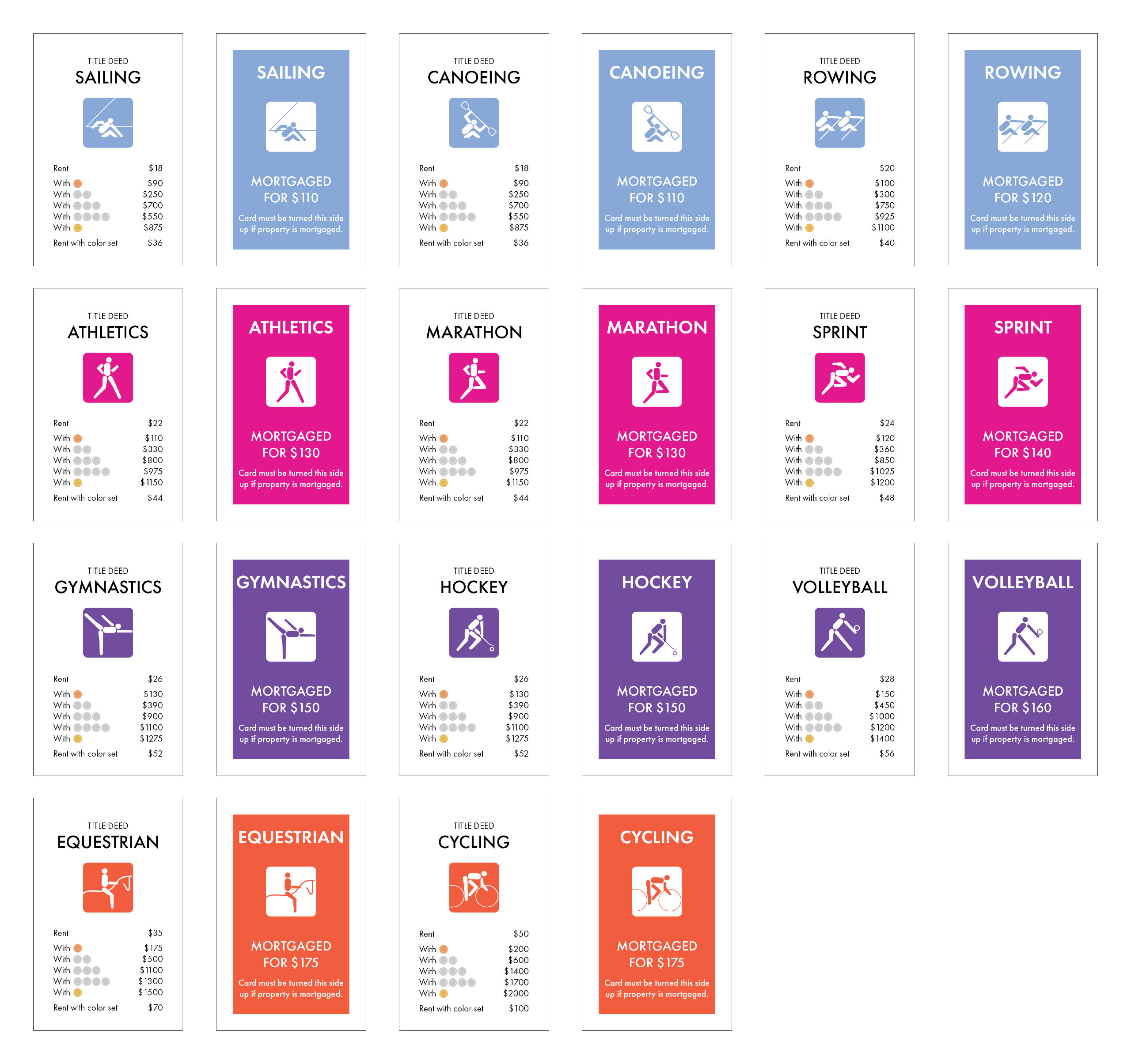
Overview: There are hundreds of themed Monopoly boards in the world. Students were tasked with working with a team to design one such board based on a specific design movement—in this case, Olympic Design.Brief: Alongside two other designers (Thien Pham and Sarah Wert), create a Monopoly board themed around Olympic Design. Fully design the board center, property spaces and cards, corner spaces, chance and community chest spaces and cards, money, and all other game assets together as a team. Delegate responsibilities among one another.Solution: By focusing on the LA '84 Summer Olympics, literal Olympic design was implemented into the gameboard and its pieces. In particular, I was tasked with designing the corner spaces, money, chance and community chest cards, and utility cards. On top of that, I took it upon myself to organize the final board, the final presentation images, and go over each piece created by my group members to ensure every element was consistent.
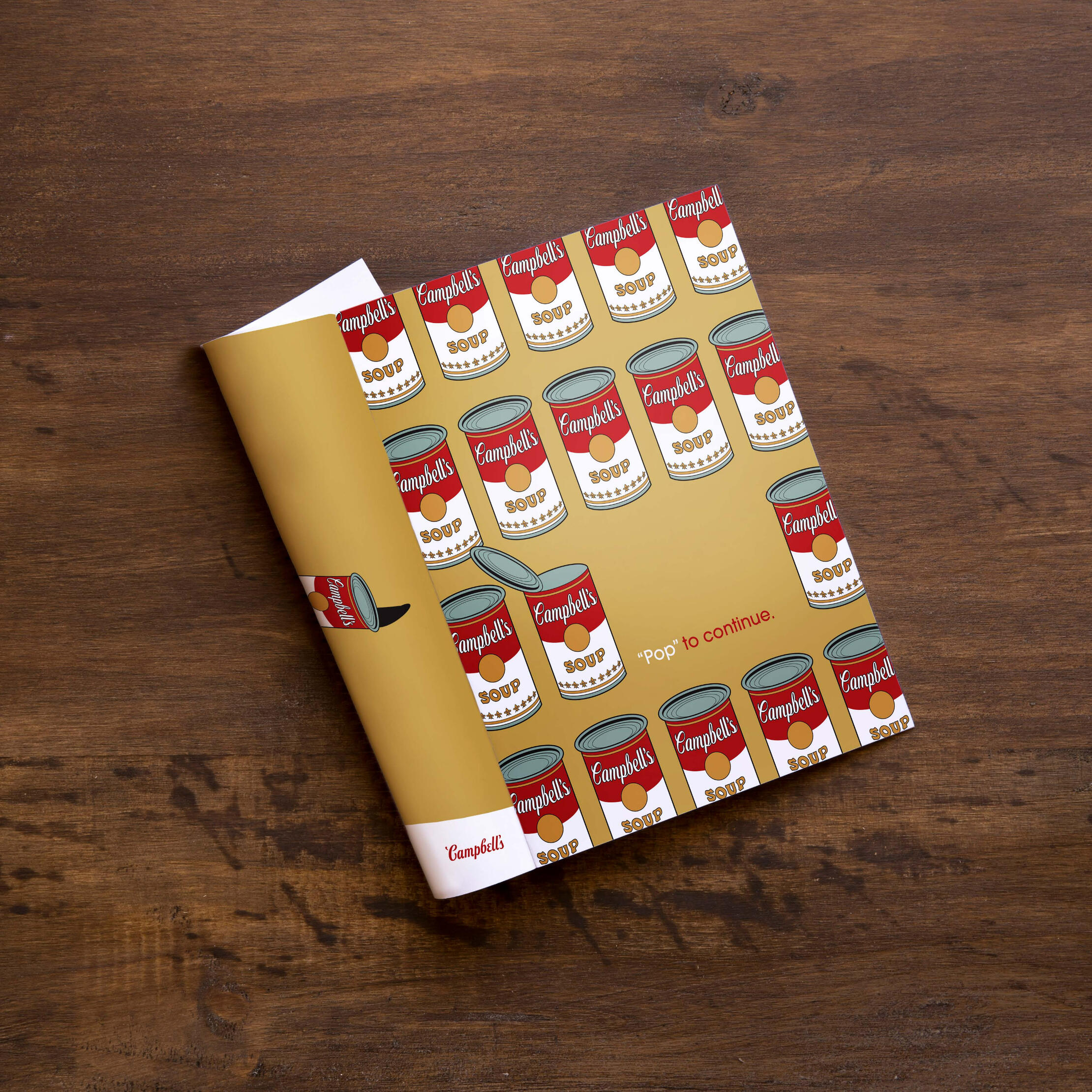
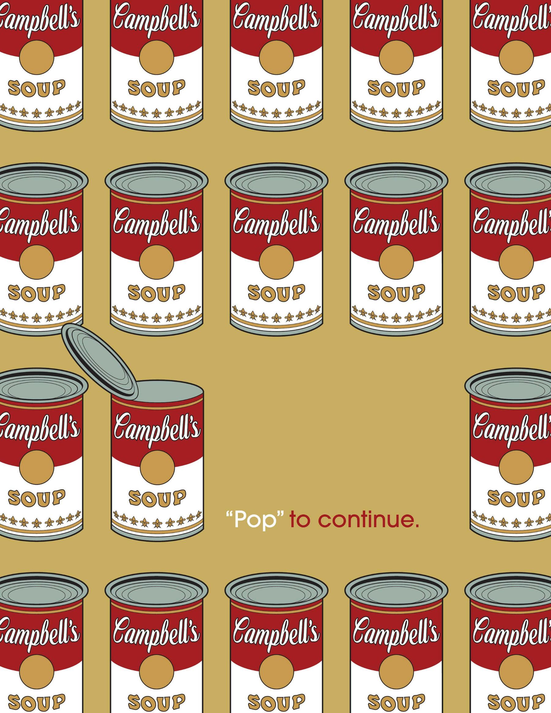
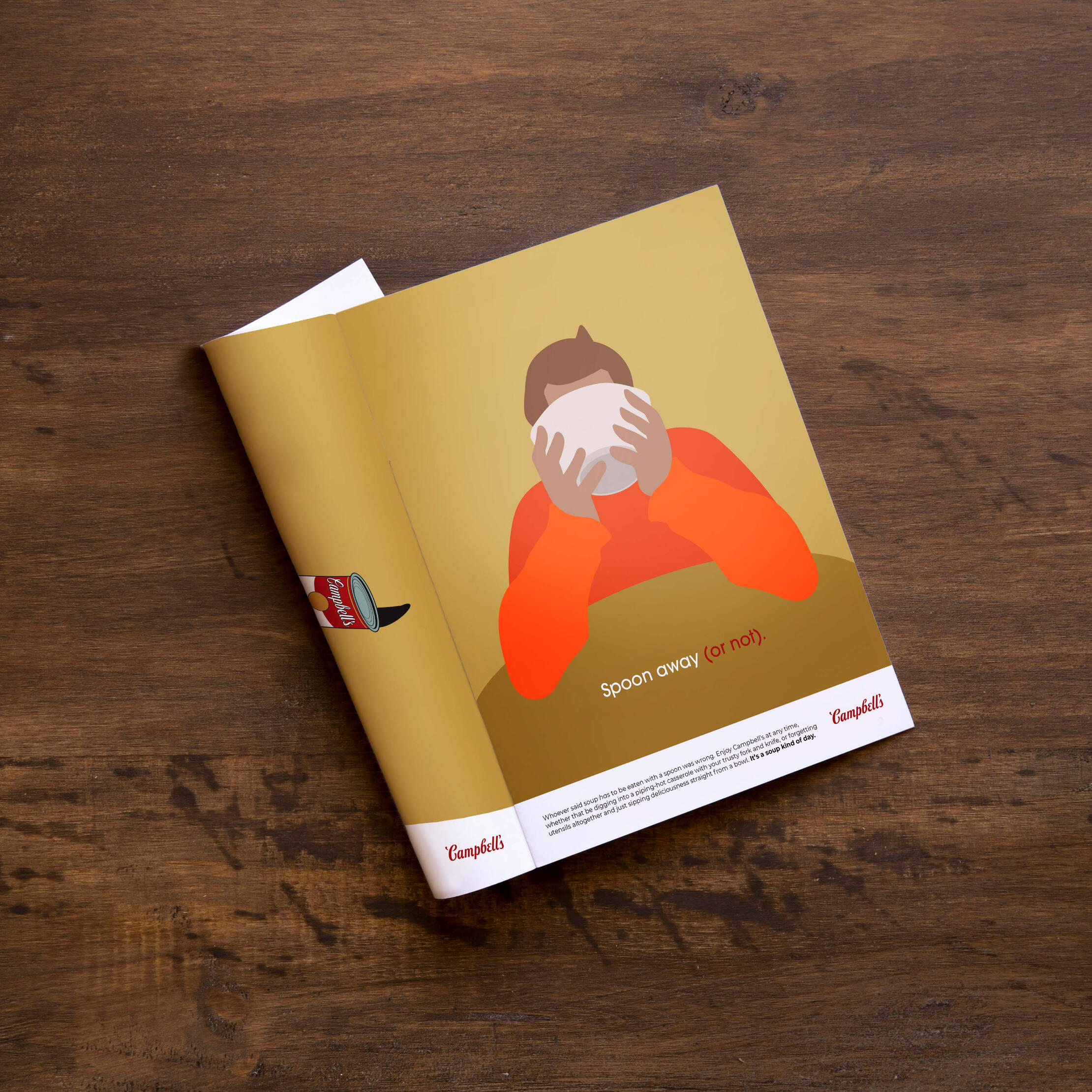
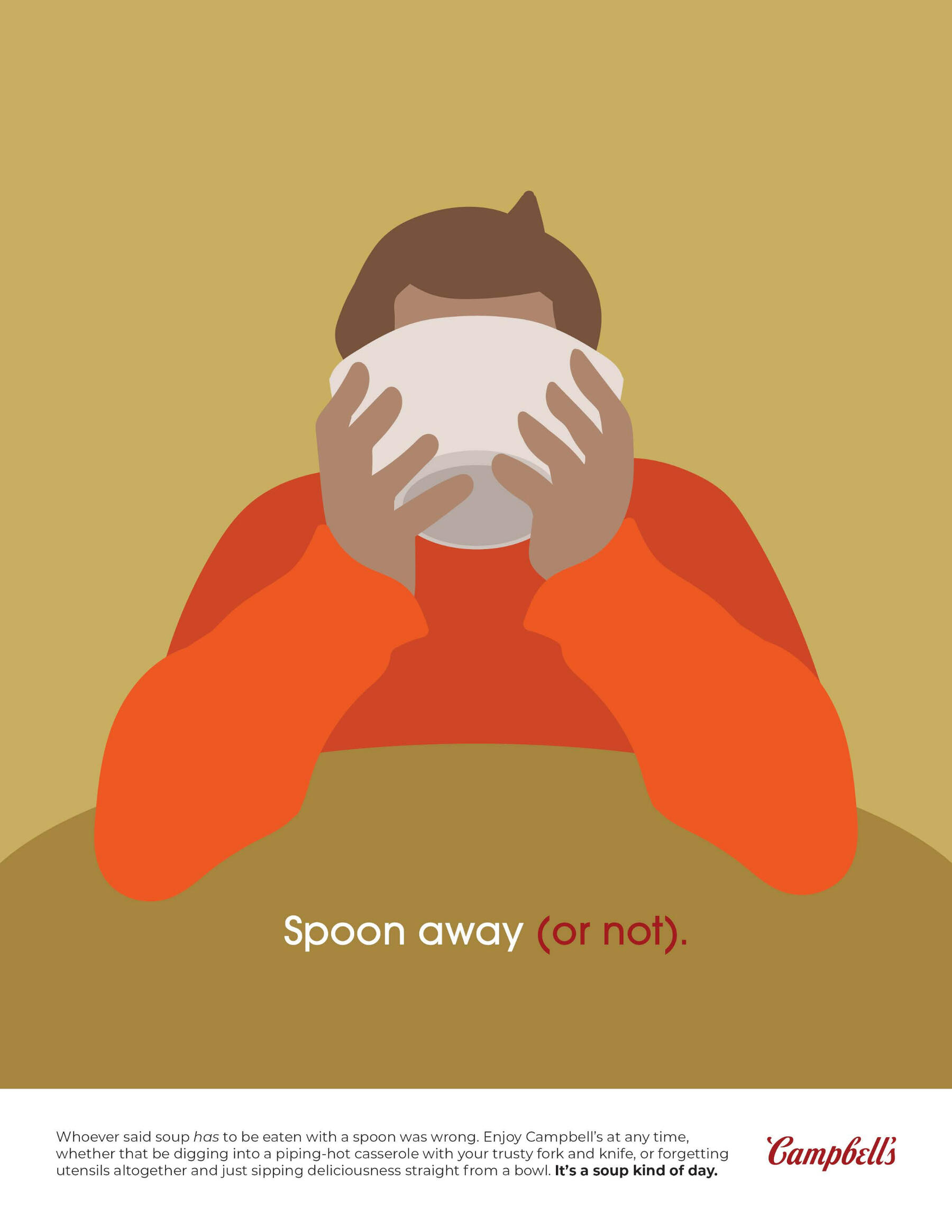
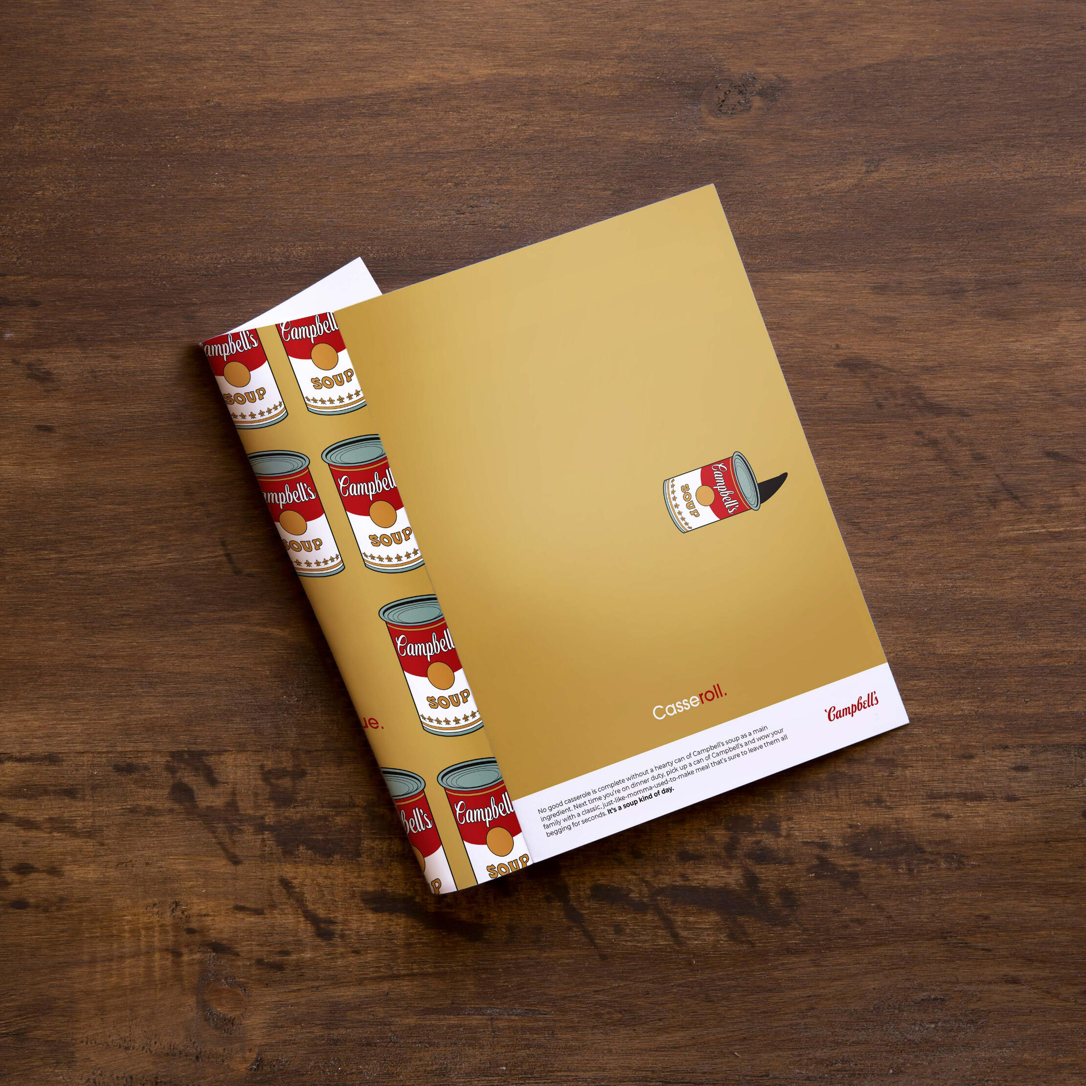
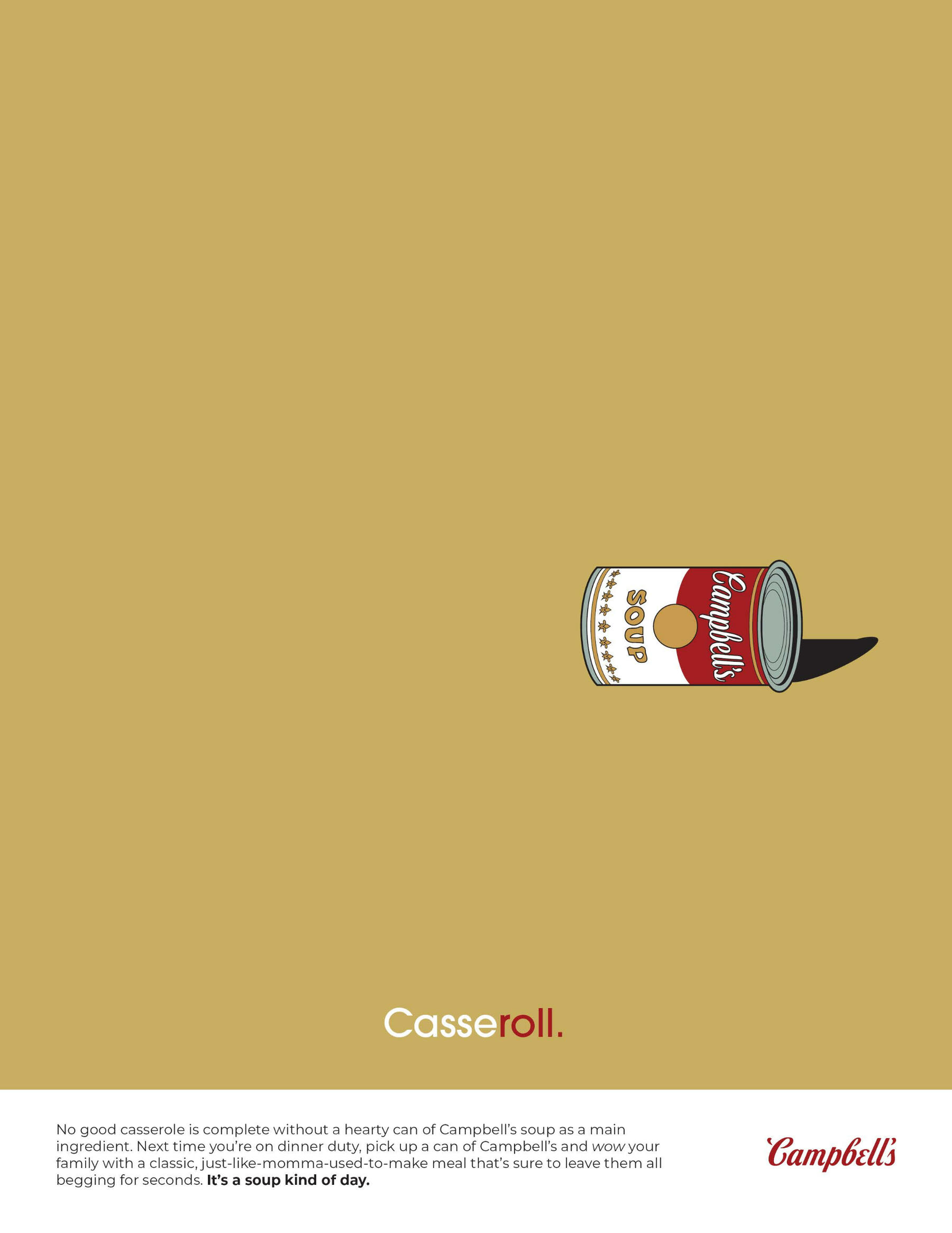
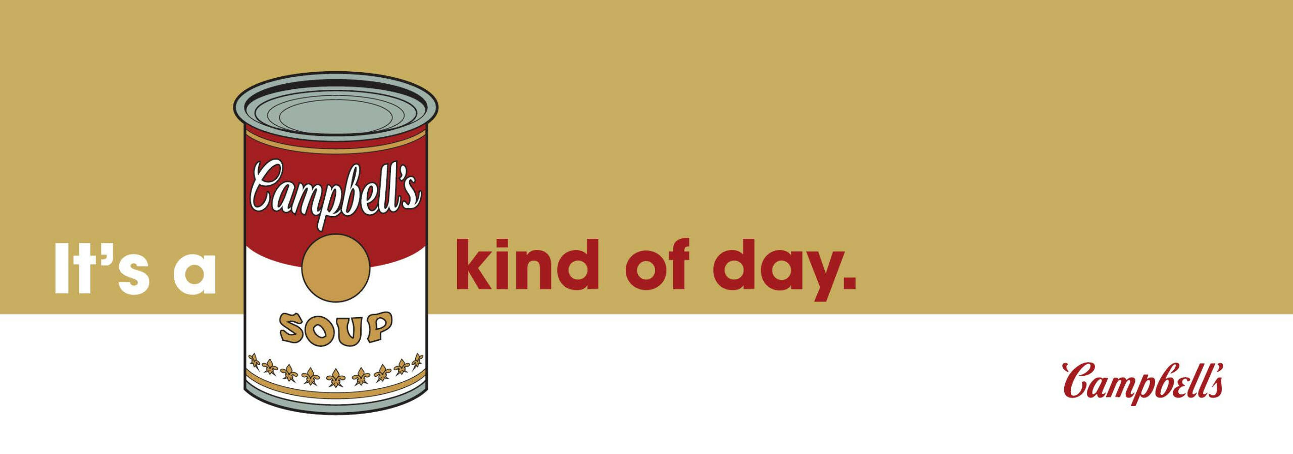
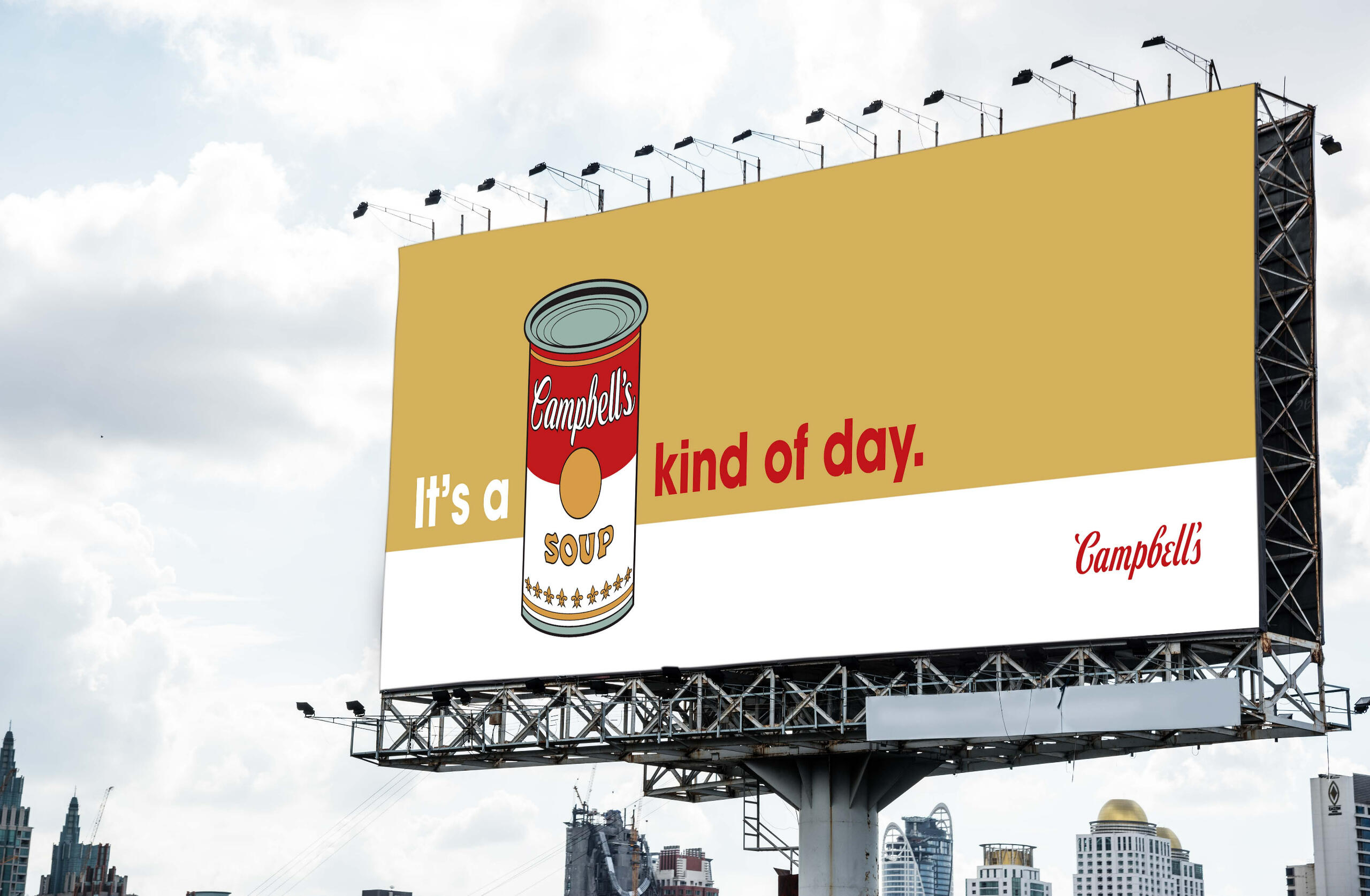
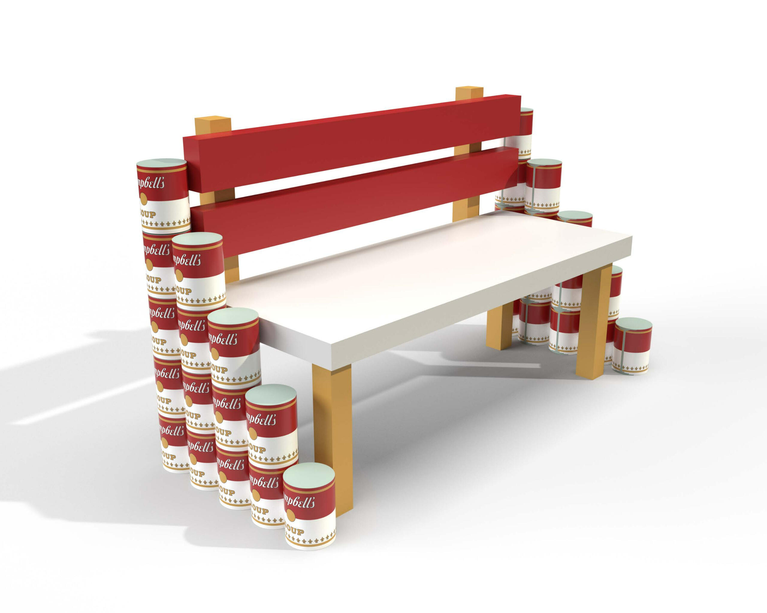
Campbell's Soup: "It's a Soup Kind of Day" Campaign
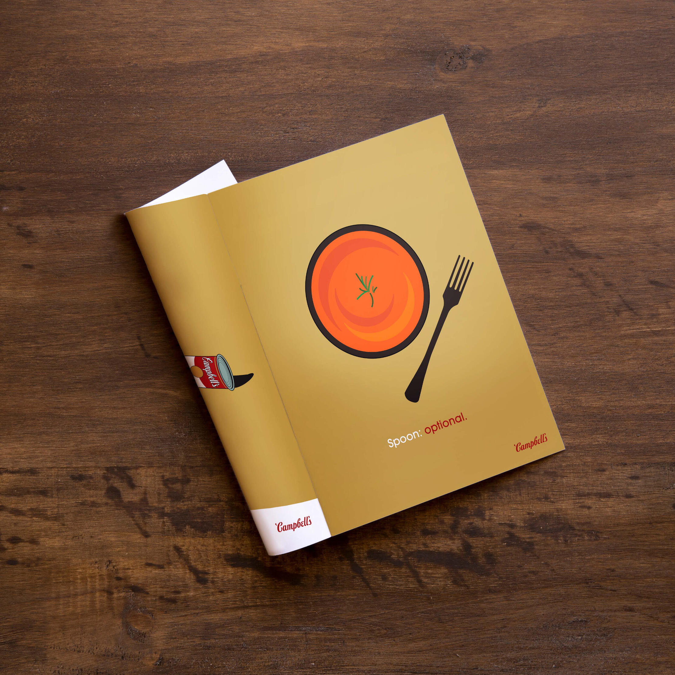
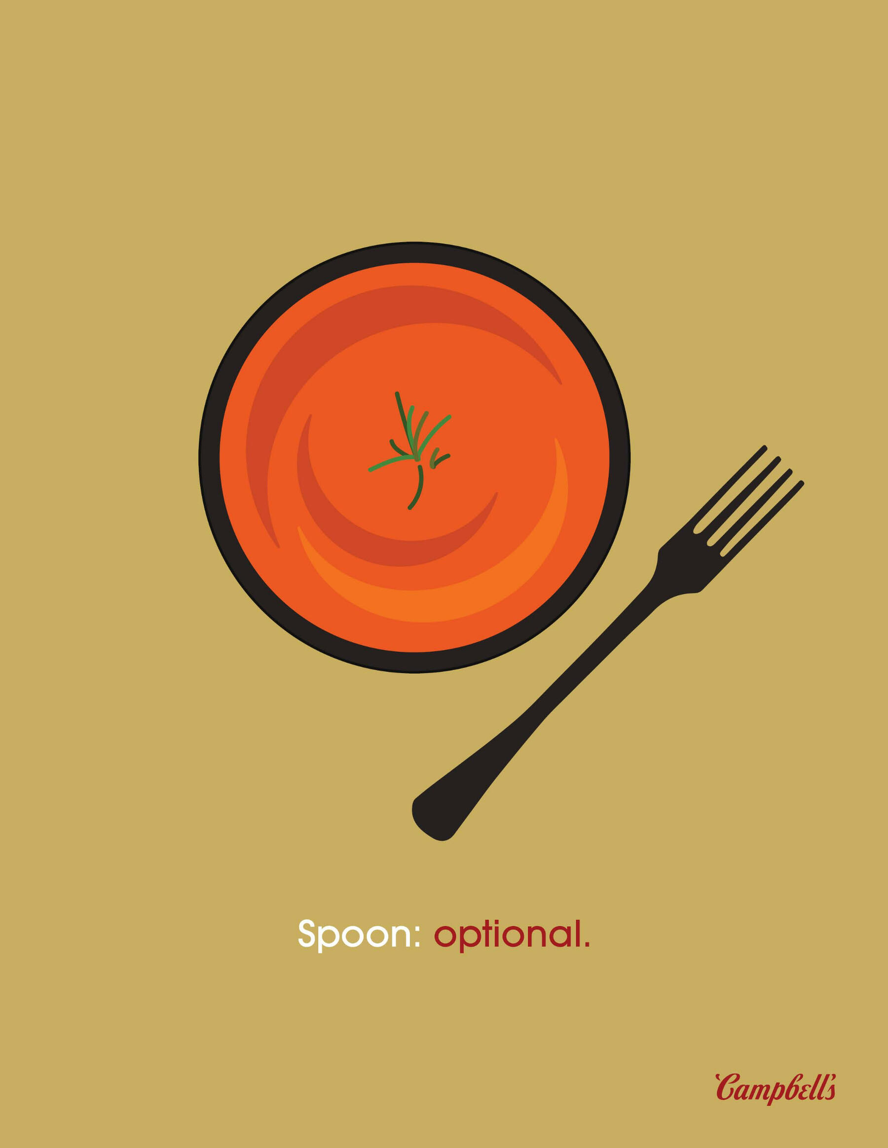
Overview: Campbell's is the king of the soup section in any grocery store, but hasn't had a truly remarkable campaign in quite some time.Brief: Write a creative brief and design a campaign with a unique slogan that includes a variety of print ads, out-of-home advertising, radio and television commercials, and social media campaigns.Solution: Aiming for a target audience of college-aged individuals who only think of soup as a side dish instead of a whole meal, the slogan "It's a Soup Kind of Day" reminds viewers that they can enjoy soup at any time, anywhere, for any reason.
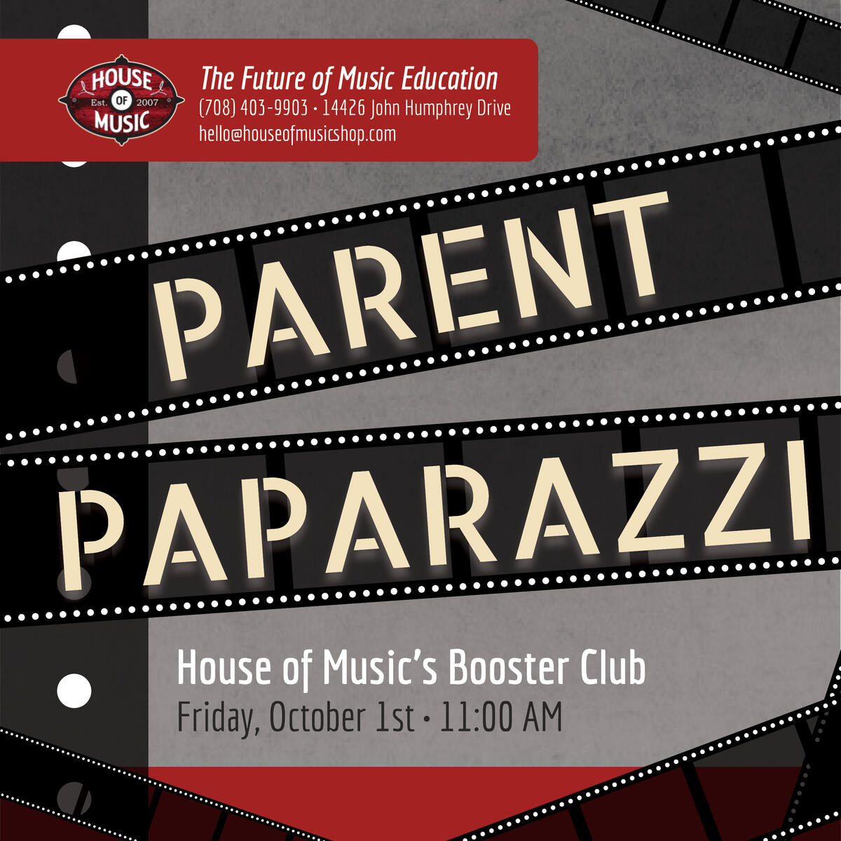
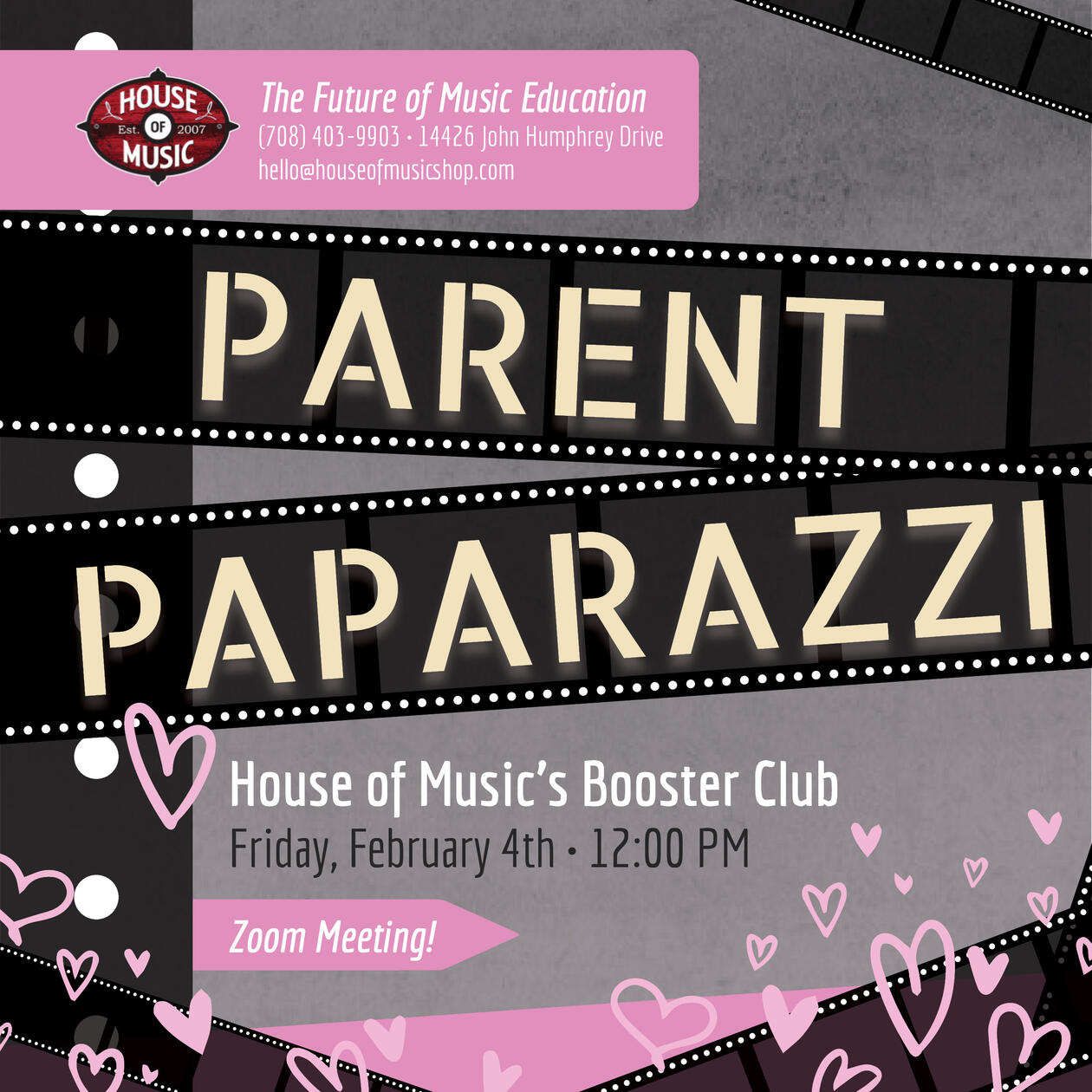
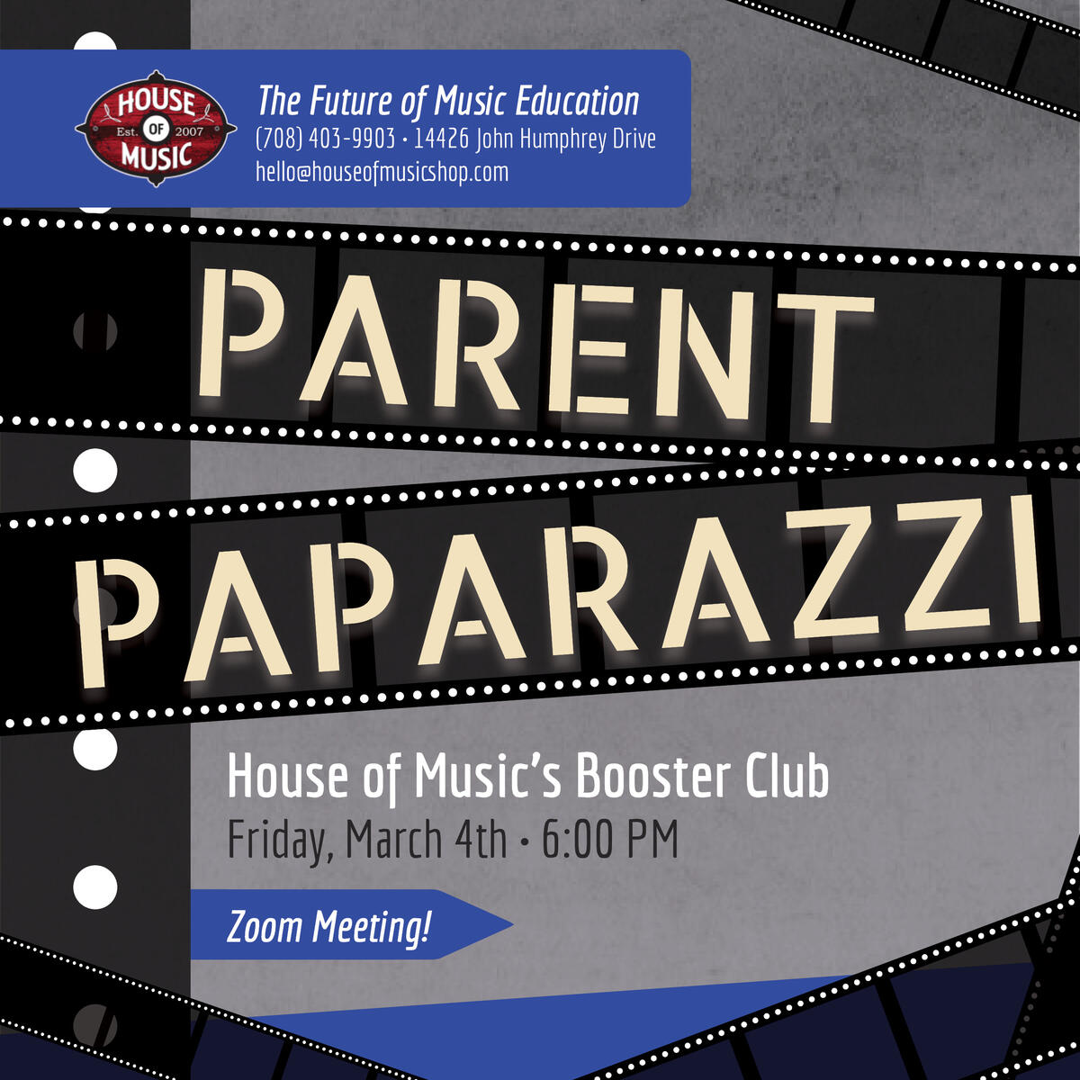
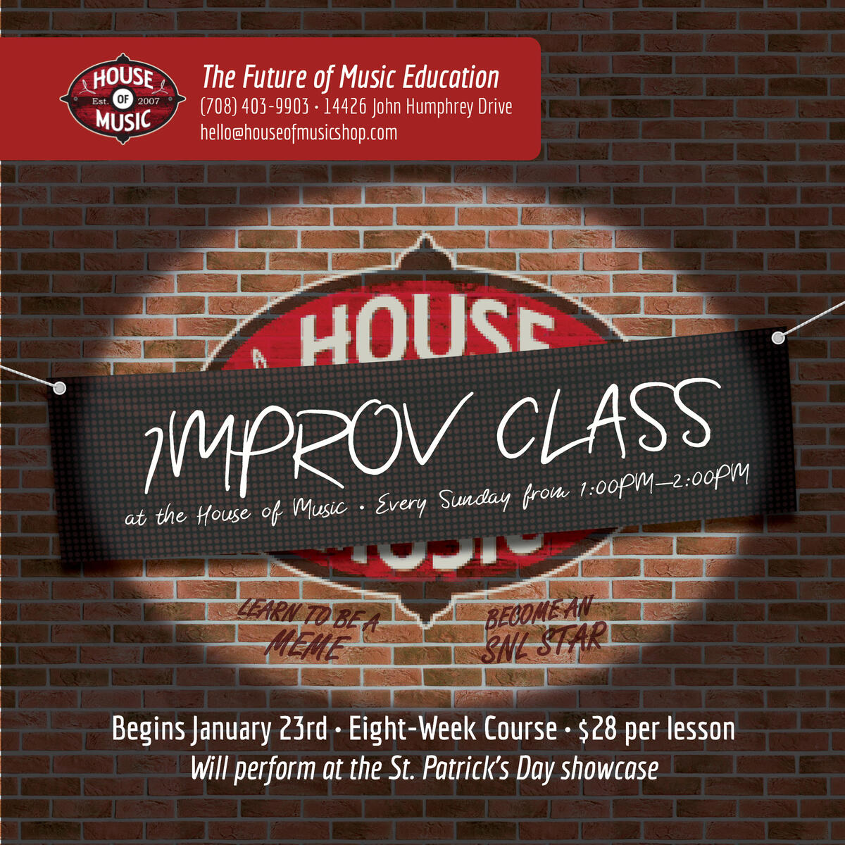
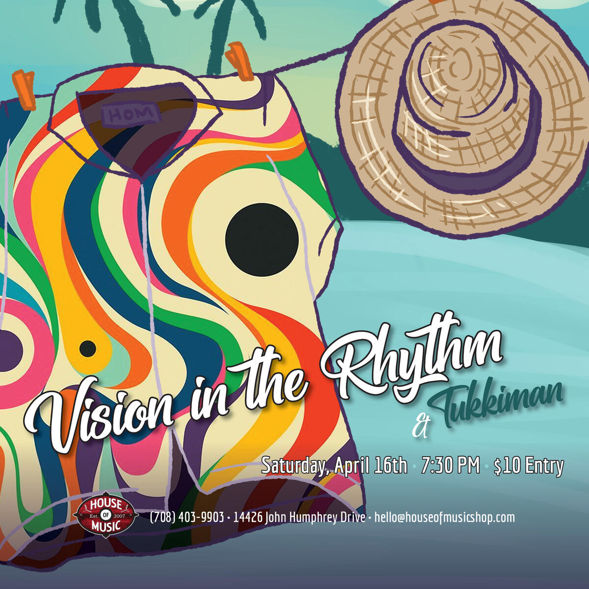
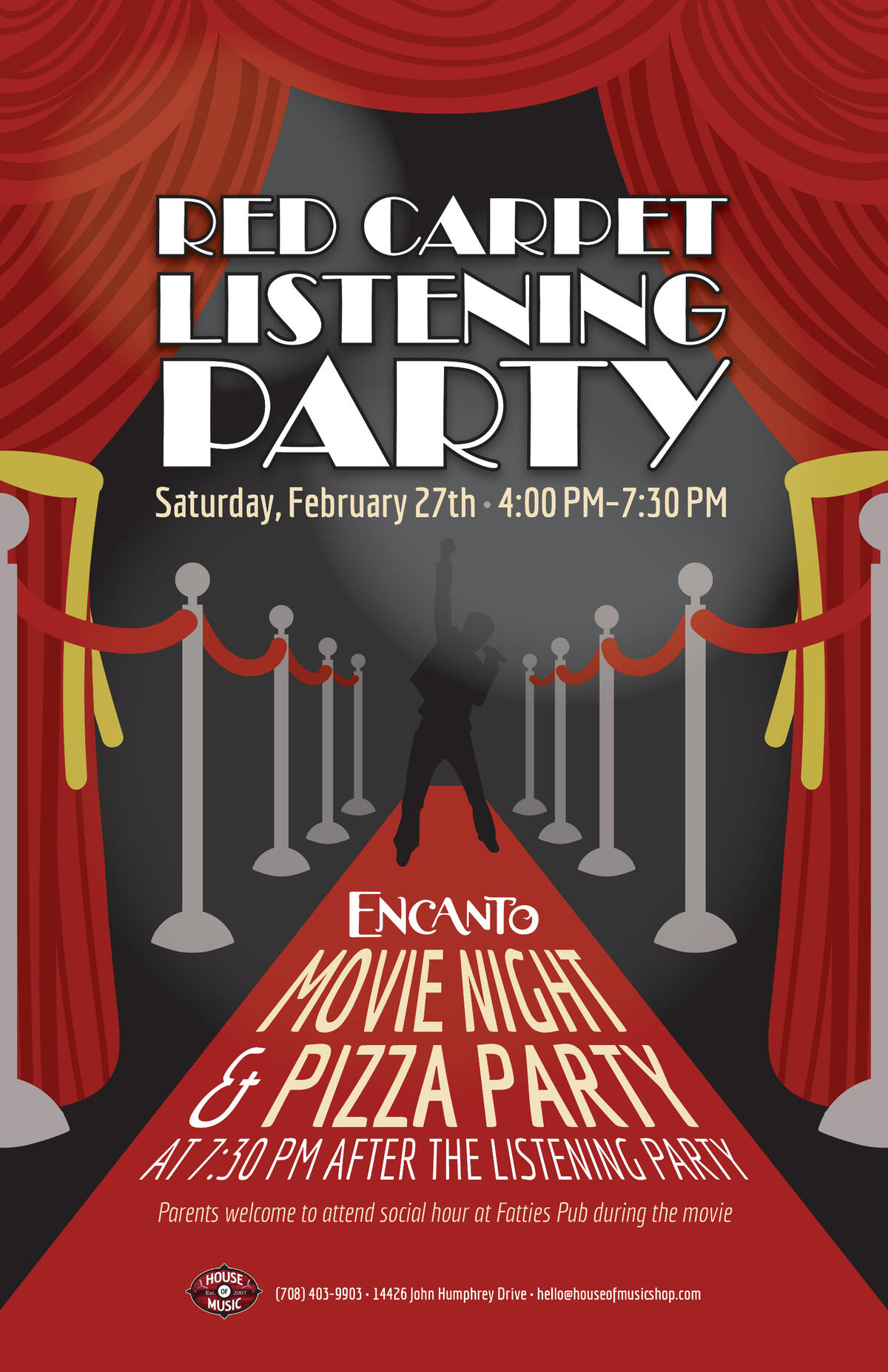
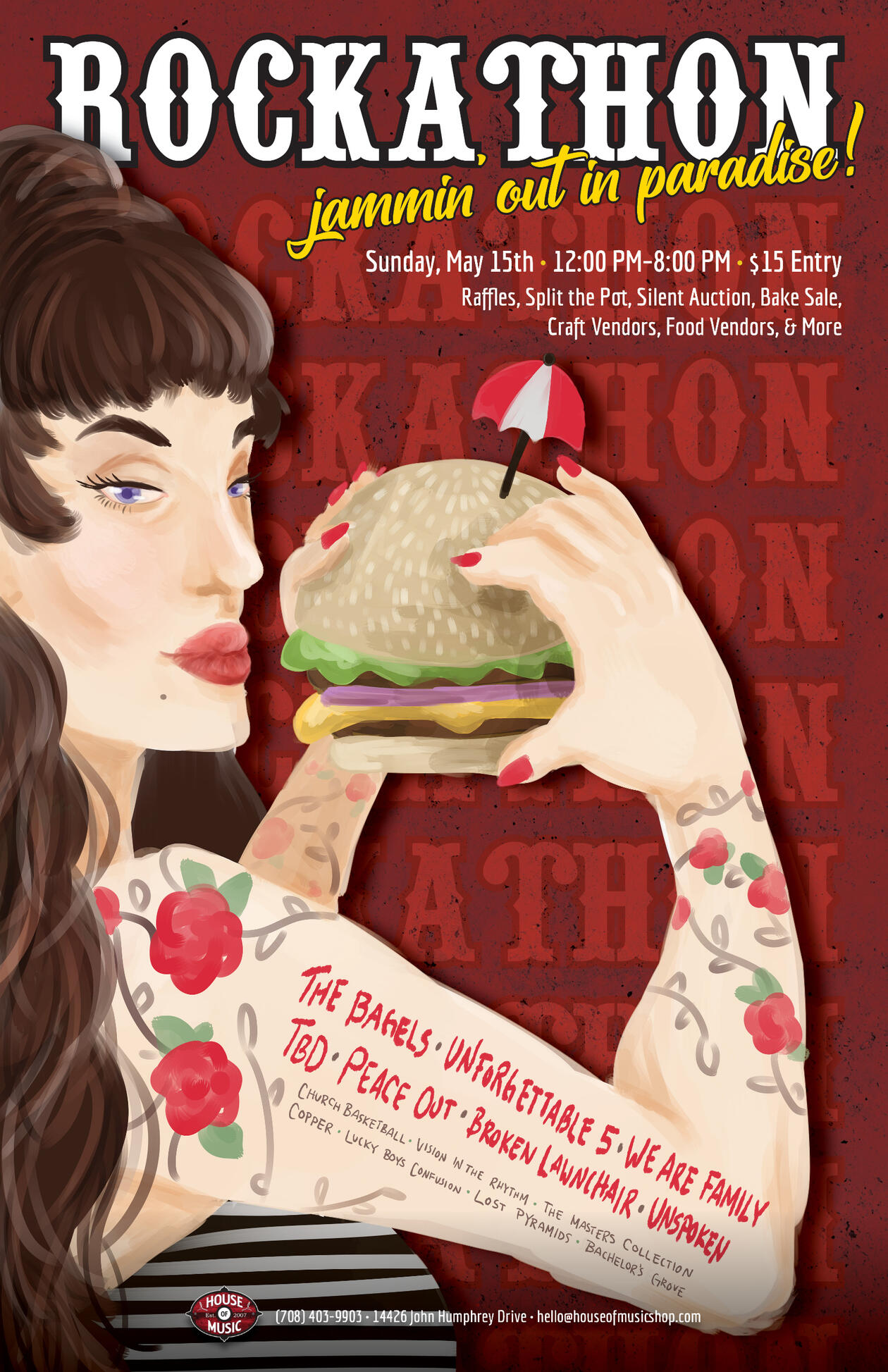
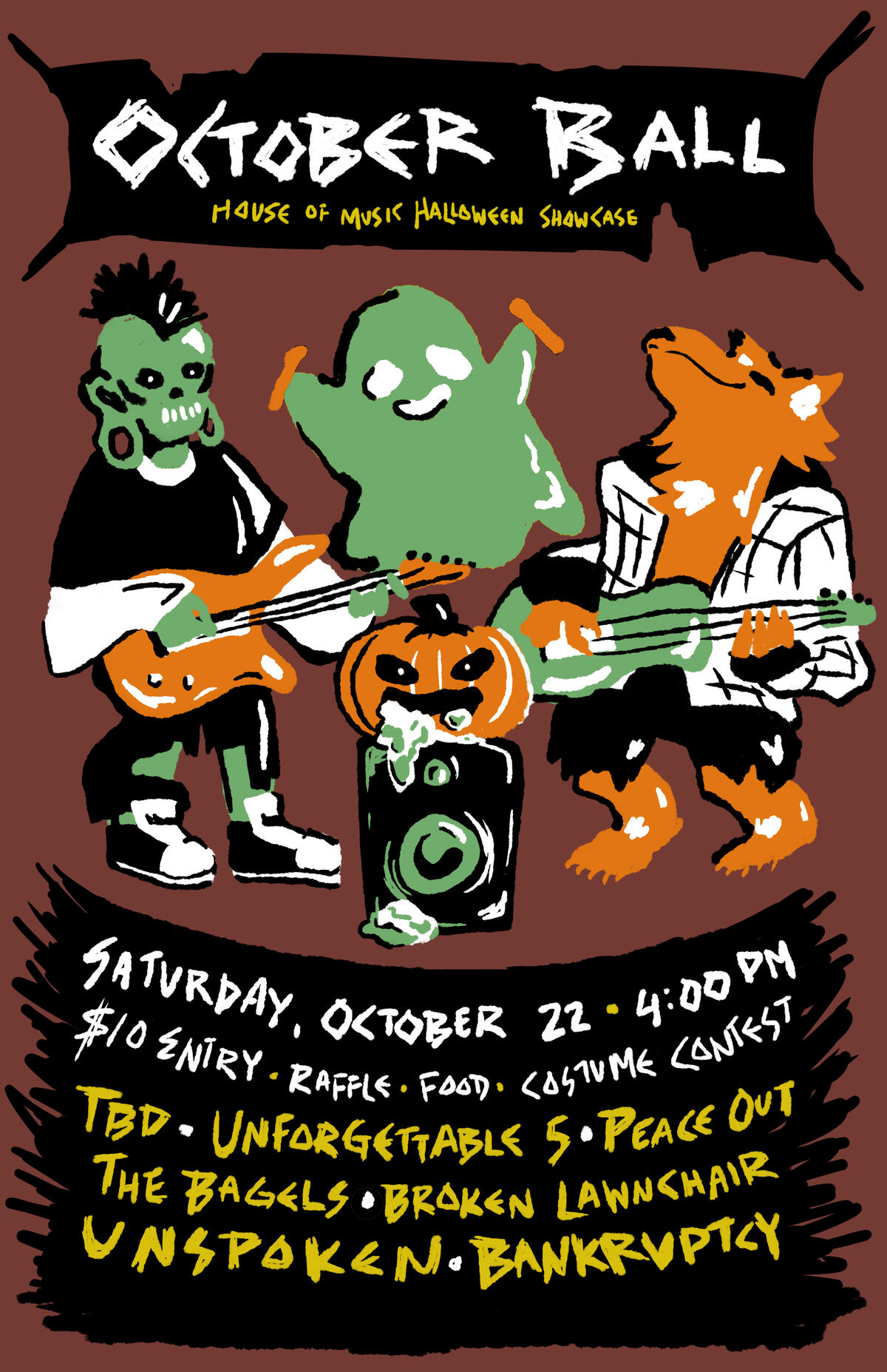
The House of Music
The House of Music is a family-owned music store in Orland Park, Illinois, that offers music lessons, recording studio access and rehearsal space, new and used instrument sales, qualified instrument repair, music and instrument accessories, and organizes "Rock Bands" with its students to allow them to perform live on stage every few months after rigorous rehearsal and instruction. Visit their website to learn more.

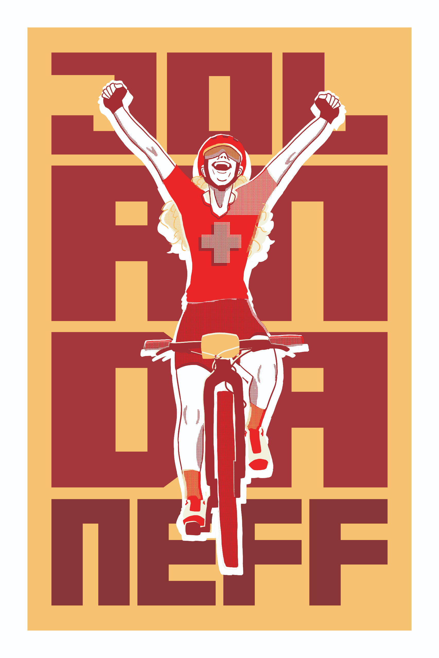
Trek Bikes
Overview: Trek Bikes has celebrated athletes since 1976. In 2021, they aimed to celebrate female Olympic athletes and all of their accomplishments.Brief: Create a poster inspired by the Olympic biker Jolanda Neff.Solution: By utilizing a type-based, screen print-inspired design, this poster celebrates the accomplishments of Neff at her most incredible victories and shows pride for her country, Sweden.
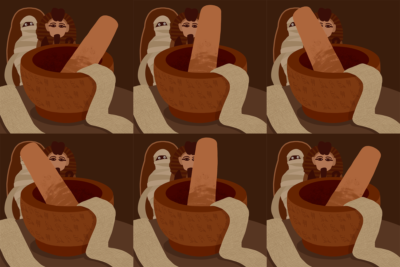
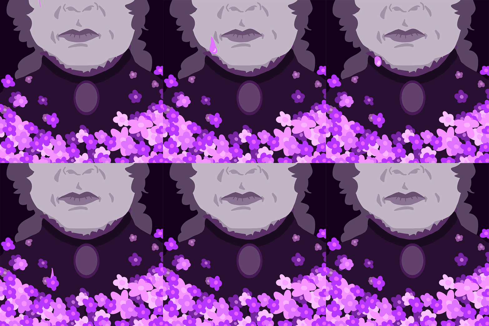
The Secret Lives of Color
Overview: Every color has a unique history and meaning. Mummy brown comes from the pigment made by crushing mummified remains; heliotrope is the color made from the titular flower, as well as a color of mourning in the Victoria era; and isabelline is the color that Queen Isabella of Spain's shift turned after she vowed to not remove it until her husband returned from war (a long three years later).Brief: Create an animated spot illustration for each assigned color that describes its history at a glance.Solution: Simple animations in various tones of the assigned colors are designed as easy-to-load files so that readers may easily view the animations alongside an accompanying article. Each animation only has a small moving aspect, making it easy to take in the animation as a whole instead of needing to watch closely and for a long time to understand what is happening within the gif.
Doodle for Google
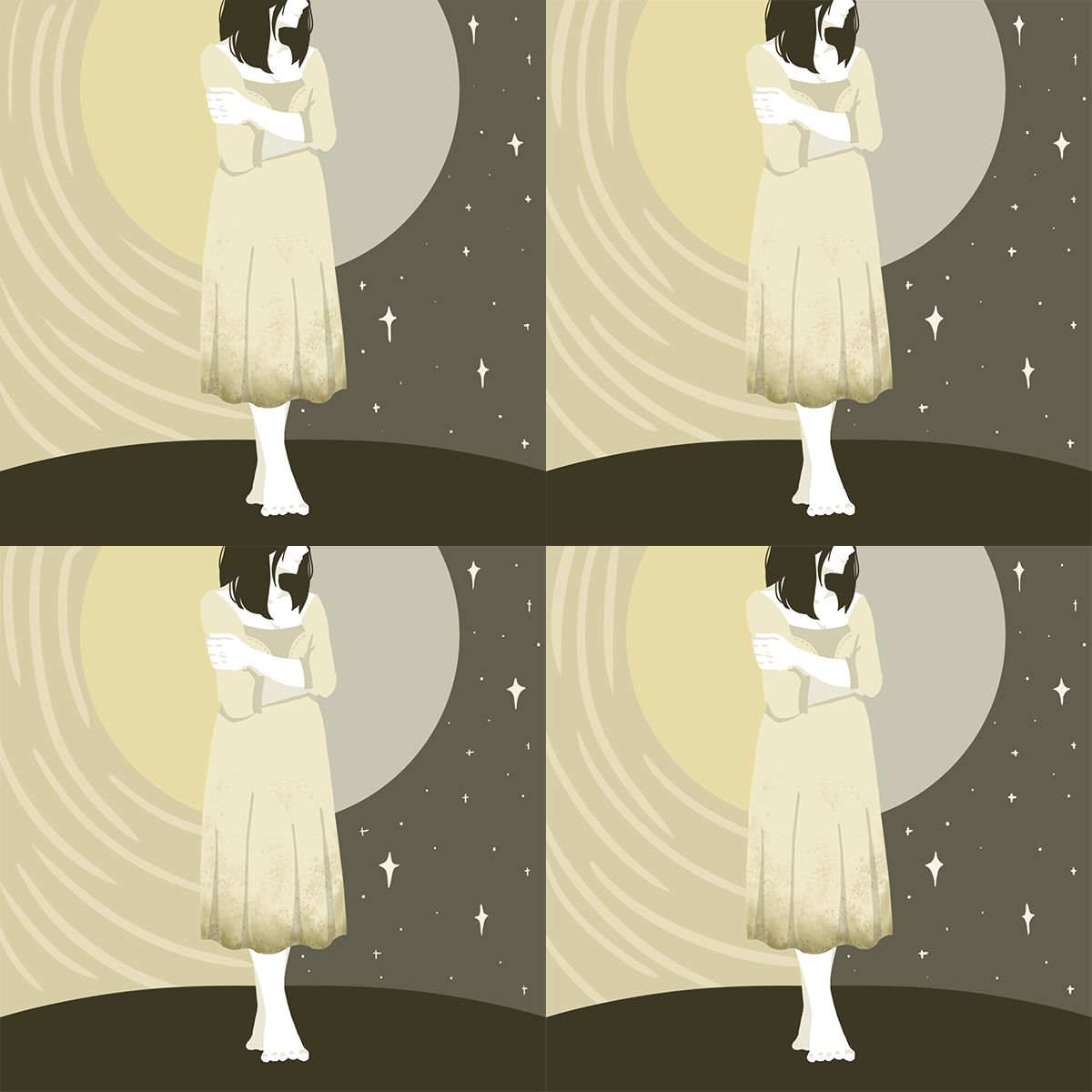
Overview: Google is known for the various artwork displayed on its homepage, which celebrates different holidays, famous people in history, and more. They also host "Doodle for Google," a contest where young artists submit doodles to be displayed on Google's homepage.Brief: Students were tasked with creating a Doodle for Google under the theme of a holiday that falls on their birthday (in this case, February 6th: International Maple Syrup Day).Solution: As students were only given two and a half hours to complete this assignment, the use of vector shapes created the cleanest shapes to match this piece. To ensure that the illustration still reads as "Google," only two letters were changed, while the rest are changed to a "Canadian red" to allude to maple syrup.

Colectivo Cups
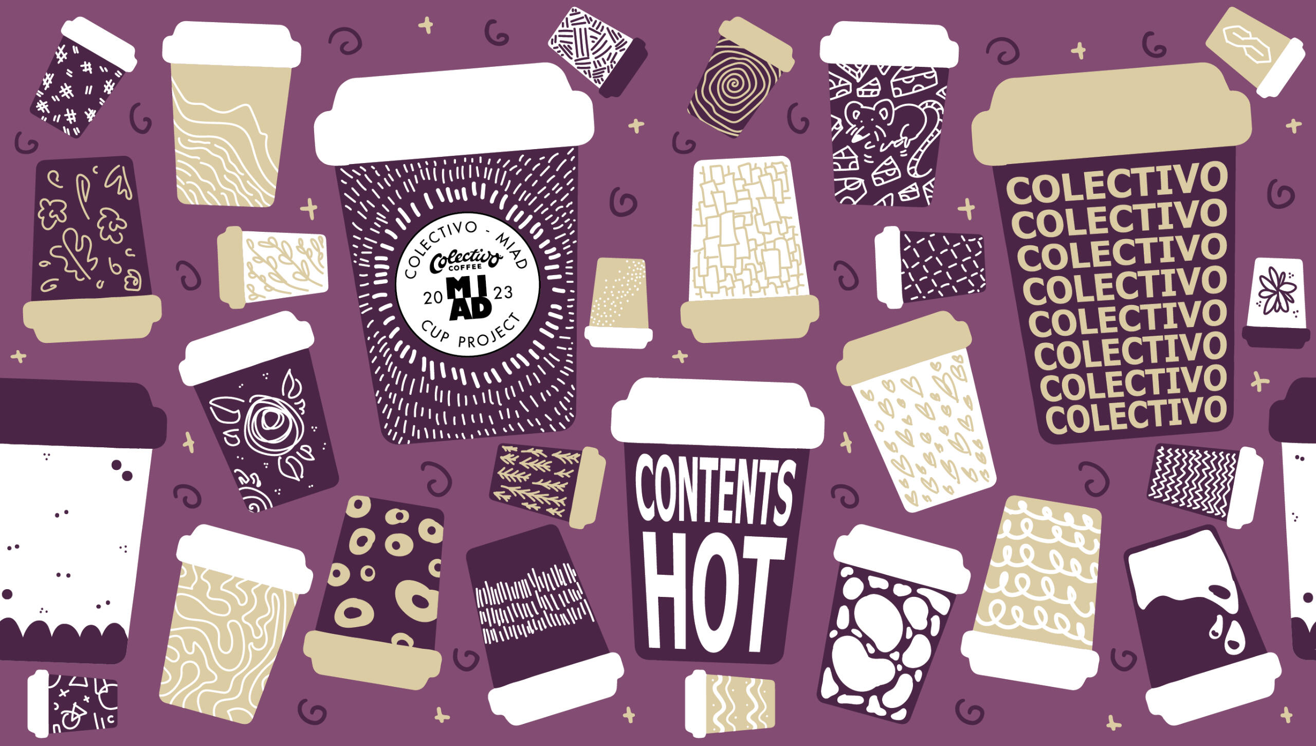
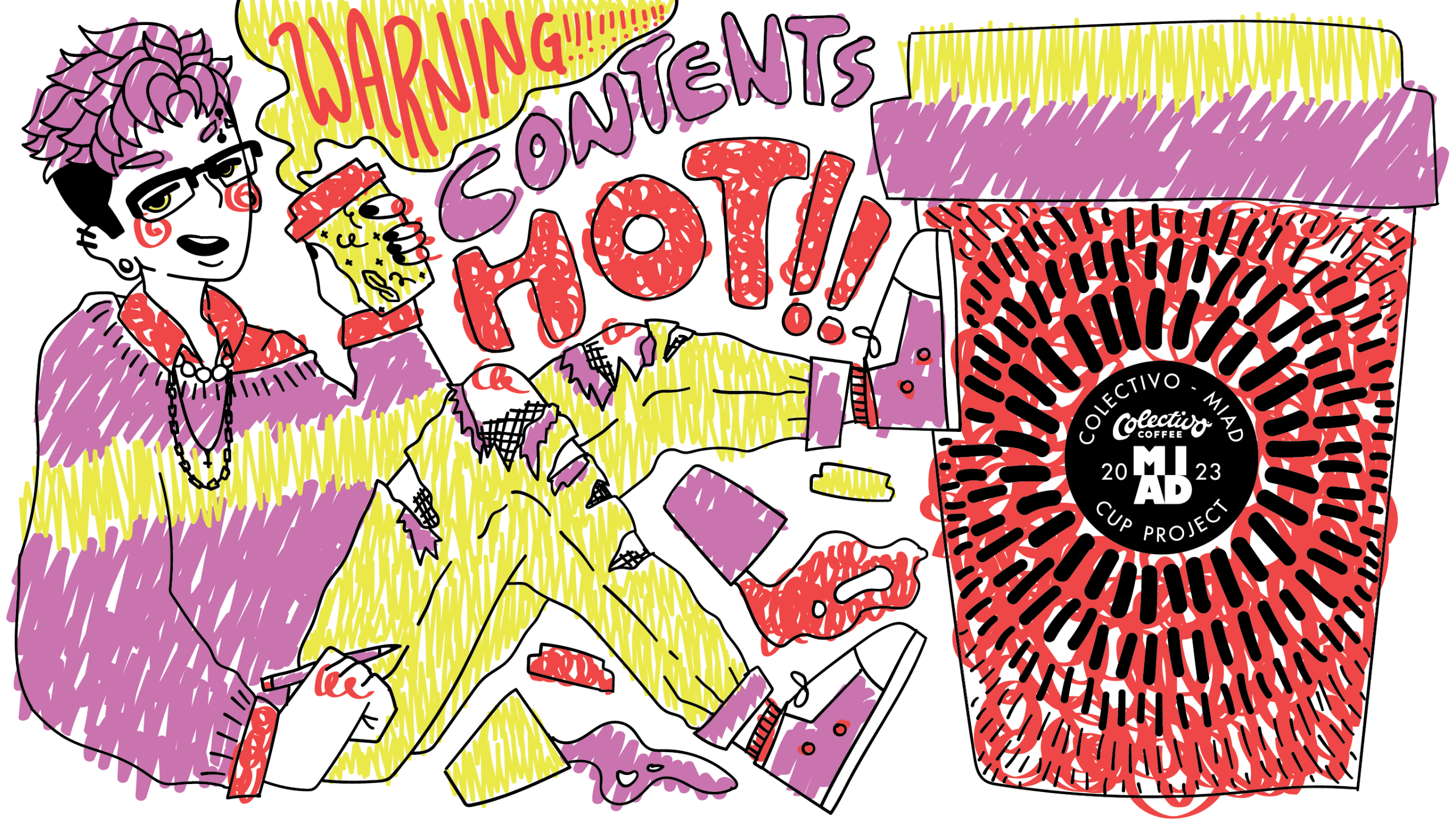
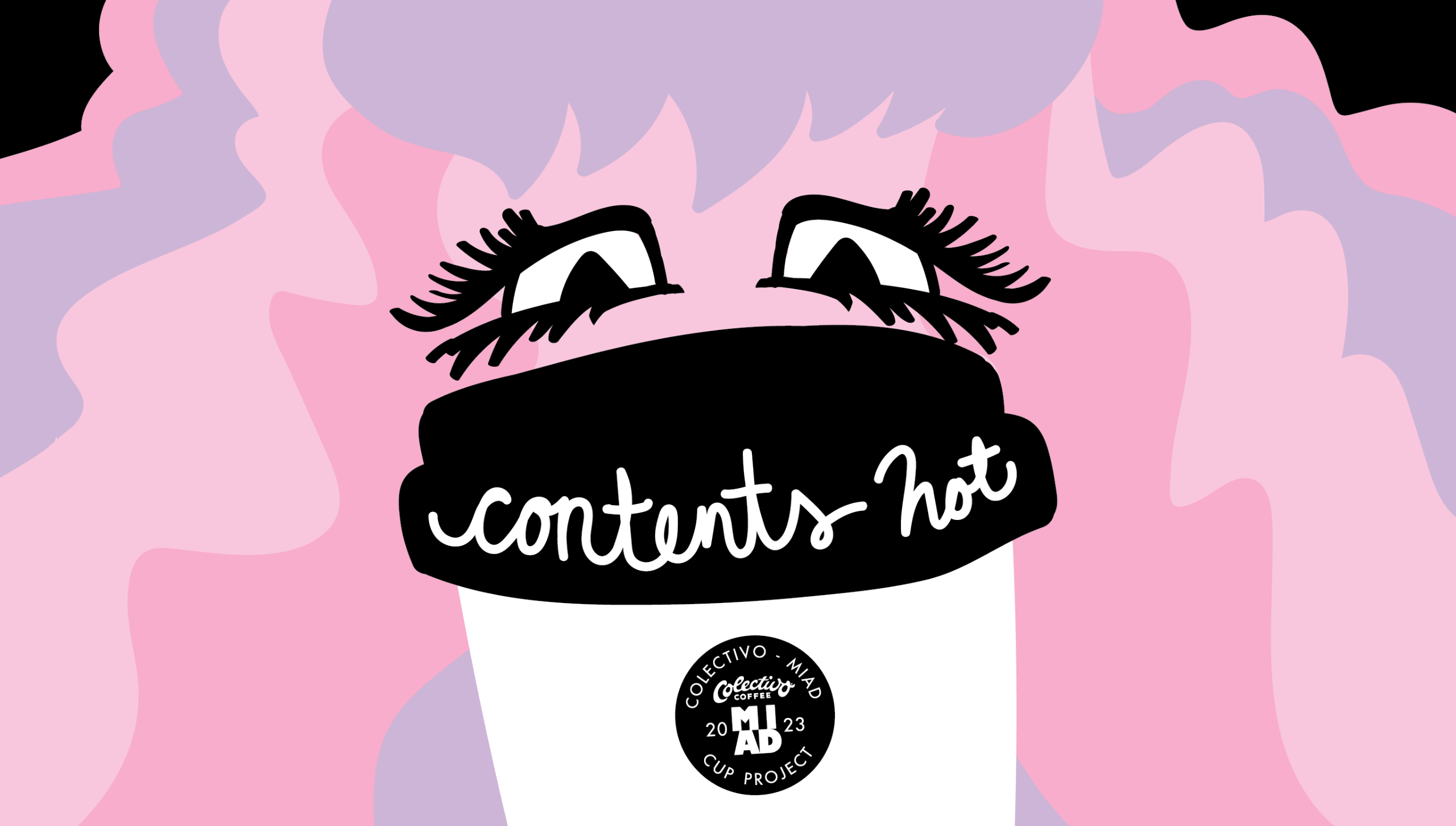
Overview: Colectivo, a coffee chain in the Milwaukee area, hosts a contest every year for senior illustrators at MIAD to design a medium-sized cup to be used in their shops.Brief: Students were tasked with creating two or three different cup designs using vector artwork and no more than three colors. Each design must take the cup wrap-around into consideration and include the Colectivo/MIAD collaboration logo and the phrase "contents hot" somewhere on the cup.Solution: Leaning into the idea of "graphic design vs illustration," the first cup design is based heavily in patterns and graphics to celebrate Colectivo and its coffee; the second design is far more illustrative, playing to the artist's personal style and utilizing unconventional drawing methods (in this case, a naive coloring style to represent playfulness); the third design is a combination of the two, being very graphic but still illustrative.
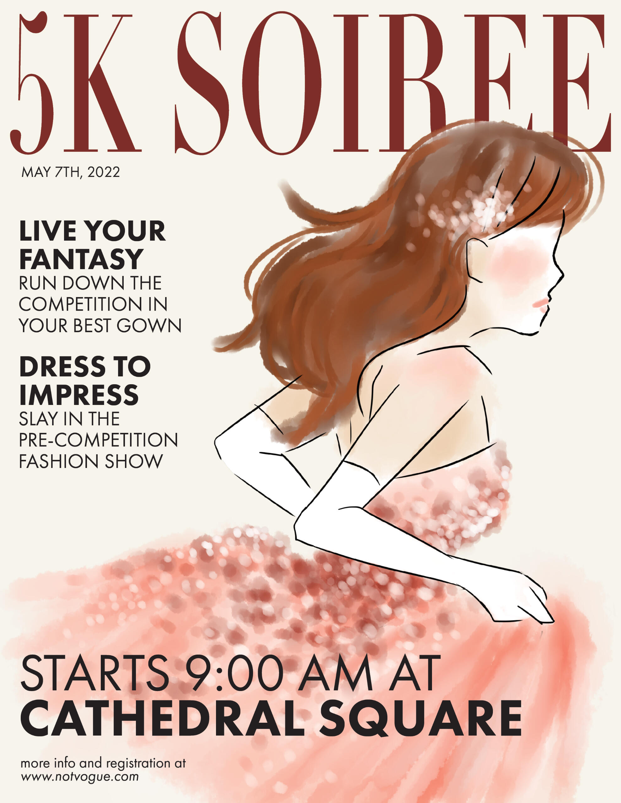
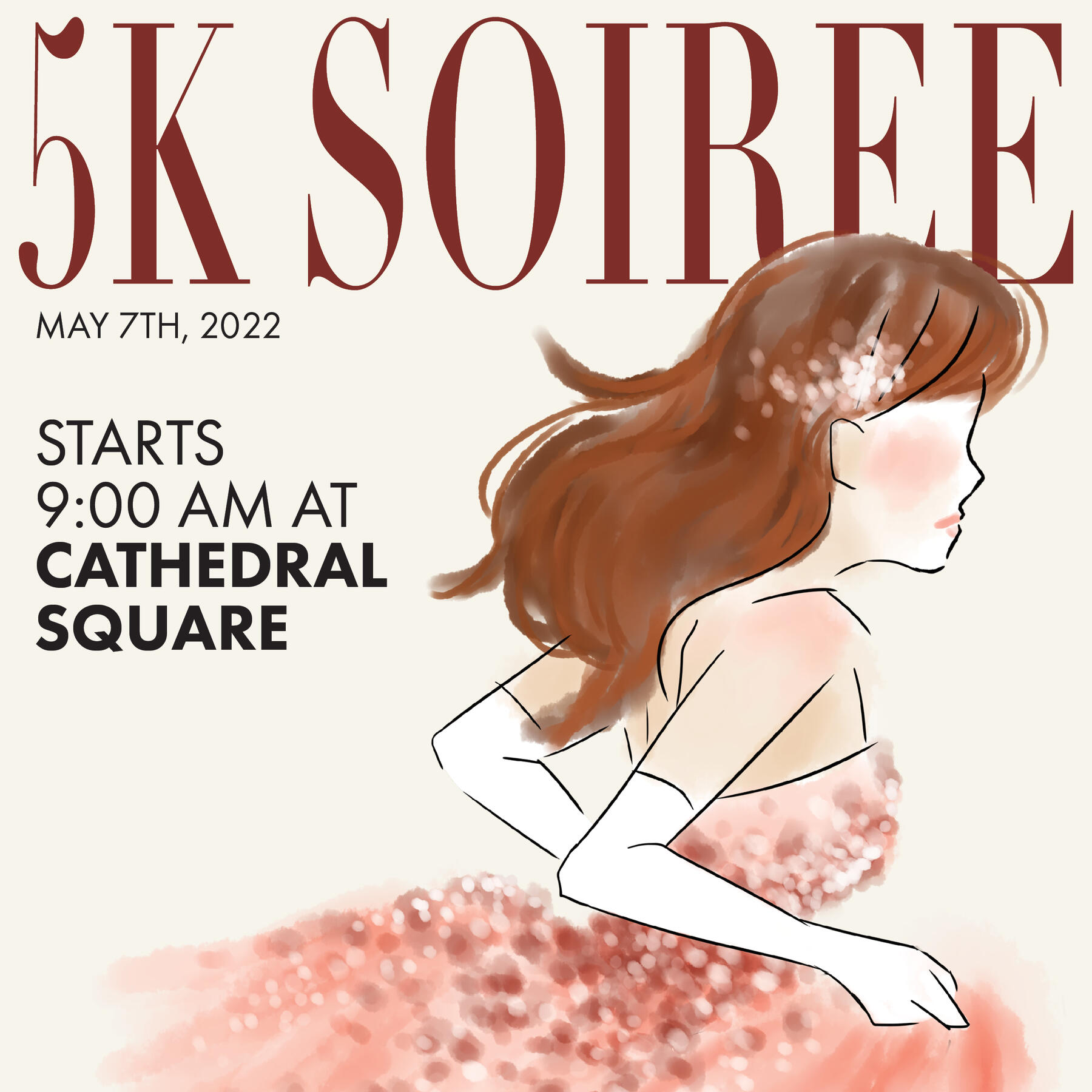
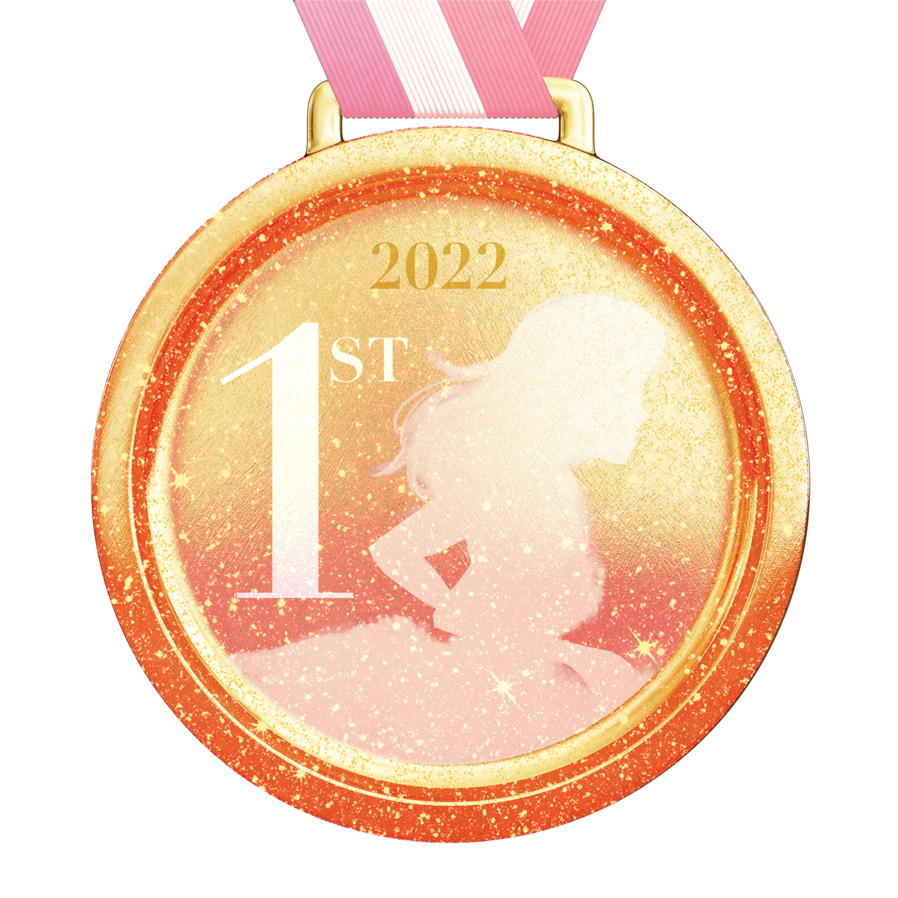
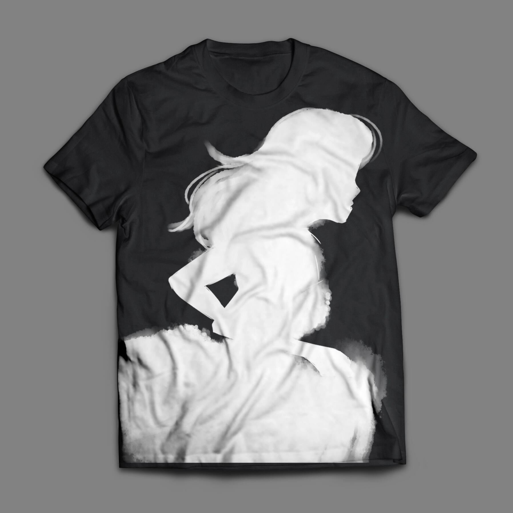
5K Soiree
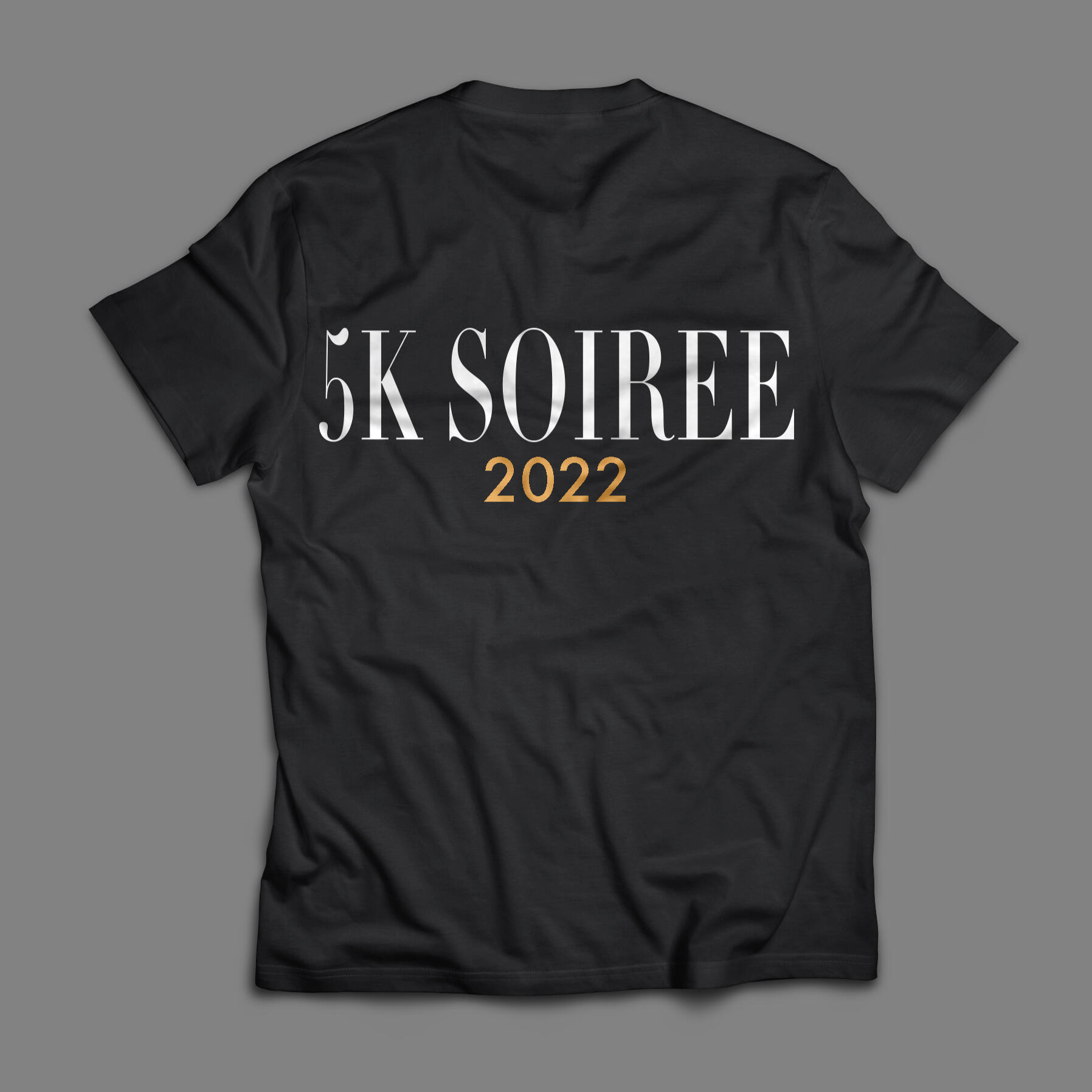
Overview: Marathons are one of the most common types of multi-media advertising events out there. Illustrators and designers must understand how to translate their work from one media to another while still remaining similar and relevant to the original piece.Brief: Students were tasked with developing a concept for a 5K marathon. They had to design a poster, static social media advertisement, first-place medal, and t-shirt for their marathon. The designs must be consistent across all pieces and unique enough to be easily differentiated.Solution: By combining the aesthetic of fashion illustrations with the design of fashion magazines, the final poster resembles that of a magazine cover, with information about the event appearing like article headlines on the front cover. The social media advertisement does the same in a smaller format, and the medal showcases the silhouette seen on both the poster and t-shirt. The t-shirt shifts the femininity of the design to a more androgynous one so that any participant can feel comfortable wearing it.
Notes & Oats
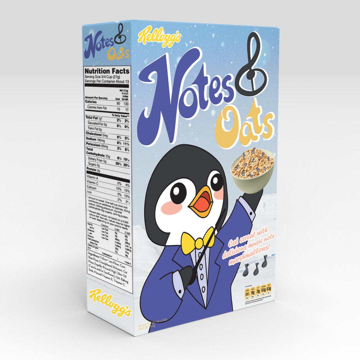
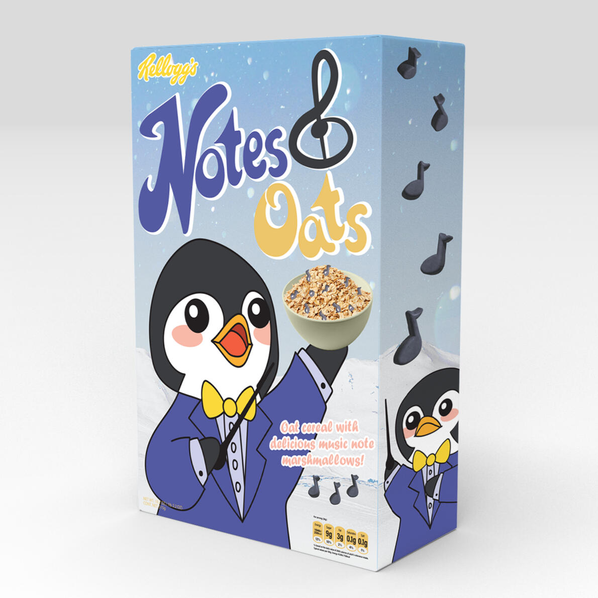
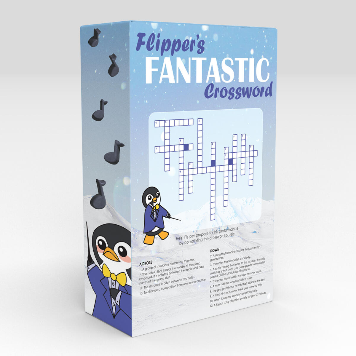
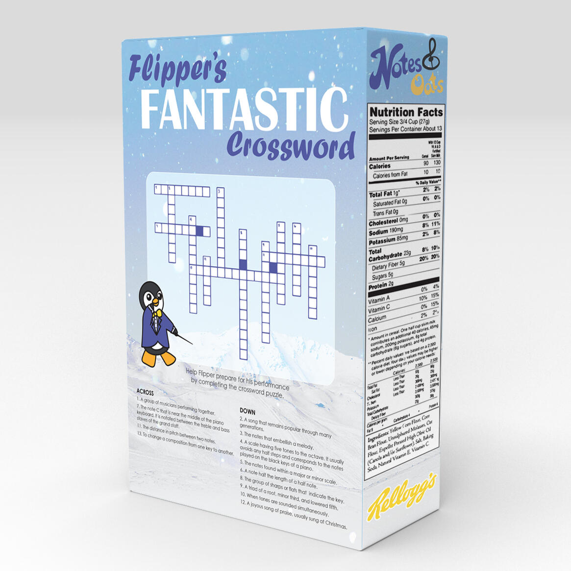
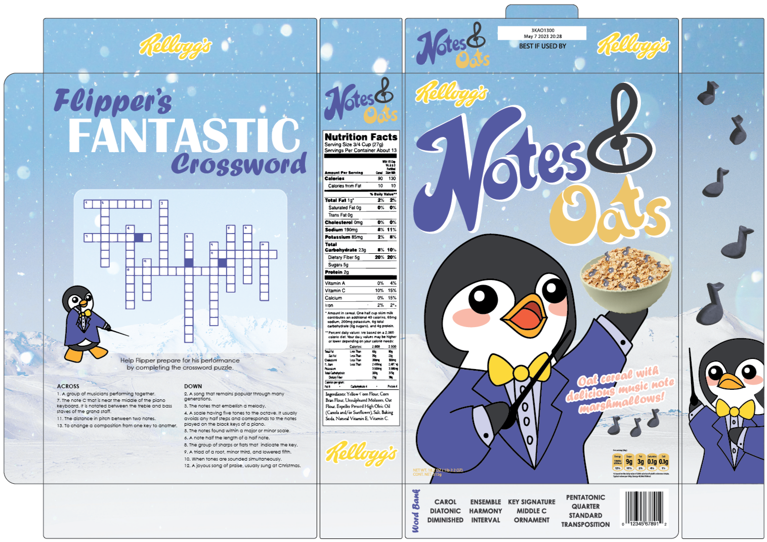
Overview: Product design is often overlooked when considering what an illustrator does for work. Cereal mascots are some of the most-recognizable brands on grocery store shelves—and someone had to draw them on each and every box.Brief: Students were tasked with developing a cereal brand with a unique mascot character. The final box design must include a finalized logo, a brand, a mascot, elements of the cereal, a game on the back of the box, and a photographic element. Each design must thoughtfully consider target audiences and legibility at a glance.Solution: With the goal of educating children about music, Notes & Oats is a fun way for children to engage with their morning meal by teaching about music terms and concepts via crosswords and other games on the back of the box. The crossword utilized here teaches basic music concepts, with a word bank at the bottom of the box for those who might not yet know all of the terms. With a mixture of photographic and drawn elements to represent the cereal, children get a good idea of what their food will taste like, while the box design retains a fun, playful element.
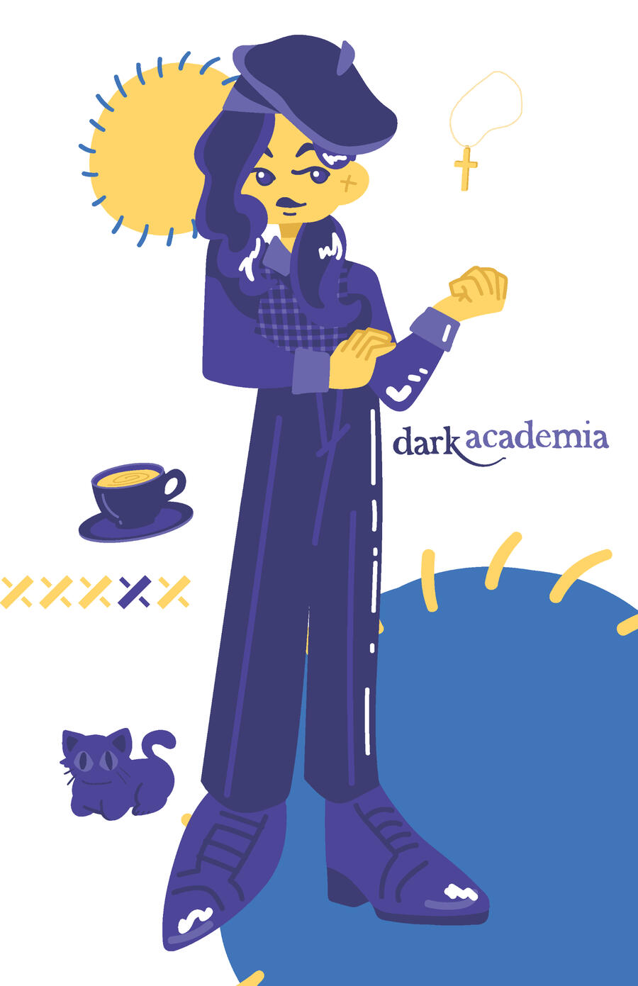
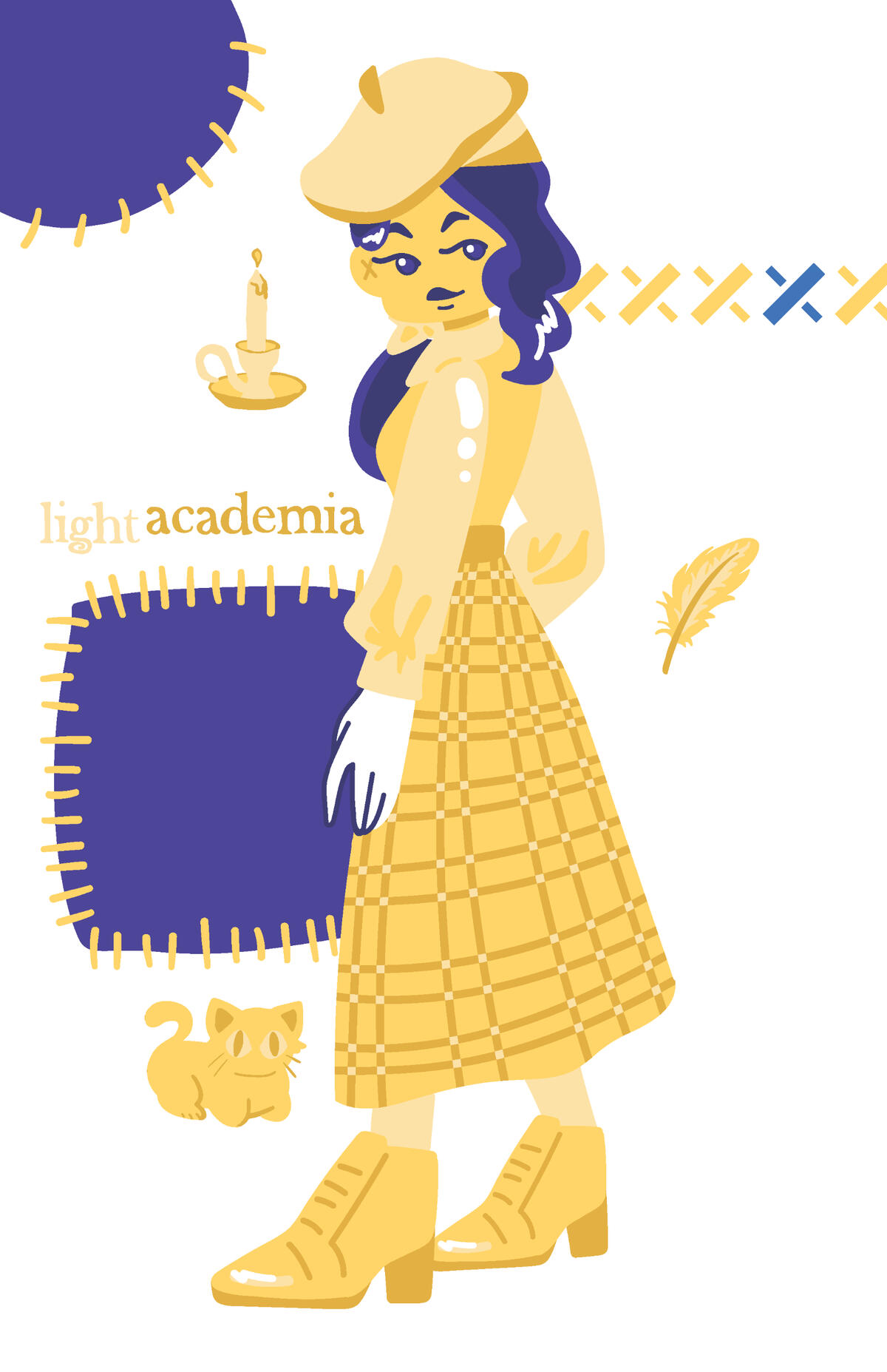
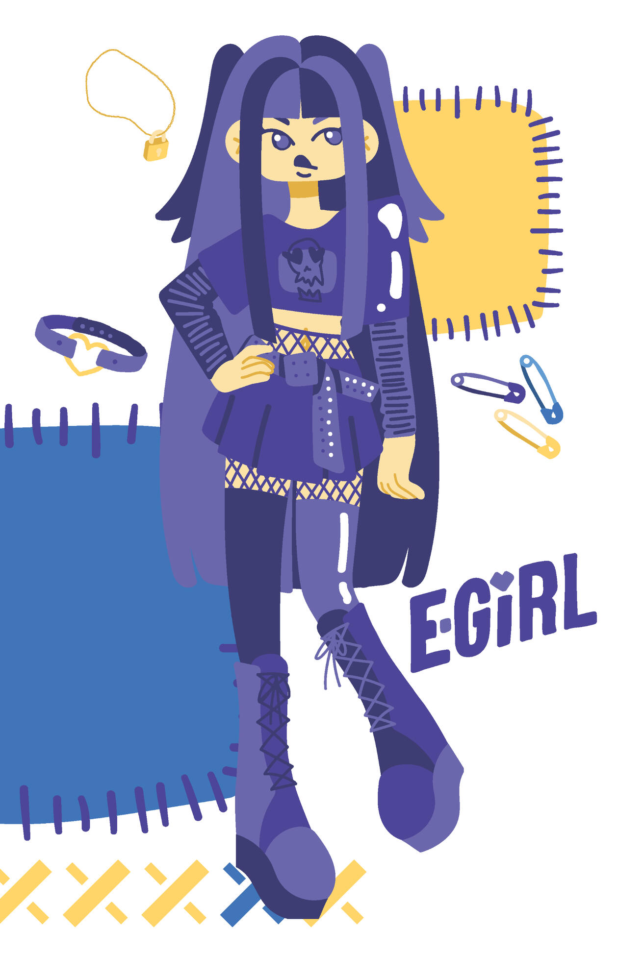
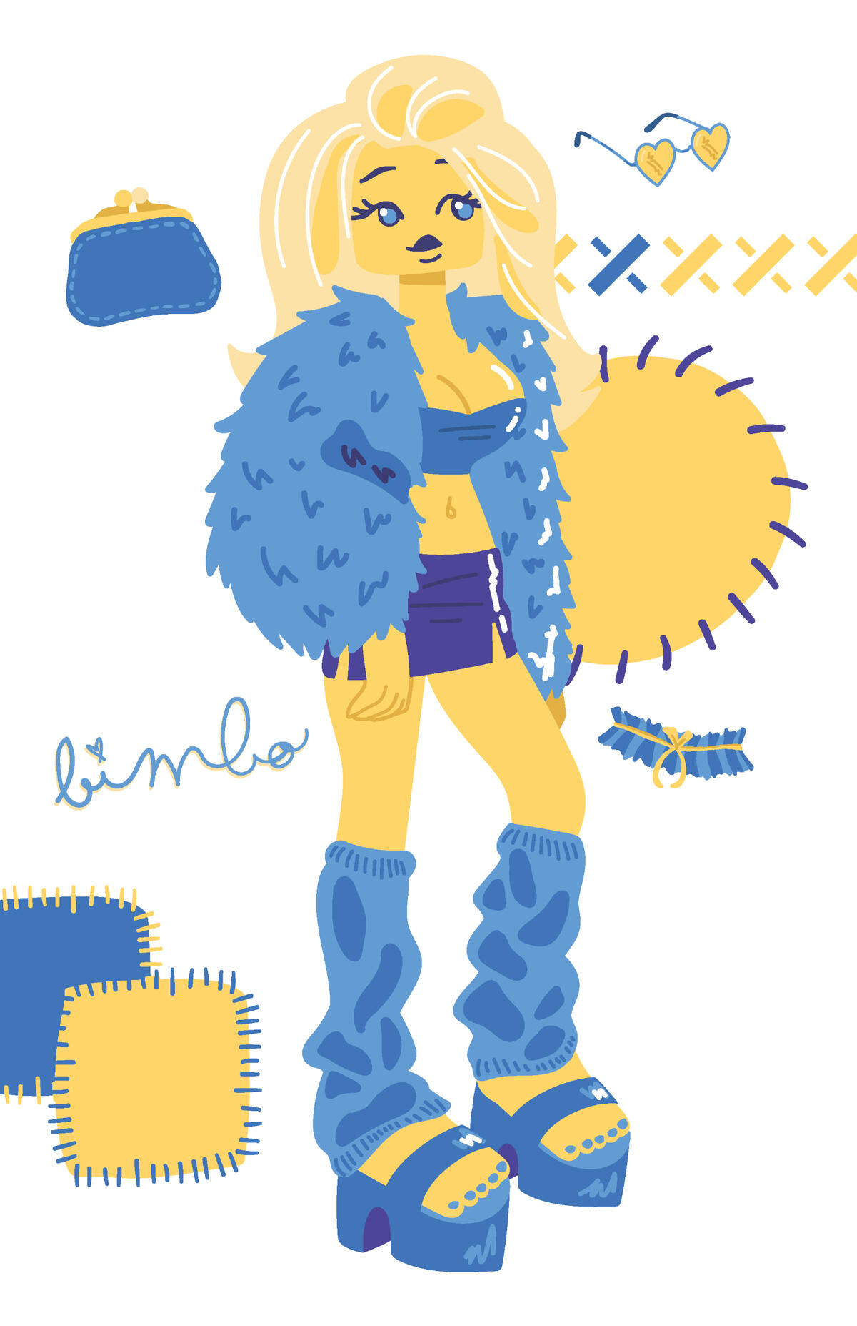
Senior Thesis: Sewn In
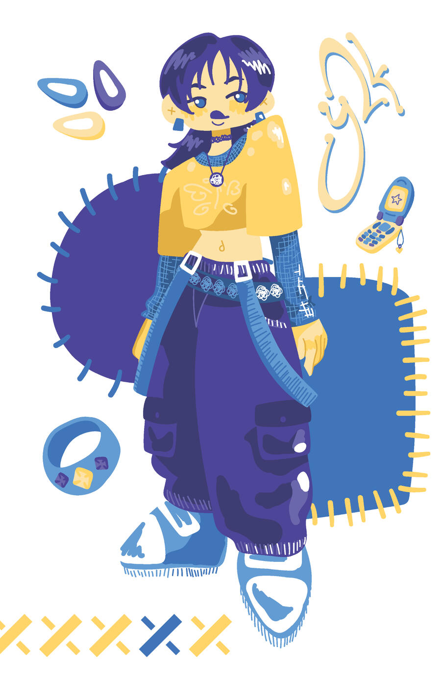
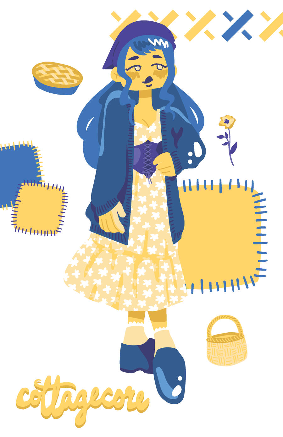
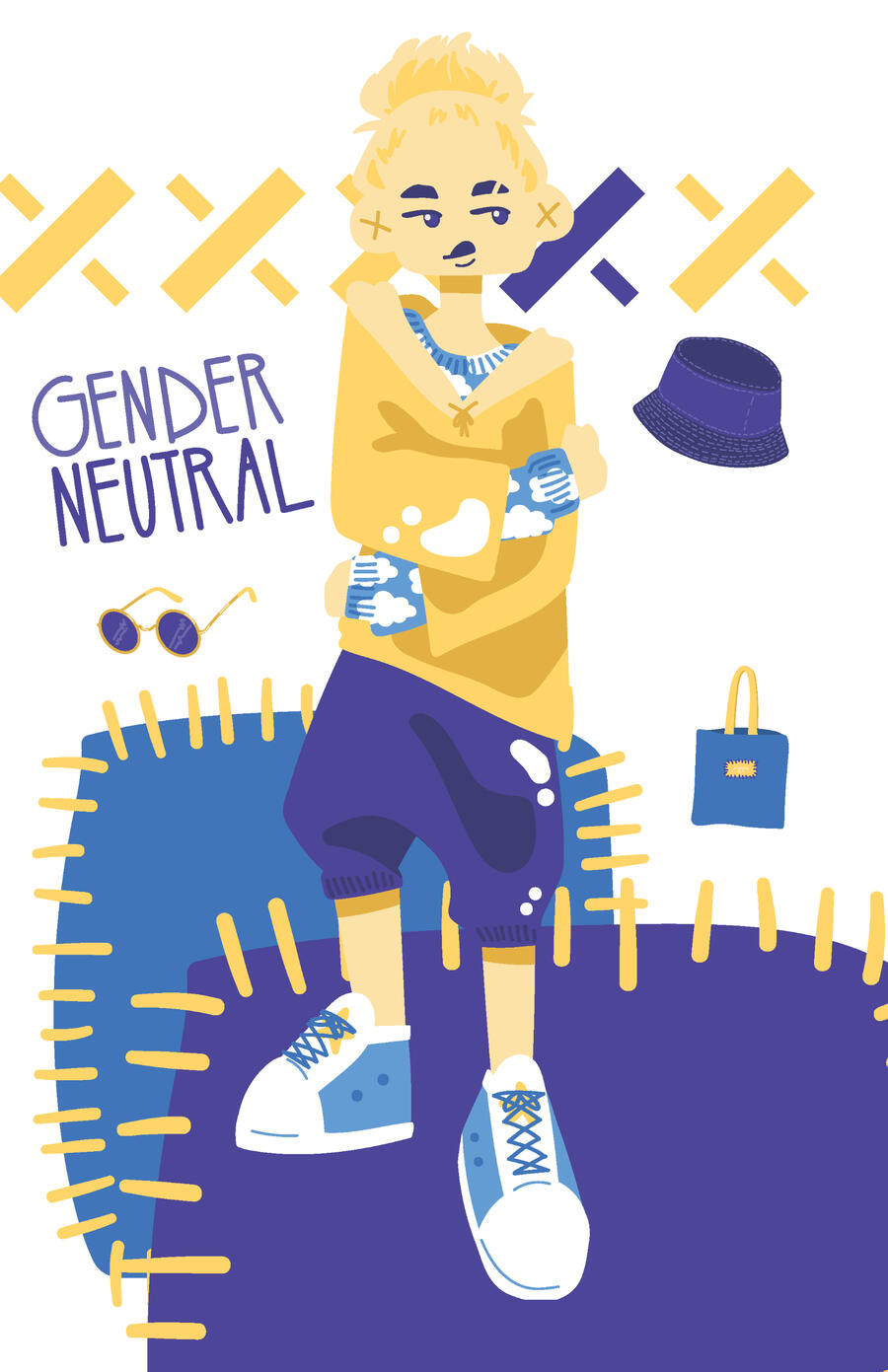
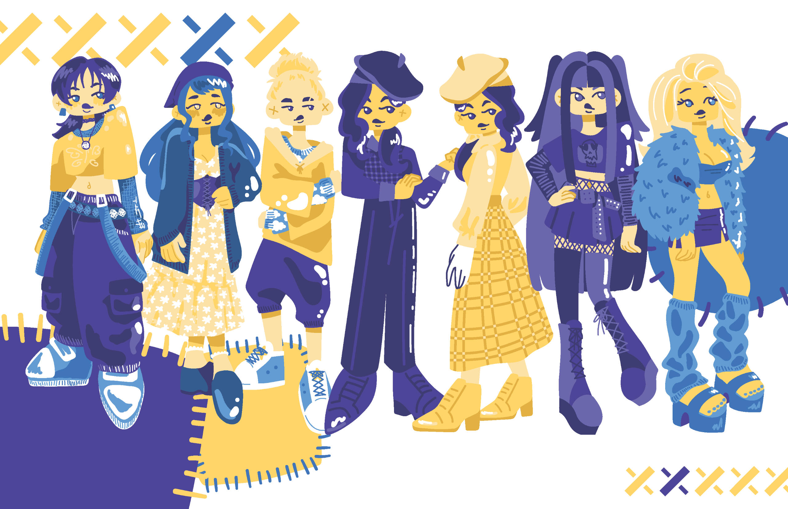
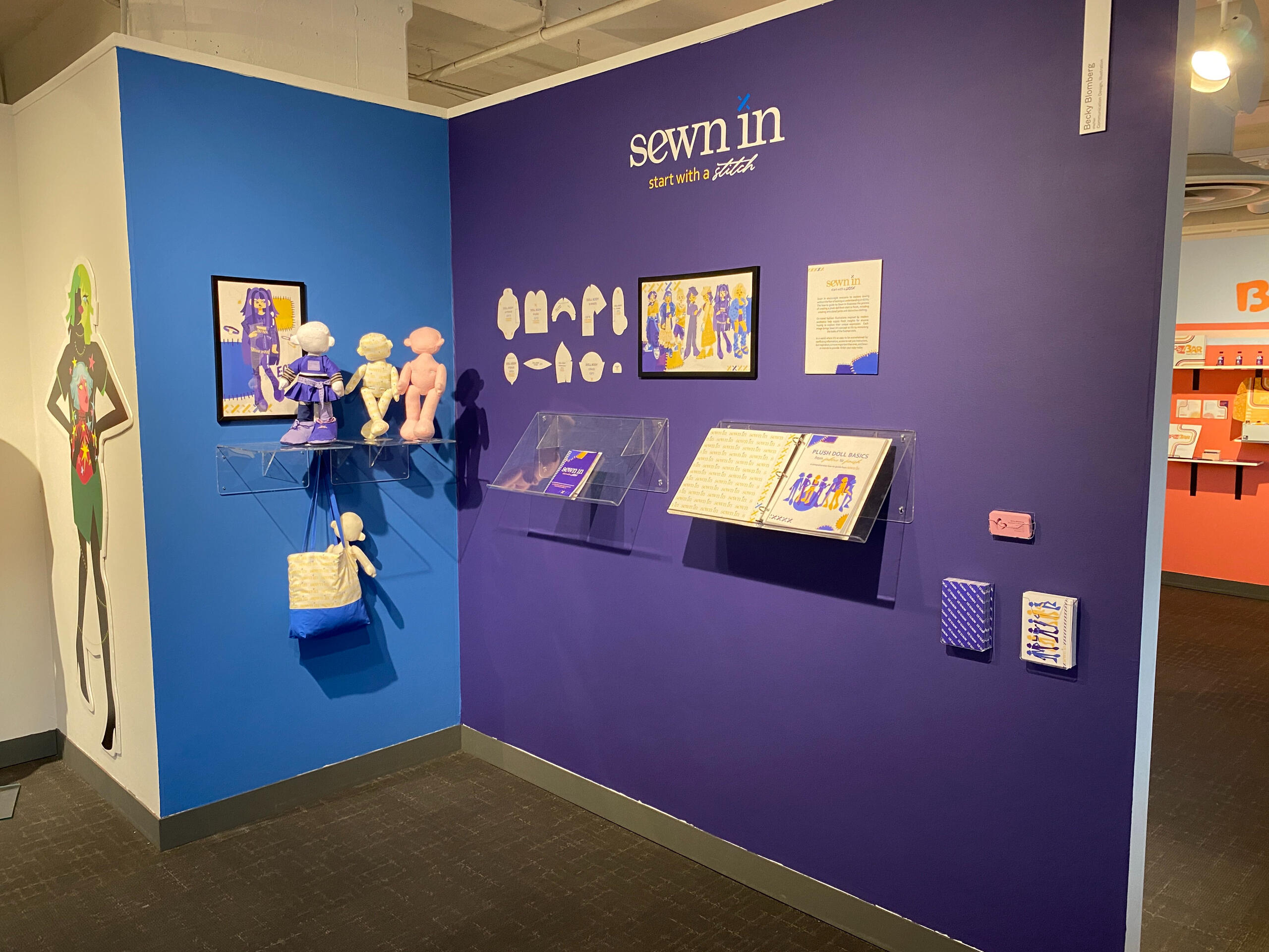
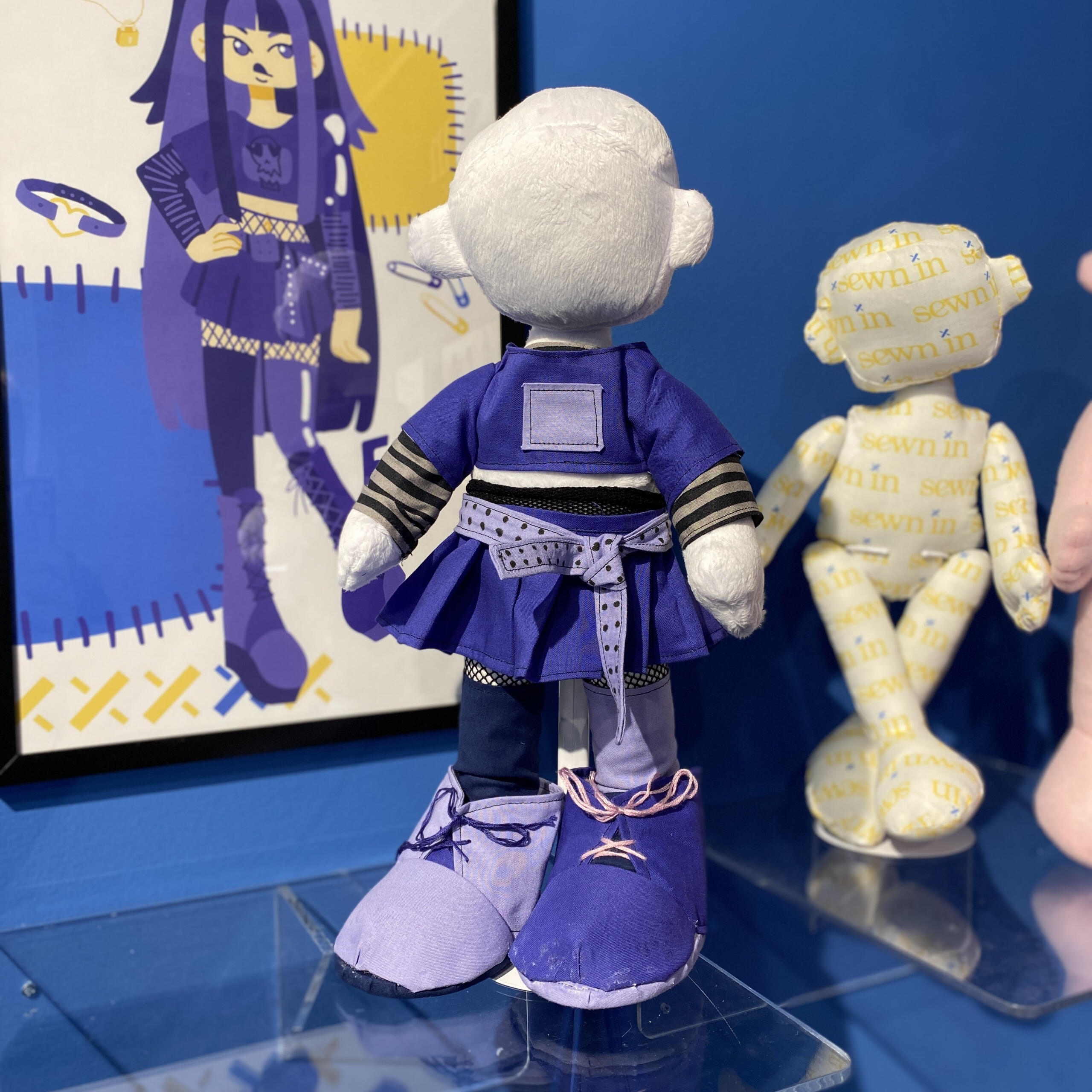
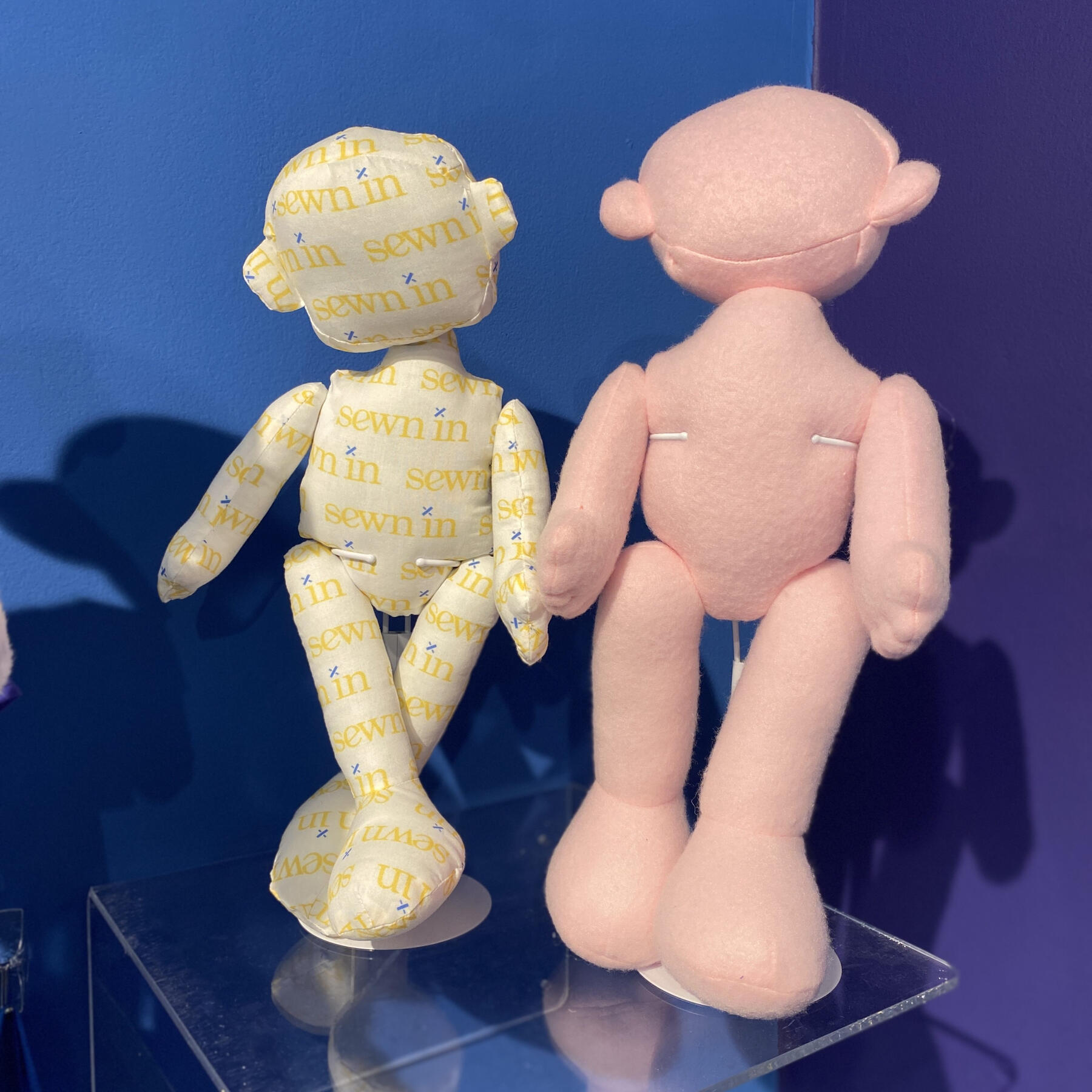
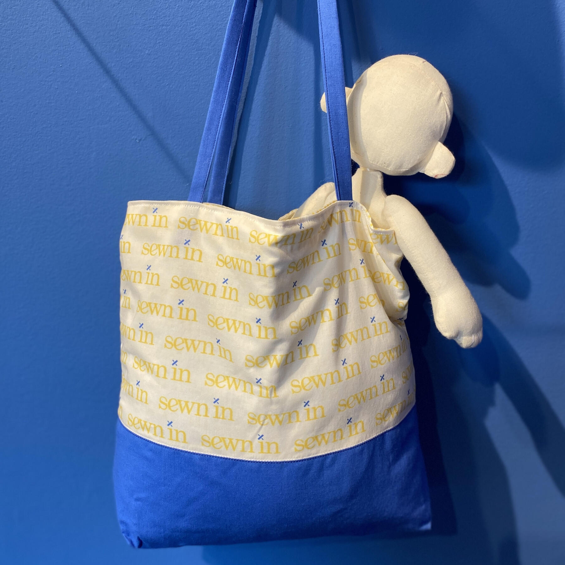
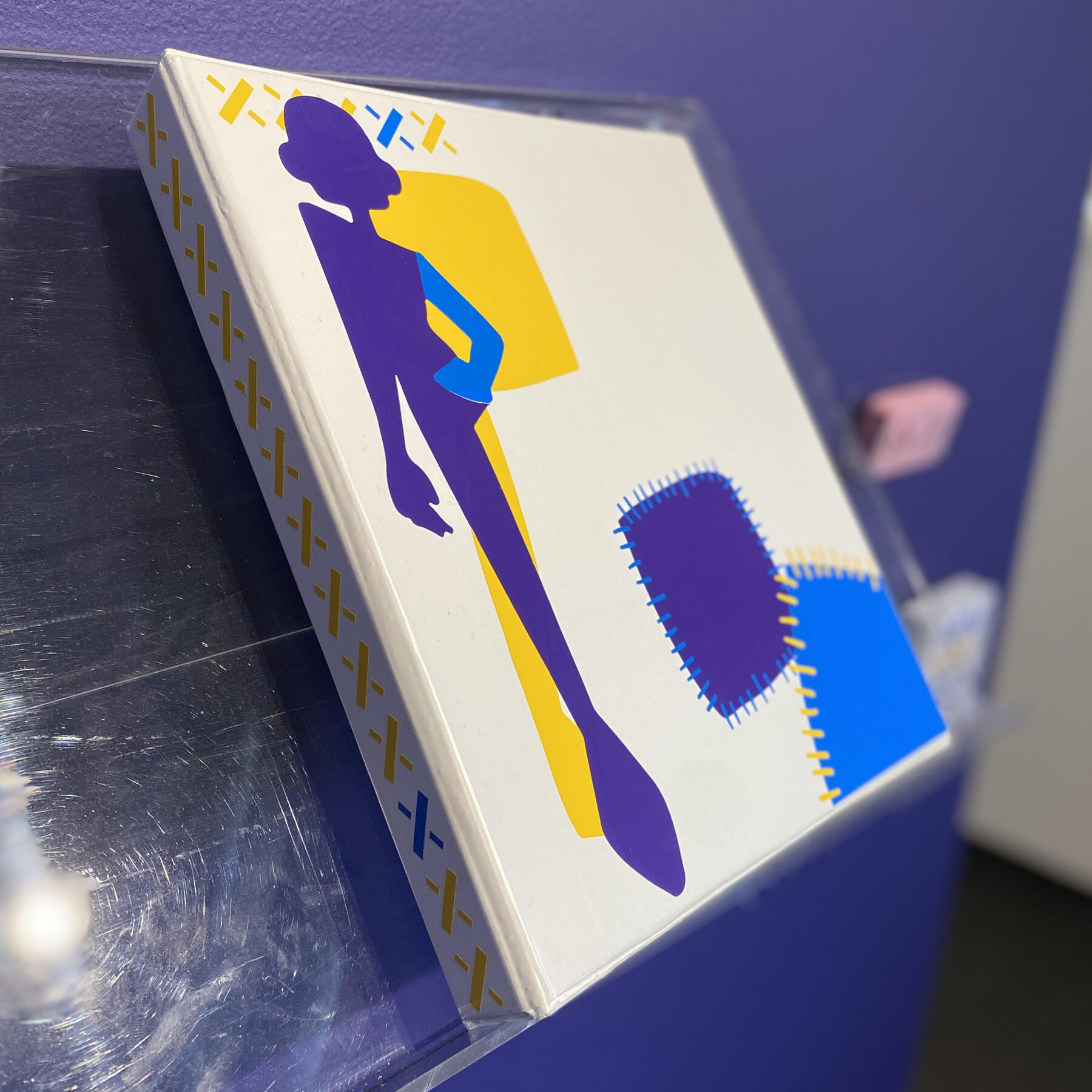
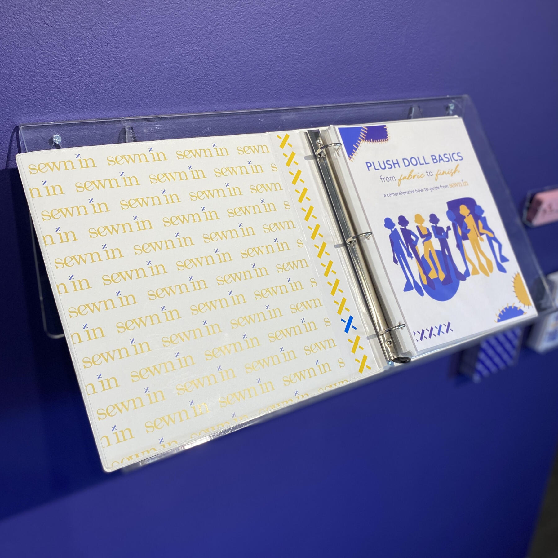
Overview: Senior thesis at the Milwaukee Institute of Art & Design is the capstone to each student's undergraduate degree. After two semesters of hard work, a final exhibition showcase is put on for the public to come in and see just what all the fuss is about.Brief: Students were tasked with finding a problem that could be solved with design and illustration, respectively. Double majors, in this case in graphic design and illustration, have to incorporate both aspects of their practices into a culminating project.Solution: Sewn In is a fashion brand dedicated to information and inspiration. The information—or graphic design—half comes from a step-by-step instructional manual that teaches how to sew a Sewn In fashion plushie. The booklet goes over necessary terms and techniques and includes pattern pieces to cut out at home, so even a beginner that has never sewn before can understand the process. The inspiration—or illustration— half comes from posters created by taking the aesthetic of the finished Sewn In fashion plushie and applying it to modern fashion. This is to demonstrate that anything that can be dreamed of in the realm of fashion can be sewn and put onto these dolls, no matter how intricate a design may be.
